
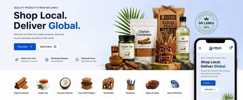
A beautiful website may catch the eye, but looks alone don’t guarantee sales. In fact, poor design choices can quietly sabotage your business. They create friction, erode trust, and send potential customers away before they ever click “buy.”
Website design directly shapes user experience and conversion rates. Many businesses unknowingly lose leads every day because of avoidable mistakes. This article uncovers the most common sales-killing design errors and shows the practical solutions.
Mistake #01: Slow Website Loading Speed
Visitors expect websites to load almost instantly. Slow websites frustrate users, increase bounce rates, and directly cut into sales. Site speed has become a critical ranking factor for search engines.
Common Causes
- Large, Unoptimized Images: Oversized images are one of the biggest culprits.
- Excessive Scripts and Plugins: Too many third‑party scripts (analytics, chatbots, ads) or bloated plugins can overload the site.
- Poor Hosting: Cheap shared hosting may save money upfront but often results in slow server response times.
- Render‑Blocking Resources: CSS and JavaScript files that load before page content can delay rendering.
How to Fix
- Compress Images: Use tools like TinyPNG or built‑in CMS optimizers. Switching to WebP can dramatically reduce file sizes.
- Enable Caching: Browser and server caching reduce load times for returning visitors.
- Minify CSS and JavaScript: Removing unnecessary spaces, comments, and code reduces file size.
- Choose Reliable Hosting: Invest in a reputable hosting provider with CDN (Content Delivery Network) support.
- Remove Unnecessary Plugins or Code: Audit your site regularly. If a plugin isn’t essential, remove it.
Mistake #02: Confusing Navigation
If visitors can’t find what they’re looking for quickly, they leave for a competitor. A poorly structured menu or hidden links creates friction, reduces trust, and directly impacts conversions.
Common Causes
- Overcrowded Menus: Too many options overwhelm users. Instead of guiding them, the menu becomes a maze.
- Poor Page Hierarchy: When pages aren’t organized logically, users struggle to understand where they are or how to get back.
- Hidden Navigation: Menus tucked away behind icons or buried at the bottom frustrate users.
- Too Many Menu Options: Cognitive overload sets in when users face endless choices.
How to Fix
- Simplify Navigation: Limit top‑level menu items to 5– Group related pages under categories.
- Use Descriptive Menu Labels: Avoid vague terms. Instead, use action‑oriented, specific labels.
- Organize Pages Logically: Follow a clear hierarchy. Breadcrumbs help users track their location.
- Keep Important Pages Accessible: Place high‑value pages in the main menu or header.
Mistake #03: Weak or Missing Calls-to-Action (CTAs)
CTAs guide users toward the next step, whether it’s making a purchase, signing up, or requesting a demo. Without clear direction, users hesitate, get distracted, or abandon the site.
Common CTA Mistakes
- Generic Button Text: Phrases like “Click Here” or “Submit” lack clarity and motivation.
- Poor CTA Placement: CTAs buried below long blocks of text or hidden in footers often go unnoticed.
- Too Many Competing CTAs: Multiple buttons on the same page confuse users. Hick’s Law applies here: more choices slow decision-making.
- Low Visual Prominence: CTAs that blend into the background or use muted colors fail to attract attention.
How to Fix
- Use Action-Oriented Language: Replace vague text with specific, benefit-driven phrases.
- Place CTAs Strategically: Position CTAs above the fold, at the end of product descriptions, and within high-traffic sections.
- Maintain Visual Contrast: Use bold colors, larger fonts, and whitespace to make CTAs stand out.
- Guide Users Through a Clear Path: Limit CTAs to one primary action per page.
Mistake #04: Low-Quality Visuals and Branding
Visuals and branding are the first things visitors notice. Poor-quality images, inconsistent colors, or weak branding can make a business appear unprofessional and untrustworthy.
Common Causes
- Blurry or Outdated Images: Grainy product photos or old graphics signal neglect.
- Generic Stock Photos: Overused stock images feel impersonal and reduce authenticity.
- Inconsistent Colors and Fonts: Random color schemes and mismatched typography confuse users.
- Weak Brand Identity: Without a cohesive visual identity, businesses struggle to stand out.
How to Fix
- Use High-Quality, Optimized Visuals: Invest in professional photography or high-resolution graphics.
- Maintain Consistent Branding: Apply the same colors, fonts, and styles across all pages.
- Incorporate Authentic Photography: Showcase real products, real people, and real experiences.
- Follow Brand Guidelines Across the Site: Document rules for logo usage, typography, and imagery.
Mistake #05: Lack of Trust Signals
Even if your website looks great and loads quickly, visitors may hesitate to buy or inquire if they don’t feel confident in your credibility. Trust is the foundation of online conversions.
Common Causes
- Missing Testimonials: Customer reviews and testimonials provide social proof. Without them, visitors have no reassurance that others have had positive experiences.
- No Client Logos or Case Studies: B2B websites that fail to showcase client logos or success stories miss an opportunity to demonstrate credibility.
- Lack of Contact Information: Hidden or missing contact details make businesses appear untrustworthy.
- No Security Indicators: Without HTTPS, SSL certificates, or secure payment icons, customers hesitate to share personal or financial information.
How to Fix
- Display Reviews: Integrate testimonials, star ratings, and case studies prominently on product or service pages.
- Showcase Certifications or Awards: Industry certifications, awards, or media mentions reinforce credibility.
- Include Clear Contact Details: Provide multiple contact options (phone, email, live chat, and physical address).
- Highlight Secure Transactions: Ensure your site uses SSL encryption. Display trust badges to reassure customers.
Mistake #06: Complicated Forms and Checkout Processes
Forms and checkout flows are critical conversion points. Long, confusing, or frustrating ones get abandoned, even permanently. Businesses lose billions annually due to friction in forms and checkout.
Common Causes
- Too Many Required Fields: Asking for excessive details upfront overwhelms users.
- Unclear Instructions: Ambiguous labels or missing guidance confuse users.
- Unclear Processing: Long forms or multi-page checkouts that don’t show progress frustrate users.
- Unexpected Costs: Hidden fees or surprise shipping charges at the final step cause abandonment.
How to Fix
- Keep Forms Short: Focus on essentials only (name, email, payment details). Optional fields should be minimized.
- Request Only Essential Information: Collect non-critical data (like marketing preferences) after the initial conversion.
- Simplify the Checkout Flow: Use one-page checkouts or a clear, step-by-step flow with progress indicators.
- Clearly Communicate Pricing and Next Steps: Show total costs upfront, including shipping and taxes, with confirmation.
Mistake #07: Poor Content Readability
Even the most valuable information loses impact if it’s difficult to read. Large blocks of text, tiny fonts, weak headings, or low color contrast make content feel overwhelming and inaccessible.
Common Causes
- Large Blocks of Text: Dense paragraphs discourage scanning.
- Small Font Sizes: Tiny text forces users to zoom or strain their eyes.
- Weak Headings: Generic or poorly structured headings fail to guide readers.
- Low Color Contrast: Light text on a white background or poor contrast reduces accessibility.
How to Fix
- Break Content into Short Sections: Use concise paragraphs, bullet points, and visuals to make content scannable.
- Use Headings and Bullet Points: Strong, descriptive headings create hierarchy and guide readers through the content.
- Improve Typography: Choose legible fonts, maintain consistent styles, and ensure adequate line spacing (1.5x line height is ideal).
- Ensure Sufficient Contrast: Test color combinations with tools such as the Contrast Checker. High contrast improves readability for all.
Small design flaws may seem harmless, but they quietly drain conversions and sales. Each issue creates friction that pushes potential customers away. The good news is that every one of these problems is fixable. Businesses can deliver a seamless user experience that builds confidence and drives results.
Contact Tectera a website development company in Sri Lanka to design a website.

