
People mostly focus on colors, images, or layouts while designing a website. Another element quietly shapes how visitors see and interact with your business online – typography. The fonts aren’t just decorative; they influence the readability, professionalism, and trustworthiness of your brand.
This article explores how the right font choice affects user experience and shares a curated list of the best fonts for business websites. You’ll also learn practical tips on selecting and using fonts effectively.
Why Font Choice Matters for Business Websites
Creates a Strong First Impression
Users form an opinion about a website in just 50 milliseconds. A clean, professional typeface signals credibility, while a poorly chosen font can make a site look outdated or untrustworthy.
Reflects Brand Personality
A playful script font might suit a bakery, but it would undermine the authority of a law firm. Choosing the right font ensures your website speaks in the “voice” of your brand.
Improves Readability and Accessibility
94% of first impressions are design-related, and legible typography is a major factor. Fonts with clear letterforms and proper spacing reduce eye strain.
Enhances User Experience Across Devices
Fonts must adapt seamlessly across screen sizes. Responsive typography (scalable, touch-friendly, and optimized for different resolutions) ensures that your content remains clear.
Supports Conversion Goals
Typography influences how easily visitors consume information. A well-structured font hierarchy can guide users through headlines, body text, and calls to action.
Contributes to a Consistent Visual Identity
Consistency builds trust. Using a unified font style across your website, emails, and marketing materials strengthens brand recognition.
What Makes a Good Business Website Font?
Before choosing, it’s essential to understand the qualities that make a font effective for websites. Let’s break down the key characteristics to evaluate.
Readability
A good business font must be easy to read across both desktop and mobile. Clear letterforms and proper spacing ensure that visitors can quickly scan content. Fonts should also provide distinct shapes for similar characters (like “I,” “l,” and “1”) to avoid misinterpretation.
Professional Appearance
Business communication demands fonts that look polished and timeless. Overly trendy or decorative fonts may grab attention but age poorly, making a site feel outdated. Professional fonts convey trustworthiness and authority.
Web Performance
Fonts should not slow down your website. A well-optimized font is widely supported, loads quickly, and is available through reliable services. Slow-loading fonts can increase bounce rates, as a 1-second delay in page load can reduce conversions by 7%.
Versatility
A strong business font offers multiple weights (light, regular, bold) and works well for headings and body text. Such flexibility allows you to create a clear hierarchy that guides users through your content. Versatile fonts also adapt seamlessly across different screen sizes.
Accessibility
Accessibility ensures that all users, including those with visual impairments, can interact with your site. Fonts with good letter spacing, an appropriate x-height (the height of lowercase letters), and strong contrast maintain readability across sizes.
12 Best Fonts for Business Websites
01. Inter
Best For: Modern, UI-focused websites, SaaS platforms, and startups.
- Designed for digital interfaces, ensuring clarity on both desktop and mobile.
- Clean letterforms with excellent character distinction.
- Ideal for dashboards, apps, and tech-driven businesses where usability is paramount.
02. Roboto
Best For: Technology companies, corporate websites, and professional blogs.
- Highly versatile with multiple weights.
- Balances geometric precision with friendly curves.
- Widely supported via Google Fonts, ensuring fast load times.
03. Open Sans
Best For: General business websites, service providers, and SMEs.
- Extremely legible, even at smaller sizes.
- Neutral yet approachable style.
- Works well for both headings and body text.
- Trusted by global brands like Mozilla for its readability.
04. Lato
Best For: Professional services, consultancies, and customer-focused businesses.
- Warm and approachable while maintaining professionalism.
- Multiple weights for flexible design hierarchy.
- Strong readability across devices.
05. Poppins
Best For: Creative agencies, design studios, and modern brands.
- Geometric sans-serif with bold, contemporary appeal.
- Excellent for headings and branding elements.
- Works well in minimalist layouts.
- Popular among startups aiming for a sleek, modern identity.
06. Montserrat
Best For: Branding-heavy websites, e-commerce, and marketing agencies.
- Strong, impactful headings.
- Inspired by urban signage, giving a bold personality.
- Ideal for logos, hero sections, and promotional content.
- Frequently used in Google Fonts showcase projects for its versatility.
07. Source Sans 3
Best For: Content-heavy websites, blogs, and knowledge platforms.
- Designed for readability in long-form text.
- Multiple weights and styles for flexible typography systems.
- Optimized for performance and accessibility.
- Backed by Adobe, ensuring reliability and global adoption.
08. Nunito Sans
Best For: Customer-focused brands, healthcare, and education websites.
- Rounded terminals give a soft, approachable feel.
- Maintains clarity while adding friendliness.
- Works well for businesses emphasizing care, trust, and community.
- Frequently chosen by NGOs and service organizations.
09. Merriweather
Best For: Editorial sites, law firms, and professional services.
- A serif font optimized for screen readability.
- Adds authority and sophistication.
- Perfect for long-form content and professional communication.
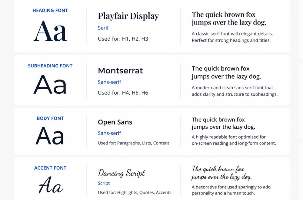
10. Playfair Display
Best For: Luxury brands, fashion, and creative industries.
- Elegant serif font with high-contrast strokes.
- Best suited for headings and hero text.
- Conveys sophistication and exclusivity.
- Commonly used in high-end e-commerce and editorial layouts.
11. IBM Plex Sans
Best For: B2B companies, technology firms, and corporate websites.
- Clean, technical design reflecting precision.
- Developed by IBM for global use, ensuring scalability.
- Multiple weights and styles for versatile applications.
- Ideal for businesses emphasizing innovation and reliability.
12. Helvetica (or System Alternative)
Best For: Broad business appeal – corporate, finance, and professional services.
- Timeless, neutral, and universally recognized.
- Extremely versatile across industries.
- System font alternative ensures fast performance.
- Used by Apple and countless global brands, proving its enduring relevance.
Google Fonts analytics says fonts like Roboto, Open Sans, and Montserrat are the most widely adopted. It’s because they balance performance, readability, and design flexibility. Choosing from these proven options ensures your website communicates professionalism while remaining user-friendly.
Best Font Pairing Practices
Choosing the right fonts is only half the battle. Combining fonts effectively creates a polished, professional look. Smart font pairing improves visual hierarchy, guiding visitors with ease.
Pair Serif Headings with Sans-Serif Body Text
Serif fonts (like Playfair Display or Merriweather) add elegance and authority, making them excellent for headings. Sans-serif fonts (like Inter or Open Sans) are clean and highly legible, perfect for body text.
Limit Websites to Two or Three Font Families
Too many fonts create clutter and confuse users. Stick to two: one for headings and one for body text. A third can be used sparingly for accents (like quotes or captions).
Use Different Font Weights Instead of Multiple Fonts
Instead of adding more font families, vary weights (light, regular, bold) within the same font. It creates hierarchy without sacrificing consistency.
Maintain Consistent Typography Across All Pages
Typography should be uniform across your website – headings, body text, buttons, and forms. Inconsistent fonts can make a site feel disorganized and reduce credibility.
Create Clear Heading and Body Text Hierarchy
Hierarchy ensures users know where to look first. Larger, bolder fonts for headings and lighter, smaller fonts for body text help structure content.
Typography is far more than a design detail; it’s a powerful tool to shape how visitors experience your business online. The right font enhances readability, strengthens user experience, and communicates brand perception with clarity and professionalism.
Contact Tectera who offers website development in Sri Lanka to develop website.

