
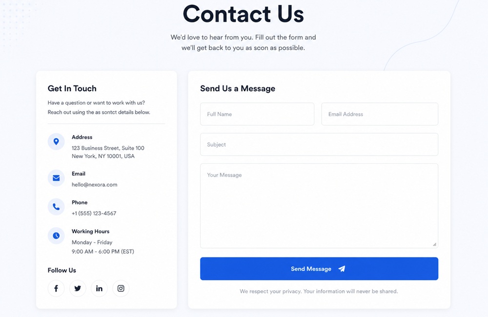
If your contact form isn’t designed well, potential leads may never reach out. The contact form is one of the most important conversion elements on any website. When done right, it becomes a powerful tool for lead generation and customer communication.
When done poorly, issues such as too many fields, unclear instructions, or a lack of trust signals frustrate users and reduce completion rates. This article explores the best practices to make your contact forms more user-friendly, trustworthy, and conversion-focused.
Best Practice #01: Keep the Form Short and Simple
Request Only Essential Information
Ask only for what you truly need to start the conversation. For most businesses, that’s a name, email, and a short message. Anything beyond that should be carefully justified.
Eliminate Unnecessary Questions
Every extra question feels like friction. Users often abandon forms when they see irrelevant or overly personal requests.
Balance Business Needs with User Convenience
Yes, businesses want rich data, but users want speed. The best forms strike a balance: they capture enough information to qualify leads without overwhelming visitors.
Best Practice #02: Use Clear and Descriptive Field Labels
Avoid Vague Wording
Labels like “Details” or “Info” leave users guessing. Instead, be specific: “Your Email Address” or “Message About Your Project.”
Keep Terminology Simple
Use everyday language, not jargon. For example, instead of “Company Identifier,” simply say “Company Name.”
Place Labels Consistently
Labels should be positioned where users expect them, above or beside the field. Labels placed directly above fields are read faster and reduce cognitive load.
Use Placeholder Text Only as a Supplement
Placeholders can be helpful for examples (“example@domain.com”), but they should never replace labels.
Best Practice #03: Make Required Fields Obvious
Clearly Identify Mandatory Fields
Always indicate required fields with a clear visual cue, commonly an asterisk (*) or bold text. Unclear field requirements are among the top 5 causes of form abandonment.
Avoid Making Every Field Required
If every field is mandatory, users feel pressured and may abandon the form. Instead, focus on essentials (name, email, and message).
Request Only Essential Information
Mandatory fields should align with business goals while respecting user convenience. Forms with fewer than 5 required fields have higher completion rates.
Best Practice #04: Group Related Fields Logically
Personal Information
Start with basics like Name and Job Title. These are familiar and easy to provide, setting a smooth entry point into the form.
Contact Details
Next, group fields like Email Address and Phone Number. This section signals how you’ll reach back to them.
Project Information
For businesses offering services, it can include Project Type, Budget Range, or Timeline. Grouping these helps qualify leads without overwhelming users.
Additional Comments
Finally, provide an open-text field for “Message” or “Additional Notes.” It gives users freedom to explain their needs in their own words.
Best Practice #05: Write Helpful Error Messages
Display Errors Near the Affected Field
Errors should appear exactly where the problem occurs. If a user mistypes the email address, the error message should appear next to the email field.
Use Plain Language
Avoid technical jargon like “Validation failed” or “Error code 404.” Instead, say “Please enter a valid email address.” Plain language reduces confusion and makes the fix obvious.
Preserve Entered Information After Validation
Few things frustrate users more than having to retype everything after a single mistake. Preserve all previously entered data so users only correct the problematic field.
Provide Real-Time Validation Where Appropriate
Real-time validation (flagging invalid email formats as soon as they’re typed) helps users fix them instantly. It reduces submission errors and boosts confidence.
Best Practice #06: Optimize for Mobile Users
Responsive Layouts
Your form should adapt seamlessly to different screen sizes. Responsive design ensures that fields, buttons, and text scale properly.
Large Touch-Friendly Input Fields
Small fields and buttons are hard to tap on mobile. Make input fields large enough to accommodate finger taps and provide sufficient spacing between fields.
Appropriate Keyboard Types
Trigger the right keyboard for each field. For example: show the “@” symbol keyboard for email, numeric keypad for phone, and alphabetic keyboard for name fields.
Readable Text
Tiny fonts force users to zoom in and out. Use a font size of at least 16px for mobile readability. Contrast should also be strong enough for outdoor viewing.
Simple Scrolling
Long, unstructured forms that require endless scrolling discourage users. Break forms into logical sections and minimize vertical length.
Best Practice #07: Build Trust with Privacy Reassurance
Brief Privacy Statement
Include a short note near the form, such as “We respect your privacy. Your information will only be used to respond to your inquiry.”
Link to Privacy Policy
Always provide a direct link to your privacy policy. It demonstrates transparency and compliance with global regulations such as GDPR (Europe) and CCPA (California).
Explain Why Information Is Collected
Users are more comfortable when they understand the purpose. For example, “We ask for your number to confirm the appointment” or “Your email helps us send project updates.”
Avoid Requesting Sensitive Data Unnecessarily
Never ask for details such as national ID numbers, financial information, or personal demographics. Over-collection raises red flags and discourages submissions.
Best Practice #08: Include a Clear Call-to-Action
Action-Oriented Button Text
Generic labels like “Submit” don’t inspire action. Instead, use verbs that reflect the user’s goal. For instance, “Request a Quote”, “Get in Touch”, “Book a Consultation”, or “Send Message”.
Visually Prominent Submit Button
The CTA button should stand out with colors, size, and placement. Users instinctively look for a bold, visually distinct button to complete their action.
Align CTA with User Intent
Your CTA should match what the user expects. If they’re filling out a service inquiry form, “Request a Quote” feels natural.
Avoid Generic Labels Like “Submit”
“Submit” feels cold and transactional. It doesn’t tell users what they’re submitting or why. Clear, descriptive CTAs reduce uncertainty and encourage action.
Best Practice #09: Protect Against Spam Without Hurting UX
CAPTCHA Alternatives
Traditional CAPTCHAs often annoy users. Modern alternatives like Google reCAPTCHA v3 or hCaptcha run invisibly in the background.
Invisible Spam Protection
Techniques like JavaScript checks or time-based submissions silently filter bots. For example, if a form is submitted in less than two seconds, it’s likely automated.
Honeypot Fields
A honeypot is a hidden field that humans won’t see, but bots will fill. If the field contains data, the submission is flagged as spam.
Server-Side Validation
Bots can bypass client-side validation (like JavaScript checks). Server-side validation ensures that only properly formatted data is accepted.
Best Practice #10: Show a Clear Confirmation Message
Confirmation Page or Message
Always display a confirmation immediately after submission. It can be a simple inline message (“Thank you! Your message has been sent.”) or a dedicated confirmation page.
Explain What Happens Next
Tell users what to expect after submitting. For example: “Our team will review your inquiry and respond within 24 hours,” or “You’ll receive a confirmation email with your ticket number.”
Expected Response Time
Setting clear timelines reduces anxiety. If you typically reply within 48 hours, say so. Transparency prevents users from feeling ignored.
Optional Next Steps
Offer users something to do while they wait. Consider: links to FAQs or a knowledge base, suggestions to follow your social channels, or an option to schedule a call or demo.
An effective contact form isn’t a data collection tool. Instead, it’s the gateway to stronger customer relationships and higher conversions. Minimize friction, keep forms short + simple, and ensure they are mobile-friendly, trustworthy, and seamlessly integrated. Then, you can make it easy for users to reach out and for your business to respond effectively.
Contact Tectera who offers website design in Sri Lanka to develop a website.

