fbpx
sales@tectera.com
+1 (437) 830-4940)

Tectera

BLOG

Bring your
web ideas to life

If you’re like most lawyers, you probably spent a lot of time in law school learning how to argue cases and write briefs. But when it comes to your website, you might be more comfortable with the word processor than the photo editor. The average attorney spends less than an hour per week on marketing activities, but that can make all the difference in attracting new clients and retaining existing ones.

A good website design will not only help establish your credibility as an expert in your field but also increase brand awareness among potential clients.

Tip #1: Clearly define your target audience

website

You may have heard the old adage “first impressions last.” It’s true, and that’s why it’s so important to make a good one on your website.
Your website will be your first point of contact with potential clients, so it should be designed in such a way as to convey the message you want them to receive about your law firm. Your website design can help give clients a sense of trust and professionalism, or it can leave them feeling frustrated and confused that’s why it’s crucial that you take the time to craft an effective one for yourself.

The best way to do this is by making sure that all of the information on your site is relevant and easy for visitors to find.

Once these aspects are taken care of, then you can move on toward other areas like SEO optimization (i.e., search engine optimization), which will help make sure that people who are looking specifically for legal services in their area actually find yours when they search online.

Suggested Read: How To Choose The Right Graphic Design Agency in Toronto

Importance of having a strong online presence for law firms

As a lawyer, you know how important it is to have a strong online presence for your firm. The Internet is the place where clients and potential clients go to look for attorneys.

The role of website design in attracting and retaining clients

Website design plays a crucial role in attracting and retaining clients. A well-designed website will tell visitors everything they need to know about your law firm, from the services you provide to how you operate as an organization.

In addition to making sure that your website looks professional and is easy for visitors to navigate, it’s important to keep it up-to-date with new content on a regular basis so that people who visit regularly feel like they are seeing something new every time they visit.

Suggested Read: Best 5 Ecommerce Platforms in Canada

Tip #2: Use professional, high-quality images and graphics

website

Your website is an important marketing tool for your law firm, so you need to make sure it’s as effective as possible. It should be clear, professional and easy to use. One way to do this is by making sure your images are high quality and relevant and another way is by avoiding common design pitfalls that can distract visitors from their purpose on the page.

To make sure your images are high quality:

  • Use graphics instead of plain text where possible
  • Make sure they’re not too busy or distracting it’s better if they don’t take up much space on the page at all (this will also help with mobile compatibility).

Avoid using generic or low-resolution images

Avoid using generic or low-resolution images. If you aren’t a graphic designer, consider hiring one. They have the knowledge and skills to make your site look good and they can help you create professional-looking content that matches your law firm brand.

Consider using stock photos as inspiration for custom graphics rather than relying on them entirely. Stock photography sites offer millions of images created by professional photographers all over the world, so there’s a good chance you’ll find exactly what you need without having to invest in high-quality original work from scratch.

Consider hiring a professional photographer or graphic designer

Even if you have the most basic of skills, hiring a professional photographer or graphic designer is worth considering. A good photographer can capture shots that will make your practice look more polished and professional, while a graphic designer can help you create an eye-catching design that’s consistent with your brand.

Suggested Read: Toronto Ecommerce Development Company

Tip #3: Make sure the website is easy to navigate

website

Having a website that is easy to navigate is paramount to its success. Your website needs to be designed in a way that allows your visitors to easily find what they are looking for, and also encourages them to explore the rest of your content.

Your website should include a clear structure, with an intuitive layout that guides users through it. This will make it easier for people who are coming across your site for the first time or returning after an absence.

Use a clear and logical structure for your website’s pages

A good site design is clear and logical. Your website should be easy for visitors to navigate. You don’t want them to feel confused or intimidated, so make sure that your website navigation is simple, user-friendly and intuitive.

Use a clear visual hierarchy to highlight the most important information on each page. This will help visitors navigate easily through your content and quickly identify what they are looking for on your site.

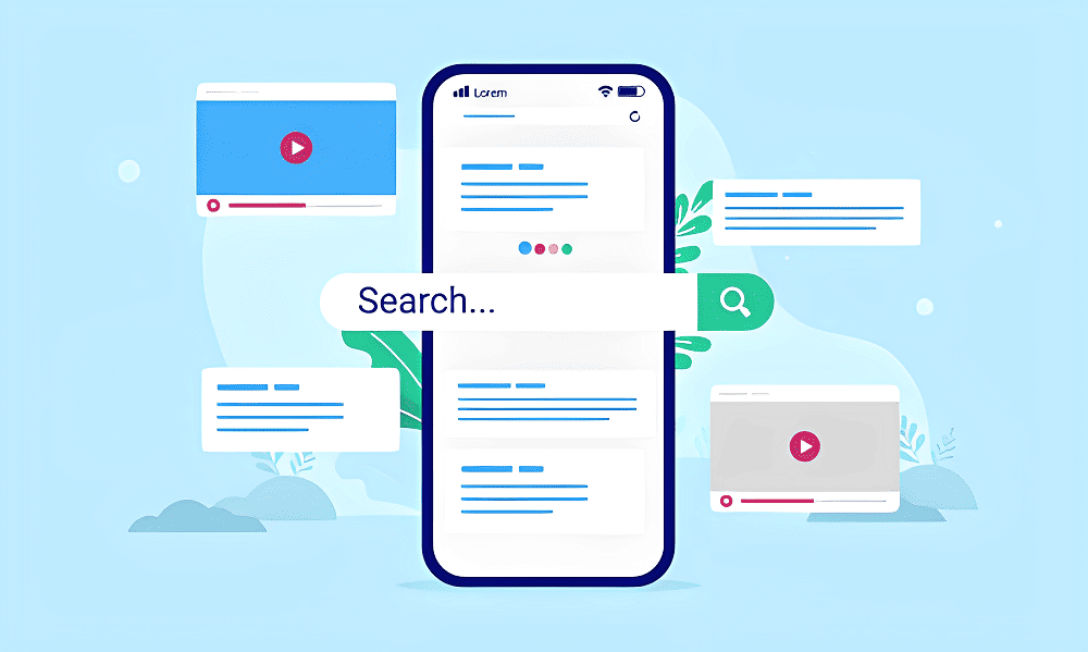
Implement a search function and clear calls to action

Your website should have a search bar on the homepage, as well as clear call to action (CTAs) throughout every page. These CTAs can be buttons like “Contact us” or other text with an obvious purpose, such as “Get a free consultation” or “Schedule your appointment today.” It’s important that these CTAs are easy to find and use so that visitors don’t have trouble navigating your site.

Make sure the search bar and CTAs aren’t just placed somewhere in an obscure corner of each page—they need to be front and centre so they’re easily seen by visitors. Also, make sure they’re not generic; don’t use words like “Contact us” unless they actually direct people specifically where they need to go next!

Suggested Read: Best 10 Medical Website Design Ideas

Tip #4: Keep the website up to date with fresh content

website

Keep the website up to date with fresh content. You should add new blog posts or articles on a regular basis, if possible. Regularly updating your practice areas and attorney bios will also keep your site from looking stale and outdated.

Use analytics tools to track how users interact with your website. Analytics tools like Google Analytics can help you see what kind of traffic comes in from search engines, where they come from (i.e., which keywords they were searching), and how long those visitors stay on your site (among other things). In addition, knowing who visits will help you figure out whether there are any design issues that need fixing or content that needs updating or if there’s something else you could do to increase engagement among this group of potential clients or customers!
Add new blog posts or articles on a regular basis

Adding new blog posts or articles to your website on a regular basis will keep it fresh and relevant for your visitors. To make this task easier, use a content management system that is simple and intuitive, so you can add new content quickly without needing to worry about coding or web design.

In addition to posting articles about the practice area you specialize in (or just general legal advice), also consider adding blog posts related to local community news. This helps build trust with potential clients: if a client visits your law firm’s website and sees that you are an active member of the community, they may feel more comfortable hiring you as their attorney.

Update your practice areas and attorney bios

Update your practice areas and attorney bios. If you’ve been practicing for a while, chances are that your practice areas have changed a bit over time. For example, maybe you started out as a general practitioner but now specialize in cases dealing with intellectual property law. It’s important that this information be represented on your website so potential clients know what services they can expect from your firm.

Tip #5: Test and optimize the website for conversions

website

Testing is the final step in our five-step process to creating an effective law firm website. Testing is the most important part of your website’s design because it determines whether people will actually convert to your site, which means you need to know what works and what doesn’t.

When it comes down to it, testing can be very simple; all you need to do is change some elements of your site and record how each change affects conversions (whether that means clicks or leads). This will allow you to figure out exactly which design elements work best for your audience and what content resonates with them as well as where they click when they visit your page.

Use analytics tools to track how users interact with your website

A website analytics tool allows you to collect data about how your users interact with your website. This data can be used to determine what content is most popular, where users are clicking and leaving from, and more.

Test different design elements to see which ones increase conversions

Testing different design elements is one of the most important steps you can take to ensure that your website is optimized for conversions.

  • Test different calls to action (CTAs).
  • Test different content, headlines, and subheads.
  • Test different images and see what performs best.
  • Test different colours and see which ones convert best for you.

Conclusion

In conclusion, the design of a law firm’s website is a crucial factor in attracting and retaining clients. An effective and professional website can help to establish the credibility and expertise of the firm, and make it easier for potential clients to learn about the services offered and get in touch with the firm.

By following some simple tips, such as clearly communicating your services, including information about your team, making it easy to contact you, using high-quality images, and keeping the design clean and simple, you can create a website that effectively represents your law firm and helps you to attract and retain clients.

For website design for law firm in Toronto Canada contact Tectera who do web design in Toronto.

Having a well-designed website is a must for any insurance agency. In this post, we’ll look at why you should invest in it and some tips to help you create a site that converts visitors into leads and sales.

The importance of having a well-designed insurance agency website cannot be overstated. The website is the first point of contact between your company and potential customers, so it’s important to use this opportunity to your advantage.

The importance of having a well-designed website for an insurance agency

If you’re in the insurance business, then you know how important it is to have a well-designed website. It doesn’t matter if your website looks like it was designed by someone using only their left hand and their feet (it does not actually matter if this happens). You need to have a good user experience that makes sense for your users and converts them into customers.

The role of the website in attracting and converting leads

If you’re a long-time Digital Marketing veteran, you may be surprised to learn that your website is actually the first point of contact with most potential customers.

The average person does very little research before buying insurance; most simply call their agent and ask for a quote. If they do any research at all, it’s usually just enough to get an idea of what kind of coverage they need and how much it’ll cost them.

Tip 1: Use a clean, modern design

website

It’s important to have a clean, modern design that is consistent across the website. This will help customers find what they are looking for easily and make them feel like they can trust your agency.

Use white space to let the content breathe. A lot of times you can use images or video in place of text to create density on the page without sacrificing readability.

Use grids, columns and images as background elements when possible. This helps organize information into digestible chunks that are easy to scan through quickly on mobile devices or desktops alike!

The benefits of a clean, uncluttered design

A clean, uncluttered design is easier to read and navigate. Visitors can focus on the content without being distracted by clutter.

A clean web design is also easier to maintain, which is important for SEO rankings and conversion rates.

Finally, a clean design that isn’t cluttered with unnecessary elements or ads makes it more likely that your site will be mobile-friendly (which Google loves).

How to create a visual hierarchy and balance on the website

Create a grid system. When designing your page layout, ensure that every section is aligned with another section on either side of it, as well as the overall website itself. This will help establish visual balance and hierarchy throughout your site.

Use colour to create a visual hierarchy. Colours are powerful tools for creating a visual hierarchy on a website because they’re universally understood as having different meanings in various contexts (e.g., red means danger or success).

You can use colour alone or with other design elements like images and videos to create a sense of flow throughout your site’s content, which encourages visitors to stay on longer or come back later when they know there will be something important waiting for them at each stage along their journey through your pages before reaching their destination at checkout or contact form submission buttons!

Tip 2: Make it easy for visitors to find what they need

website

To keep visitors on your site longer, you’ll want to make sure they don’t have to sift through a lot of information. Use search and filtering options to help people find what they need quickly.

Your website must also be easy to navigate. If you have more than one page of content, use a navigation bar at the top or bottom of the page so that visitors can quickly find what they want without scrolling around too much on your site.

It is also important to include clear calls-to-action (CTAs) on each page of your site so that people know where they can click next when they are ready to take action.

The importance of clear navigation and clear calls to action

Clear call to action (CTAs) are important because they direct the user’s attention towards the next step in a conversion funnel.

Clear website navigation is important because it helps visitors navigate through your website and find what they want quickly and easily.

How do you create clear CTAs? Use clear language, like “Learn More” or “Get a Quote” instead of “Submit” or “Contact Us.”

How do you create clear navigation? Use words that are easy for people to understand, like “Homepage,” “About Us,” “Quotes & Forms,” etc., rather than something technical like “/about-us/contact-us.”

How to use search and filtering options to help visitors find what they’re looking for

The search and filtering options on your insurance agency website are key to helping visitors find what they want. It’s important that they be easy to use, intuitive, fast and accurate. They also need to provide relevant results—and be helpful.

First things first: Make sure your site has a good search function! The best way for visitors to find what they’re looking for is through the use of clear, specific keywords in their search terms (think “homeowner policies” instead of “insurance coverage”). By making it easier for users to locate relevant content on your site, a powerful search tool will improve conversion rates by reducing the amount of time spent browsing around before finding what they need or give up altogether because there isn’t enough guidance available through navigation menus alone.

Suggested Read: Ecommerce Website Development in Toronto

Tip 3: Optimize for the mobile devices

website

Mobile responsiveness is one of the most important things in an insurance agency’s website. You want visitors to be able to find what they need easily and quickly, regardless of which device they’re using. To ensure this, you’ll need to make sure that the site is responsive on both desktop and mobile devices.

With the rise in popularity of mobile browsing, it’s important that your website looks good on all devices so that customers can easily navigate through their options without any hassle or frustration. This means having high-quality images and text as well as creating a user experience that is easy for users to navigate around on different devices (iPad vs iPhone).

The increasing importance of mobile responsiveness in website design

It’s become increasingly important to make sure that your website is mobile-responsive. Mobile responsiveness is a design concept that ensures your website looks good and functions well across all devices, from desktops to tablets to smartphones.

How does one go about testing for mobile responsiveness? There are a number of easy ways you can do this. Some websites offer free tools for checking a site’s mobile-friendliness by entering its URL; here are some examples:

  • Google Webmaster Tools
  • Yahoo! Site Explorer (for entering the URL)
  • Bing Webmaster Tools (for checking the site on multiple browsers)

How to ensure that the website looks good and functions well on all devices

You want your customers to be able to easily navigate your insurance agency website no matter what device they’re using. Make sure that the site is responsive, meaning it doesn’t look or work differently depending on whether a person is using a desktop computer, tablet, or smartphone.

To ensure that your pages are responsive:

Double-check the responsiveness of each page on all devices before you launch them. If you have any non-responsive elements (like an embedded Google map), then use this tool from Google to check if they’re responsive as well.

Suggested Read: Mobile App Development Company in Toronto

Tip 4: Incorporate social proof and customer testimonials

website

Social proof is a powerful persuasion tool that can be used to build trust and credibility. Social proof is often cited as a strategy for increasing conversions on your website. You might be familiar with some of the ways social proof can be used, such as customer testimonials or reviews. But did you know that social proof can also be used to create a sense of urgency? And did you know that there’s more than one way to use this technique?

The power of social proof in persuading visitors to take action

Social proof is a powerful tool to help convince visitors to take action. It can come in the form of testimonials, reviews or even social media shares. When you showcase social proof on your website, it tells people that others have already done what they are thinking about doing and were happy with the results.

When visitors see a social proof on your site, it reassures them that purchasing from you will be a good decision. The more positive reviews and testimonials you have showing how many people are satisfied with their purchase from your company, the more likely it is for them to convert into customers.

How to use customer testimonials and reviews to build trust and credibility

  • Testimonials and reviews can go a long way to build trust and credibility. They’re also an effective way to showcase your services as a business.
  • Use customer testimonials and reviews on the website to create trust, increase conversion rates and show prospective clients that you’re an industry leader in your field.

Suggested Read: 5 Tips for Designing an Effective Website for Your Law Firm

Tip 5: Test and optimize the website for conversions

website

You have a website, and it’s time to test it. It’s not enough to just have a functional site that looks good and tells the story of your agency. You need to optimize your site for conversions the number of leads (or sales) you get as a result of people visiting your website. This is where A/B testing comes into play.

The importance of A/B testing and conversion rate optimization

A/B testing is a method of measuring the effectiveness of a website or landing page by comparing two separate versions of it. The first version (the control) remains unchanged while the second version (the test) is modified in some way. Conversion rate optimization then uses these results to determine which modifications perform better, allowing you to make informed decisions about how best to improve your website’s user experience.

Techniques for improving the conversion rate of the website

Once you’ve got a solid website design, it’s time to start optimizing. Conversion rate optimization (CRO) is the process of improving your site’s conversion rates through A/B testing, usability testing and other methods. Here are some CRO strategies that can help improve your website’s conversion rate:

  • Testing different landing pages
  • Testing different forms
  • Testing different offers
  • Testing different calls to action (CTA)
  • Testing different headlines
  • Testing different images

Conclusion

There are several benefits to following best practices for designing an insurance agency website that converts visitors into leads or customers. Some of these benefits include:

It can increase conversions, provide a better user experience, increase credibility, have greater reach, and be a cost-effective marketing tool. By following best practices for website design, insurance agencies can effectively showcase their products and services and encourage visitors to take the next step and contact them for more information.

For website design for insurance agency in Toronto Canada contact Tectera for web design in Toronto.

Looking for the best Ecommerce platforms in Canada? eCommerce has been a big part of the retail landscape for quite some time now, and it’s quickly gaining momentum here in Canada too. With eCommerce platforms, you can create your own online store and start selling products online without having to worry about creating your own website from scratch or managing a server.

These Canadian ecommerce platforms are available for purchase with plans ranging from free starter plans to paid professional plans that include more advanced features like analytics tools and inventory management tools.

What is an eCommerce Platform?

An e-commerce platform is a software package that allows you to create and manage your own online store. Unlike traditional websites, e-commerce platforms are specifically designed for selling products online so they have specialized features such as shopping carts and checkout pages.

Unlike a traditional website or store, an e-commerce platform keeps track of the inventory in real-time so that no products can be sold out of stock without warning. This makes it easy for customers who are browsing on different devices because they won’t need to keep visiting back to see if what they want is still available before completing their purchase.

In addition, an eCommerce platform offers several other benefits such as:

  • Creating customized landing pages tailored for specific campaigns or promotions;
  • Full integration with payment gateways like PayPal so that customers don’t even have to leave the page when checking out;

Automatically generate tracking codes for each product so that you can measure conversions at different stages of the sale; Integration with social media channels like Facebook, Twitter, and Pinterest so that customers can easily share their purchases on these networks.

1. Shopify

shopify

Shopify is a popular eCommerce platform in Canada that’s easy to use and offers plenty of features. It also has an excellent customer support team, which is helpful if you’re new to the world of eCommerce. Shopify’s marketing tools are some of the bests around (especially for small businesses), so you’ll be able to promote your store on social media and other channels without any problem.

Despite its popularity, Shopify isn’t perfect it doesn’t have as many themes as some other platforms do (about two dozen are available), but most people will find something they like among them.

Shopify is a great choice for anyone who’s just getting started with eCommerce, but it’s also powerful enough for businesses that are ready to take their operations to the next level.

Suggested Read: How to Start an E-Commerce Business in Canada

2. BigCommerce

bigcommerce

BigCommerce is a leading eCommerce platform. It’s an all-in-one solution that allows you to design and develop your website, create an online store, and manage it from one place. From there, BigCommerce offers support for everything from marketing campaigns to social media optimization.

BigCommerce plans include features like unlimited products and categories along with search engine optimization capabilities while the Advanced package adds inventory management tools as well as additional payment gateways like PayPal Here or Stripe Connect so customers can pay using their phones at the point of sale instead of swiping their cards through a terminal at checkout time (this option also lets them skip entering in personal details).

Meanwhile, Enterprise customers get access to dedicated account management teams along with specialized services such as localized language support depending on where they’re located across North America (US/Canada) or Europe (UK & Ireland).

3. Wix

wix

Wix is a website builder that allows you to create a website without having to learn how to code. It offers a wide range of features, including over 1 million templates and the ability to customize them with your own photos and videos. You can also add text blocks, widgets, and social media integration for free or for a fee depending on how much customization you want.

The drag-and-drop editor makes it easy for anyone to make their own website as it doesn’t require any knowledge of coding languages like HTML or PHP; you just drop your content where you want it on the page using the editor’s intuitive interface.

Wix also integrates with Google Analytics so that you can track visitor data such as traffic sources (where they come from), time spent on each page of your site, etc.; this way you’ll be able to understand what works best for visitors coming across different pages in order to optimize conversion rates as much as possible!

4. WooCommerce

woocommerce

WooCommerce is an eCommerce solution built for WordPress. It’s free and open source, so you can use it as the foundation of your store without having to pay any fees or royalties. The platform is popular among many small businesses because it offers a high level of customization.

With WooCommerce, you can build a wide variety of online stores: from simple storefronts to highly customizable eCommerce websites that sell physical products, digital goods, and services. WooCommerce has some great integrations with other popular plugins (such as MailChimp and Google Analytics) that allow you to easily manage customer information in one centralized location.

5. Squarespace

squarespace

Squarespace is a great platform for eCommerce stores. It’s easy to use and has a great user interface. Squarespace is ideal for small businesses that want to sell products online, but aren’t sure where to start. It’s also good for hobbyists who want an online store but don’t want all the hassle of setting up their own website or managing it themselves.

While Squarespace is a great platform, it doesn’t have all the features that more advanced eCommerce stores need. If you’re looking to sell higher-end products or services, you’ll want to look elsewhere.

Conclusion

E-commerce is a growing industry in Canada, and the number of eCommerce platforms available has increased accordingly. With so many options to choose from, we hope that this list has helped you narrow down your choices and find the best online store platforms in Canada that fits your needs.

To create a ecommerce website in Canada using above platforms contact Tectera for web design in Toronto.

See Also:

Wants to compare WordPress vs Squarespace vs Shopify?

You need to decide what’s best for your project, based on your situation and needs. That’s why we’re here! We’ve created this helpful guide to help you understand the differences between the three platforms, so you can make an informed decision about which one is best for your needs.

Squarespace is the easiest to use.

squarespace

Squarespace is the easiest to use. It’s a great tool for beginners who aren’t comfortable tinkering with code or managing their own plugins. The platform has been doing this for years, and its user interface is intuitive and easy to navigate.

The CMS has one-click updates so you don’t need to worry about installing any new plugins or getting stuck with an outdated version of WordPress Squarespace handles it all for you automatically (and can even auto-generate a backup).

Shopify is the best for e-commerce websites.

shopify

Shopify is a great platform for selling physical or digital products online. It can be used to build an online store, blog, or portfolio site. Shopify has a large community of users and developers who contribute to it daily through their expertise in e-commerce design and development workflows.

Shopify is a hosted SaaS platform, meaning you don’t have to worry about hosting or maintaining the code for your e-commerce store. You can also use it on any device no matter where you are.

WordPress is the most customizable.

wordpress

WordPress is the most customizable and flexible, but it’s not for everyone.

WordPress is one of best CMS platforms is great for developers and designers who want to be able to customize their sites as much as possible. This is because WordPress has a huge marketplace of themes and plugins that you can use to customize your website with. You can also hire a developer or designer to help you further customize your site if necessary!

If you’re looking for something that’s simpler than this heavy-duty customization, then Squarespace might be a better choice for you.

Squarespace is a great option if you’re looking for a simple, easy-to-use website builder. It’s designed for people who just want to get online and start building a presence without having to worry about learning how to code or design. This makes it perfect for bloggers and small businesses who don’t have the time or resources to learn how to build their own websites.

Investigate your options before building your website.

wordpress

Before you decide on a platform, it’s important to understand what your website will be used for. If you are planning to sell products or services online, it’s best to choose a platform that supports e-commerce. Likewise, if you have no intention of selling anything but just want a personal website, then an easy-to-use option is probably better suited.

When selecting a platform, look at the ease of use and flexibility as well as cost. If the company provides good customer service and regular updates for their software, this can also be an important factor when deciding which site builder is right for you.

The best for small, one-time projects

squarespace

Squarespace is the best for small, one-time projects. If you just need a simple website that fits in with your brand and can be updated by anyone on your team, Squarespace is the way to go. It’s also great if you want to focus on other parts of your business instead of building websites.

Shopify is best for e-commerce websites and stores that sell physical products like books or clothes directly from their site (as opposed to linking off to an external merchant).

If you’re looking at creating an e-commerce store as part of your business model, Shopify makes it easy to set up payment gateways options and process orders through one central dashboard which saves time in the long run! But remember: Shopify charges fees when customers purchase goods from within their platform, so factor those costs into any calculations before choosing this option over others described below!

WordPress is most customizable if you have experience coding HTML/CSS yourself; otherwise, we recommend sticking with either Squarespace or Shopify since they’ll save time due to both being easier than learning code as well as having built-in features like shopping carts which make running an online store much simpler!

Decide what your needs are and pick the platform that fits those.

shopify

Now that you know how each platform works, it’s time to pick the one that best fits your needs.

If you’re a beginner: Shopify, Squarespace, and WordPress are all great options for beginners. They all have easy-to-use interfaces with lots of features, so the choice really comes down to personal preference. If you want something with less clutter than WordPress or Squarespace, then Shopify might be the right choice for you.

If you are an expert who needs more control over their website: All three platforms offer themes (the design of your site) that allow users full control over how their site looks and feels through customization options like colors and fonts.

However, if having full control over every element of your digital presence is important to you for example, if this is going to be an eCommerce website then choosing Shopify would be the best option because it gives users more freedom in designing their store compared to other platforms such as WordPress or Squarespace which only allows users limited customization options for themes due its open-source software nature

Conclusion

You should always do your research before starting a website. The three platforms we’ve discussed here are all great options, but they each have their own strengths and weaknesses. If you’re looking for something simple and easy to use, Squarespace may be the way to go.

However, if you need something more powerful with e-commerce capabilities, Shopify could be better suited for your needs.

Finally, if customization is important to you then WordPress is probably your best bet because it offers the most flexibility when building websites although this may come with some downsides like having more work involved in getting started or needing more expertise on hand when managing content updates later on down the road (as well as having access to plugins).

To create a website in WordPress, Squarespace or Shopify in Canada contact Tectera for web design in Toronto.

Scroll to Top

We'd love to hear all about

Who you are and what your needs are!