fbpx
sales@tectera.com
+1 (437) 830-4940)

Tectera

BLOG

Bring your
web ideas to life

Would you like to enhance your social media copywriting abilities? The skills that bring engagement and traffic to your social platforms. Let\’s explore how you can achieve that.

When social media first emerged, it was treated as an entertainment platform but not anymore. With the passage of time, it has taken the role of a business and marketing tool. Now, billions of people use social media, more accurately, 4.88 billion.

You must write compelling social media copy to use social media in your favor. We are exploring 10 social media copywriting best practices in this post that can benefit you.Let’s continue.

Social Media – A Powerful Marketing Tool

4.88 billion people are not using social forums to watch videos or reels; in fact, social media has turned out to be the dominant source of advertising and promotion. Be it Facebook, Instagram, or YouTube, every brand and business launches its campaigns on its social handles.

These social platforms give access to millions of potential buyers and business owners. Only Facebook has more than 2.9M users. Moreover, an individual spends 151 minutes scrolling social media on average. So, how can we ignore the power of social media?

Marketing companies channel social media to connect with consumers, build brand awareness, and drive conversions.You can use social media to show your strengths and stand out from competitors.Social media gives you useful customer information to reach the right people.

It\’s essential to use social media wisely because it can be tricky. One wrong move can make you lose many followers. On the other hand, a strong call to action can make you famous overnight.

What Is Social Media Copywriting?

Social media copywriting is writing text that engages your audience and drives them to take action. You can write a post or show an ad in order to drive the audience to your website.

Using your penmanship, you ask the users to subscribe, sign up, purchase, or follow anything you want. But it\’s not that easy; your message must be persuasive and engaging. Social media copywriting is a skill for a reason because it grabs the attention of users despite the reduced attention span.

The typical attention span has dropped by 30%. People can now concentrate for only about 8.25 seconds. With shorter spans and fierce competition, effective copywriting is paramount.

10 Social Media Copywriting Best Practices

In a digital landscape saturated with information, mastering the art of crafting compelling social media copy can be the key to success.Let\’s dive into these proven strategies for writing impactful social media posts.

1. Define Your Audience

To craft effective social media copy, it\’s essential to first identify your target audience within the vast landscape of social media users. This involves narrowing down the demographics, interests, and behaviors of the individuals most likely to engage with your content and convert into customers.

Once you\’ve identified your target audience and developed buyer personas, the next step is to tailor your social media copy to align with their interests, needs, and pain points. This involves:

  • Creating content that communicates directly with your specific audience.
  • Addressing their challenges and pain points.
  • Ensure your content matches what your audience is interested in and needs.

2. Use A Strong Hook

A hook is the initial sentence or words of any content, including social media copy. It is your responsibility to make the beginnings extra interesting for your audience. So they become glued to the whole post. If they find the starting bland, they will not continue to read. Hence, leaving the page.

There are a few things you can do to grab the initial attention:

  • Ask a question
  • Make a statement
  • Tell a story
  • Use humor
  • Use a statistic
  • Use a quote

3. Clear and Concise Wording

Being clear and concise in your social media copy means using simple language that is easy to understand. It also means avoiding jargon and unnecessary words. You aim to convey your message in as few words as possible without sacrificing clarity.

Here is how to write clear and concise social media copy:

  • Use simple language
  • Avoid using jargon or technical terms
  • Be specific
  • Get to the point quickly
  • Use active voice
  • Use strong verbs
  • Avoid filler words
  • Proofread carefully

For example:
Instead of: \”We offer a wide variety of services to help you with your business.\”
Try: \”We help businesses succeed.\”

4. Use Active Voice

An active voice is a writing technique where the subject of a sentence carries out the action of the verb. It is generally more direct and engaging than passive voice.

In social media copy, it is generally best to use active voice. This is because a busy agent is more likely to grab the reader\’s attention and keep them engaged.

Some tips for using active voice in social media copy are:

  • Put the subject of the sentence before the verb.
  • Use strong action verbs.
  • Use pronouns like \”you\” and \”we.\”

For example:

Instead of: \”The problem was solved.\”
Try: \”I solved the problem in just 10 minutes!\”

5. PAS (Problem, Agitate, Solve)

PAS stands for Problem, Agitate, and Solution. It is a copywriting framework that can be used to write persuasive and engaging social media copy.

The PAS framework works by first identifying the problem that your audience is facing. Then, you agitate the problem by showing how it is causing them pain or frustration. Finally, you solve the problem by offering your product or service as the solution.

For example:

Problem: Are you tired of feeling stressed and overwhelmed?

Agitate: Stress is the cause of many lethal physical and mental problems like depression and headaches, resulting in lower productivity.

Solution: Our latest stress management application is your ultimate life-saver, providing you with the solution for stress reduction. Get personalized advice and exercise relaxation techniques to improve your well-being.

6. Use Visuals

Visuals prove to be very influential in social media copywriting, especially if you are using Instagram and TikTok. Visuals break the monotony of text, break up the post into smaller parts, and make it more interesting. Moreover, visuals improve readability and grab attention quickly.

Benefits of using visuals in social media copy:

  • They grab attention
  • They improve comprehension
  • They increase engagement
  • They boost brand recall

Here are some tips for using visuals in social media copy:

  • Choose the right visuals
  • Keep it simple
  • Use high-quality visuals
  • Optimize your visuals for social media
  • Use a call to action

For example:

Use images or pictures to demonstrate your points: If you are promoting your book, post a picture of an engaging page so the audience gets a glimpse of the inside. This way, they will be intrigued to read more.

7. Use Emotions

The best way to connect to your audience is to use emotion and humor in your copy. Your copy should sound human, not robotic instructions. Give it a personal touch, share a memory, crack a joke, or ask your reader’s opinion.

Human beings connect strongly to emotions, especially humor. Use genuine and authentic emotion to get connected and evoke a beneficial response. Do not fake it or overdo emotion.

Some tips for using emotion in your social media copy:

  • Know your audience
  • Be authentic
  • Be relevant
  • Use sparingly

For example:

Use a personal anecdote: A personal story can help to make your copy more relatable and emotional.

8. Always Use A CTA

A call to action (CTA) is a statement that tells your audience what you want them to do. It\’s essential for every social media copy since it aids in accomplishing your marketing objectives.

A strong CTA helps:

  • Increase engagement
  • Drive traffic
  • Boost conversions
  • Build relationships

Reading your social media post might confuse the audience about the next step. Tell them exactly what to do next by providing a clear CTA. You ask them to subscribe to your channel, buy your book, or follow them on Instagram.

A strong CTA should be:

  • Clear and concise
  • Use action verbs
  • Make it specific
  • Place it prominently
  • Test and optimize

9. Be Findable

How will you reach your target segment if they cannot find you on social media? The goal is to be visible. For visibility, you can do a few things:

  • Use hashtags
  • Use keywords
  • Post regularly
  • Engage with your audience

Hashtags are an efficient way to find a post, product, or person. Utilize hashtags, but very carefully, as they can be very competitive. Likewise, long-tail hashtags are more specific if you are targeting a niche market.

Use keywords in your social copy so if a person searches that keyword, your social link pops up.

10. Tailored Content

Every platform possesses its distinct audience and culture, so you must create content tailored to each forum. Not only the audience but the format and word count also varies among these forums.

Millennials use Facebook primarily for long-form content. Posting content on Facebook that targets Gen Z is not a savvy choice.

Moreover, Instagram is made to post photos; if you post long messages there, no one will bother reading them.
Hence, carefully craft your content strategy for every platform.It\’s important to remember that there is no one-size-fits-all approach to social media marketing.

We discussed 10 social media copywriting best practices to assist you in crafting captivating and efficient content that drives results. Implementing these suggestions can enhance your social media presence and connect with your audience meaningfully.

Looking for social media marketing? Contact Tectera which is a social media marketing agency in Toronto.

Looking for travel agency website design ideas? Check these best 10 travel agency website design ideas.

A Website is the most successful way to digitally show off any business. Since most of the people are now connected with the network, this is the best way to get connected with them. A great and attractive website is helpful in both ways.

If you’re looking for a design to launch a new travel website to market your services and to attract tourists, these designs might help you to create a perfect website according to your needs.

Travel Agency Website Design Idea 1

\"Travel

This website emphasizes the ‘less is more’ theory. The homepage here is quite simple and clean. Only the essential components are displayed here.

A highlighted strapline provides information on what the website is all about. The matching picture behind elevates the meaning more. The search function is very clever and user friendly website.

Giving an additional search bar to directly search the destination details is also a nice feature. If someone wants to search for things right away, this will help.

Suggested Read: Best 10 Website Design Ideas For Restaurants

Travel Agency Website Design Idea 2

\"Travel

This website is created by aiming to match flights and other travel methods for people. The full screen backdrop image makes it so attractive. It’s kept very simple as well.

The search engine is designed to specifically search for a particular date, place and travel method. This simply filters the search and makes it more accurate.

The search tabs are clear and therefore, it is easy to use by even the people who have vision problems.

Travel Agency Website Design Idea 3

\"Travel

The website has made it exactly to look like an official looking tourism website.

This is a flawless website from top to bottom. The website is curated with stunning photographs to make it look modern.

The format of the website is simple and it has categorized the services under different tabs to make the work easy.

Travel Agency Website Design Idea 4

\"Travel

Here, everything is well balanced. The layout doesn’t overwhelm any of the visitors. It has only the information that is most needed.

Visitors have the option of making a filtered search as soon as they walk into the website. There are several other menu items as well. But everything is made as an easy to navigate system.

All the information is well organized in tabs. And for a visitor who has the aim of directly looking for information about destinations, this helps to solve it at once.

Travel Agency Website Design Idea 5

\"Travel

This website is primarily focused to cater for travelers who want to compare between different countries and book trips accordingly.

The most attractive feature of this layout is the listing of most popular destinations overlaid with beautiful photographs. This is one of the clever techniques anyone could use to attract customers.

The information in tabs are also well organized and only the most searched and interested information is displayed.

Travel Agency Website Design Idea 6

\"Travel

Using the white, big text here is so far a brilliant idea. White is attractive. It can catch every eye when there’s nothing else so bright around.

And the full screen photograph behind with a greyscale adds up a full meaning to the whole website. People are attracted twice here: by the white letters and the full screen background image.

Adding up a call to action ‘book your travel’ makes any visitor want to click it. The information tabs are very small and contain only the most important information. This makes the screen look less complicated and soothing. 

Travel Agency Website Design Idea 7

\"Travel

This website is exceptionally comprehensive. It features different types of searching filters as well as the details about the website.

But the good thing is that everything here is easily accessible with the big search bars. The site is designed to provide information about very distinct categories making sure that visitors would find immediately what they are looking for.

The straightforward website navigation bars make everything look easy. This design will probably make sure that the website doesn’t miss any of their customers.

Travel Agency Website Design Idea 8

\"Travel

Using white is really attractive and it makes the website look less complicated and clean.

If there’s any best color that could be used to make things pop up on a white background, it’s black. Highlighted words with the concept of the website will let anyone who enters the website know what this website exactly does.

And apart from using only pictures, going for a little bit of illustration is also unique. This adds some personality to the website and makes it look fun too!

Balancing picture displays are also a good add up to the website as people will also get a pictorial idea of the website’s goal.

Travel Agency Website Design Idea 9

\"Travel

Suggesting different travel ideas on the same page is a good way to attract more people. A site has to look clean and easy to use. Labeling the locations gives more on the process of decision making.

Instead of centering the text and making the background pictures bold, vignetting the corners of a picture and bringing the text to a corner also makes it pop up quickly and also balances the page well. This also views the picture behind clearly. Using white text is actually a great way to emphasize the point of the website.

Travel Agency Website Design Idea 10

\"Travel

Photos can do a major work when it comes to building more audience and visitors. And the wordings that are used to highlight the page also matter.

Here, the first words are highlighted more on the purpose of the website and the name kf the website is added as well. This puts the idea of ‘use this website to book’ into to the visitors head. And right down below, the specific search bar makes it more convenient for them to use the website more.

This is a brilliant way of keeping visitors engaged in the website. By pinpointing and targeting what people are actually looking for, any website could become successful.

Using appropriate images that are not so complicated and clear even at the bold background takes the eyes first to the wordings.

Final Thoughts

There is no actual template that can be recommended as it will work well for a travel website.

There are a variety of designs and approaches. It has to be chosen according to the target audience and the goals of the company.

Just make sure that everything is simple and provides easy navigation. Use pictures, but make sure they download faster.

Above all, look what your competitors are into and what are the new trends. And finally, come up with your own unique way.

To get more travel agency website design ideas contact Tectera who provides web design in Toronto.

See Also:

Looking for SSL certificates guide? Here is a complete guide.

Have you ever noticed that the website addresses, which are also known as URLs (uniform resource locators) start with https:// sometimes?. The most common way that a URL will begin is http://. It’s curious why some URLs are having an extra ‘s’ isn’t it?.

What does this ‘s’ really mean?. Well simply saying, the ‘s’ stands for security. This means that your connection to the particular website is encrypted and safe. Anything that you share with this website is secured and nothing is to worry about.

The ‘s’ however has a longer meaning and a description. It stands for SSL. So let’s talk about SSL and why it is so important.

What is an SSL certificate?

SSL stands for ‘secure sockets layer’. This is also known as TLS (transport layer security) in common. It is a security method that will establish an encryption between a server and a browser. This linking makes sure that the data including sensitive information that has been transferred between these two destinations remains private and safe.

How do SSL certificates work?

SSL technology makes use of random numbers called ‘keys’. This is inspired from the public key cryptography concept. There are two different keys where one serves as a private key while the other serves as public.

When a browser tries to connect to a website that is secured with SSL, the browser requests the server to identify itself. The web server then sends out a copy of the SSL certificate to the browser.

The browser checks if the SSL is genuine and trustworthy. If everything is alright, it sends a message to the web server. The server again sends back an acknowledgement that is digitally signed, in order to start an SSL session that is encrypted.

Finally the session will begin and the encrypted data is shared by the browser and the server.

Why do you need an SSL certificates?

There are several benefits of using an SSL certificate in order to prevent the exposure of sensitive data.

Helps ensuring website security

When we come across a website that says it is not secure, we close it right away. This is because everyone is concerned about their security. With an SSL certificate, it is possible to prevent any security breach. It provides a secondary authentication that helps to secure all the information sent. None of these will be accessible from a difficult device.

Enhances the ranking of search engine of a website

In order to make sure that users are able to experience safe browsing, Google improves the search engine rankings for the websites by using SSL certificates. https:// will be used as an indicator for ranking.

The website will be trustworthy among users

Whether you are having an e-commerce website or not, SSL certificate is mandatory. No one will enter a website that says it’s not safe.

Even the customers don’t want to buy from you if your website is not secured. So it is better to show all the users that you care about privacy and security. And the best way to emphasize it is using an SSL certificate.

Improve the speed of website

By installing an SSL certificate, the website will load quickly and it even improves the performance of the website. This also increases the SEO and helps the website grow.

Encrypting sensitive information

With an SSL certificate, it is possible to encrypt all the information that is sensitive. This can be anything including passwords, bank details, personal information, telephone numbers, addresses, ID information etc. This prevents the breaching of these data and keeps all the information protected.

Types of SSL certificates

Single domain SSL certificate

This certificate applies to a single domain. It cannot be used to authenticate a different domain. Every page on the domain will be secure with this certificate.

Wildcard SSL certificate

This is to secure a single domain and all of its sub domains. Sub domains belong to the main domain and stay as a branch of it. Users are able to check the subdomains list that belongs to a main domain by clicking the padlock icon located at the URL bar.

Multi domain SSL certificate

This certificate can enlist multiple domains within a single certificate. All these domains should not be sub domains.

How to obtain an SSL certificate?

 Here’s a simple explanation on how to acquire an SSL certificate,

  1. Have all the correct information of the website such as a unique IP address, WHOIS record that is accurate, and a validation of the business or the organization.
  1. Based on the website type and structure, decide what type of an SSL certificate is needed.
  1. Choose a certificate authority that acts as an entity in issuing SSL certificates. Pick a trusted and a reputable CA that can provide a certificate according to the needs and the budget.
  1. Generate a CSR (certificate signing request) which is a file that needs to be in the web server before requesting an SSL from a CA. They will use this information to issue an SSL.
  1. After generating the CSR, submit it to the CA that is selected. And then purchase the SSL certificate.
  1. Wait for the CA to validate the details and issue the SSL certificate.
  1. Once the CA has processed the request of an SSL certificate, you will be given access to it. Then it can be installed to the web server where the website is hosted.
  1. Since now the SSL certificate is installed, the testing should be done by using SSL verification tools. Also create a schedule to monitor the SSL certificate activation.

The wrap up

 SSL certificates help to enhance the security of any website. In order to build up trust among customers and visitors and to keep them coming to your website, installation of an SSL would be greatly helpful.

This will also help you in many other ways by improving the SEO of the website and competing with other websites that are already established.

So make your website a reputed and a loyal place with secure socket layer certification.

Wants to add SSL certificate to your website? Contact Tectera who provides web design in Toronto.

Advance the content marketing strategy in order to gain leads and bring out more conversations in order to turn visitors into loyal customers with a simple and easy way: call to action (CTA).

What is a call to action?

A call to action or a CTA is a piece of wording that will induce a viewer to perform any kind of an action in order to engage more with a brand or a site.

The websites that are engaged in e-commerce usually put this into use in the form of buttons or hyperlinked phrases in order to encourage their buyers to buy a product. This is one of the key elements that a website can put to use in order to interact with users and to effectively attract them for purchases.

The main goal of a CTA is to use a small sentence to push the viewer to perform a specific action. These can also create a sense of an urgency which is also proven to increase the conversion rates effectively.

CTAs can be utilized in social media as well as in email marketing campaigns, paid advertisements, blog posts and even on landing pages.

It is becoming one of the most used and a common type of a marketing strategy in the business world.

Why is CTA important? 

CTA can make a huge impact on guiding and improvising the visitors and users to perform certain actions. This will directly affect conversion rates and SEO.

When simple and direct statements are used, it conveys the viewer to perform actions. It makes the direction clear for them. This also helps the viewer to understand and clarify things on what to do and where to go.

Every piece that is used for marketing, whether it’s a content piece or a post, CTA makes it more powerful by increasing the audience. This will alternatively affect sales increases as well.

If the CTA is crystal clear, the viewers won’t doubt what all the content says. This will help in building interest and excitement and will keep everyone encouraged to look more into the website.

Placing CTAs on different pages of the website can increase the conversion rates by improving the performance. These will make it easier to locate the products and the services of a website. The usage of the site will increase while gaining more loyal customers.

People tend to rely on CTAs these days as it’s easy to find things that they need. This will benefit both parties.

Best call to action phrases 

CTA can be of many different types. And here are some of the best and trendy types of CTAs that any type of website can use.

  • Direct CTA

This can be used if the customers or viewers need to be directly pushed into something. This can be either a product or a service.

  • Shop now
  • Add to cart
  • Buy now

These are some of the direct CTAs.

  • ‘Free’ based CTA

You can highlight a free offering to users by utilizing these CTAs. Some of the examples are,

  • Watch for free
  • Download for free
  • Free trial
  • Invitation CTA

CTAs sometimes can be an invitation for something. This type is usually used in social media or blogs. Users will be out of curiosity and they want to explore things further.

  • Find more
  • Check this out
  • Learn more
  • Read more

Are some of the examples for this category.

  • Registering CTA

This type is common in ecommerce websites and social media platforms. It encourages the users to start using something by getting registered or creating an account. CTAs such as,

  • Sign up
  • Join us now
  • Create your account

Can be under this category.

  • Email CTA

This is important when it comes to email marketing. These CTAs are important in collecting emails. Users on the other hand can be given discounts or something free for giving the details.

  • Subscribe
  • Download
  • Sign up

These are some of the email CTAs that can be used.

Components of a compelling call to action

 There are a lot of tips on how to create effective CTS. And a few best practices will help out in creating them.

  • Clarity

A CTA that is compelling should be easy and clear to understand. Using the simplest language would be helpful in this scenario.

  • Urgency 

Give a reason for the viewers to take action at once. Use attractive words to create a sense of urgency.

  • Specificity 

Be specific on what you are expecting from the viewers. It will explain them well based on your expectations.

  • Value proposition 

Give a reason for the audience in order to take action. Explain everything that they will receive and how it will be valuable for them.

  • Trustworthiness 

Build up trust with the audience by using things like feedback, reviews and testimonials from trusted sources.

  • Accessibility 

Use a clear button with a vibrant color or a very clear link that will be easy to find and click. This will make it easy for them to take action.

  • Personalization 

Customize the CTA according to the target audience. Use language that will align with them. Address specific points that will emphasize their interests and needs.

  • Visual appeal 

Use elements such as colors, fonts and images to make the CTA stand out and grab the attention of the audience.

  • Convenience 

Make it easy for the audience to take desired action by reducing barriers and simplifying the process. Also make sure the number of steps are reduced.

  • Emotional appeal 

Use language that is emotional which will appeal to the desires, fears and aspirations for the audience.

  • Relevance 

Make sure that the CTAs are relevant to the needs and interests of the audience. And also know which type of viewers that you’re targeting for.

  • Test and optimize 

Testing various CTAs to check which ones will work the best and use optimization techniques in order to improve them.

CTAs have now become an essential for driving customers to take action in marketing campaigns and websites.

So it is crucial to know and learn about the  CTAs well and choose the  best ones that will be effective.

As they help out a business or an ecommerce website in many ways, it needs to be wisely thought out in order to get the best out of it.

Wants to improve Call To Action? Contact Tectera who provides web design in Toronto.

See Also:

Looking for website design ideas for School? Check below best 10 ideas.

In the digital age, school websites are like having a lively stage that shows what they stand for, its successes and how it teaches. Making a school website is not just about its look and feel, it’s about how you can create a good website that incorporates good website design functionalities ans still keep the community involved.

This guide shares ten cool ideas for school website designs. It explains how to use good web design tricks without losing quality and clear communication. 

Let’s see what makes a good website and look at some great examples that use these ideas in their designs!

Responsive Design

Responsive design means making a website work and look good on all kinds of screens and devices. This includes not just pictures and words, but also things like animations, videos, and interactive stuff. 

Here are some great website examples that incorporate responsive design into their websites.

website design ideas for school

The school website is a great example of a design that works well on different devices. It uses moving elements that follow your mouse when you move it. This makes the website fun to use and keeps you interested in what’s on it. It doesn’t matter if you’re on a big computer or a small phone, the website looks good and works the same.

website design ideas for school

Another good example of a website that is responsive is above. It’s designed to keep you interested while you use it. Also, the website loads really fast, so you don’t have to wait. This is important because it makes sure you don’t get bored waiting for things to show up. Above school website shows how a website can be both fun and work well, no matter if you’re on a computer or a phone.

Clear Use Of White Space

Using negative space in a smart way makes it easier to read and focus. A good website leaves enough empty space around their pictures and short descriptions to be noticed well. This helps those things catch the eye and get the attention of people who are interested in the school.

Now, let’s check out some examples.

website design ideas for school

This website shows how to use empty space in a smart way. It lets the different parts of the page have their own space, so you can see and understand everything easily. The website looks clean, and it makes sure you notice the important stuff.

website design ideas for school

This website is another good example of using empty space well. It doesn’t crowd the page with too many things. Instead, it gives each thing its own space to breathe. This makes the website look neat and organised, even if there’s a lot of information.

Visual Appeal

How things look is really important in catching people’s eye and showing what a brand is like. When you’re making a website, you have to be careful about this because if it doesn’t look nice, people might leave quickly. The goal is to want to keep the visitors on your website long enough to tell them what you want to say!

Here are some examples visually appealing websites:

website design ideas for school

When you go to a website, how it looks is the first thing you notice. If it looks good, you’ll want to see more and check out what’s there. This website does a great job of making a good first impression. But, a good design also makes sure it’s easy to use and looks nice at the same time. This website gets that balance right.

website design ideas for school

Having all the important stuff visible at once can increase the value of the website. People like being able to quickly see what they need without feeling confused. This is about making things easy to find and understand. The way a website looks also helps you recognize a brand. This website is a good example that maintains the brand identity as well. 

User-Centred Design

When it comes to school websites, we want to make sure they are easy and helpful for students, parents, and teachers. That’s why we have to focus on designing them with the user in mind! 

Let’s take a look at some examples of school websites that are designed with the user in mind:

website design ideas for school

This website is a great example of thinking about what users want. Everything on the website, like how it’s set up and how you can interact with it, is made with users in mind. When you use this website, it feels like it knows what you want and helps you find it. The important stuff is easy to find.

website design ideas for school

This website is an excellent example. It’s designed to assist parents and students providing information about prices and the staff. This showcases how a website can be helpful when it’s created with users in focus. It’s about ensuring that everyone can easily find what they’re looking for and enjoy their experience.

Clear Navigation

Well-structured website navigation is akin to a road map guiding visitors through the website’s offerings. 

Let’s take a look at some examples:

website design ideas for school

This website is a great example of easy navigation. They’ve organised everything in a smart way so that you can find things easily. It’s like putting similar things together, such as having a section for “courses,” another for “events,” and even a “blogs” section. They also have a search bar that lets you find anything quickly. It’s like having a shortcut to what you’re looking for.

website design ideas for school

This website is a perfect example of how to make moving around really clear. It’s designed so that you don’t get lost. They have a menu with different sections like “About Us,” “Programs,” “Calendar,” and “News.” It’s like having signs that show you the way. This makes using the website much better for everyone.

Conclusion 

In this guide, we explored 10 website design ideas for School and learned how to make a great school website while keeping quality communication. 

Now, you can use these ideas for your own school website.

Contact Tectera who provides web design in Toronto to develop school website.

See Also:

With most of the people now accessing the internet using mobile phones and it has become a part of the day to day life, websites should focus on providing a better mobile-friendly experience.

Here are some key techniques and tips to design a mobile-friendly website to make sure that you’re doing it right.

What is ‘Mobile Friendly’?

The meaning of mobile friendly stands for the ability to perform well on devices like mobile phones or tablets.

Here, the regular website shrinks into a smaller version that fits into the display of small devices. This is the same website with the same features. Just the tiny version with all the functions. 

The experience might be a little reduced than the desktop version but it is simple and viewable.

Mobile-friendly sites have features like,

  • Speed page loading 
  • Readable text without zooming 
  • Contents fit to the screen without sideway scrolls 
  • Easily clickable buttons

Why it is important

As more of the viewers check websites on mobile devices, it is important to give them a positive experience.

These types of websites boost sales due to the easy to use interface. People like to interact with hassle free websites that will allow them to engage with the brand completely.

This easy accessibility will create more customers while keeping them for a long term.

Anyone likes to have brands that they can access anytime they want. And the trust has to be built that the website is reliable and credible to use.

A mobile-friendly website can be helpful in building trust between the customers and the business. The innovation, upgrades, offers and adaptivity have to exceed the expectations of the customers so that the loyal customer base as well as the newcomers will be impressed with the brand.

Mobile-friendly websites also increase sales and conversions. The seamless mobile experience is an important point in digitized marketplaces.

These websites also increase the google rankings. Google’s ranking gives priority to the mobile-friendly websites. The speed of downloading, easiness of using, and the content contribute to the ranking of a website. So if you need to keep the SEO ranking high, a mobile-friendly website is a must.

Tips To Create a Mobile Friendly Website

The Responsive Layout Of A Mobile-friendly Website

The design of a mobile-friendly website should make sure that the content of the website and the user interface are well optimized to be used in almost all the devices available. This is known as the responsive layout.

Here, the settings of the website are automated to get adjusted according to the device it’s being viewed. This allows the user to comfortably access and look into the website.

The responsive layout should have some key features for its success.

Scalable images- images adjusted automatically according to the dimensions of the viewing screen. This provides a high end experience.

Easy to navigate menu- an intuitive, easy menu is important and useful for touch screen devices.

Grid system- a flexible grid system enables the content to arrange in columns based on the screen size.

Quick loading- quick and efficient loading of websites are also important.

Call to action- having a direct and a clear call to action button is important to promote the engagement of the users.

Avoiding Pop Ups

Avoiding pop ups in a mobile friendly website is essential as it can interfere with the experience of the users.

Pop ups are specially designed to be displayed in desktop sized screens. These are sometimes not so responsive to the mobile screens. This will be challenging for the user to interact with the website without having trouble.

The pop ups block the content that users are focused on. It will be difficult to watch. This will result in impaired website usability.

Google will subject a penalty on websites that will block the content and obstruct the view with pop ups. This will negatively impact the website’s SEO.

People will bounce from websites where pop ups will appear and become annoyed. This will increase the bounce rate.

Users get frustrated when the interest is interfered. Therefore, avoiding pop ups can help in saving the viewer as well as negatively impacting the above features.

Decluttering The Web Design

Decluttering the web design helps to improve the user experience. There are some areas to focus and develop in this process.

Using a simplified and straightforward menu without many tabs will let the users find things easily.

Create a clean and an uncluttered layout that has a white color background. Avoid using too many colors, textures or patterns.

Using large and easy to read fonts will make the users read the contents comfortably.

Use low resolution pictures and optimize them to reduce the time of page loading. Remove anything that does not add value to the website and make sure it contains only the important contents.

To give users a seamless experience, keep consistency throughout the entire website. Make sure the website is optimized for various devices and use the same design, branding, and layout for all pages.

Avoiding flash

Flash is not compatible with some devices and browsers. This will result in a poor user experience if the website heavily requires flash.

Flash can also slow down the pages sometimes that will affect the mobile users significantly.

The content that uses flash is not accessible for the visually impaired people. This will negatively affect the website.

Flash also comes with security issues that will sometimes compromise the personal information of the users and other sensitive data.

There are other options and alternatives which are safe and optimized that can be used instead of relying on flash.

Optimize Website Speed

For a seamless user experience, optimized website speed is crucial. Here are some tips that can be used to do it.

Reduce and compress the images without compromising the quality. Use appropriate images formats.

Minimize the HTTP requests by combining javascript and CSS into a single file. This will decrease the page loading time.

Remove any unnecessary codes and reduce the number of codes per page that will prevent the slowdown of the website.

Allow browser caching to store information. This will avoid the content reloading when the users visit again.

Use a content delivery network (CDN) to distribute the content of the website across many servers around the world. This will help to reduce the server response time.

Compress Images

Specific softwares are available to help out on this task. These help to compress images without lowering the quality.

Using the correct format to upload can also be helpful in compressing images.

The images can also be resized before uploading. This will reduce the size of the file while improving the speed of the website.

There are applications such as Adobe Photoshop which can be very helpful.

Change Button Size And Placement

Buttons should be larger in size so that they are visible and clear. It should also be able to easily tap.

In order to save the customer base, offer them a variety of payments. The preference of payments differs from one person to another. Therefore consider the most common payment methods and add them up in order to give the customers a secured and a seamless payment experience.

Make the payment process as simple as possible. Refrain from asking customers to fill in forms with a lot of information. Try using auto fill forms in order to make the work easy for both parties.

Large and Readable Font

The readability and the user experience can be enhanced by using large fonts which are readable on a mobile phone or a small device.

It is recommended to use 16 pixels for the body texts and large fonts for other boxes.

 To prioritize significant pieces on the page, use typographic hierarchy.

Choose The Better Colors

A big difference in a mobile-friendly website can be made through the visual appeal of it.

A good color scheme which can give an aesthetic feeling throughout the website, that can please the customers.

Use high contrasting colors to improve the text reading. Limit the colors to reduce visual disturbances. This will help the viewers to focus on the important parts.

Use bold and bright colors to highlight the key factors such as call to action (CTAs). Don’t use this method too much since it will impact the overall effectiveness of the website.

Always test the colors with the fonts, different screen sizes, and light conditions. This is the most important part as this varies from device to device.

Be mindful about different cultures as the colors sometimes have a large impact on different cultures. Therefore the color combinations that are being used have to be appropriate.

Creating a mobile-friendly website is so important in the modernized world. It requires paying attention to all the details. By focusing on all of the above steps and using the given tips, it can be ensured that the website is optimized for all types of devices.

The website will then be able to cater any of the needs of the users and improve the whole experience. 

Contact Tectera who provides web design in Toronto to develop mobile friendly website.

Looking for best CMS platforms?

Any of the successful businesses need to stay connected with the world in order to reach more customers. But not everyone who does business is an expert on how to keep on reaching out to people by using the internet.

This is where a content management system (CMS) comes to play. Keep on reading if you really want to know what it is and what are so far the best 7 CMS platforms that you can use to elevate your business and what you need to consider before choosing one.

What is a CMS?

A CMS is a software that helps people who are doing business and don’t have any technical knowledge to create a website and to manage or modify the content. The CMS will handle the entire infrastructure of your website and you can decide on what should be displayed there.

What to consider before choosing a CMS platform?

Before choosing any CMS platform, the first thing that you have to do is thinking and listing down what are the outcomes that you are expecting to achieve through it. This way, you will be able to choose the right platform that will fulfill all your requirements.  

Your goal might be optimizing your content on search, selling more products or attracting more fans for your blog. No matter what your goal is, be cautious on selecting the right platform, not the most popular one. Here are some main points for you to focus on while looking for the best CMS.

  • Your budget
  • The specific content and process that need the support of CMS
  • Type of other softwares that should be integrated with CMS
  • Easiness of editing 
  • Number of people who will handle the CMS 
  • SEO friendliness 
  • The built on technology of CMS
  • Security measures 

These are some of the points that you should think of before deciding which CMS to choose.

But are you still confused on what are the best ones to choose from?. Well each and every CMS is unique in their own way. And it depends on what functionalities you are finding that are important. 

Let’s talk about some of the best CMS platforms.

1. WordPress

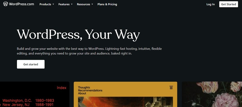
Wordpress

WordPress is a leading open source CMS platform which is free. It is known to be covering around 43% of all websites.

It is very flexible and versatile. It lets you build any kind of website from an online store to a membership site.

To use wordpress, you don’t need to have knowledge on coding. Instead, it allows you to create pages with their themes, plugins and other extras.

The users only have to pay for the domain and web hosting. Everything else is free!. The installation and updating process are also very easy. And there’s no need of having any programming knowledge to handle it. It is also easy to create custom designs and add on any plugins of your choice. The huge community around WordPress is helpful as there are so many support forums that will give quick solutions if any problem is encountered. 

If you’re in need to create a blog or to post tutorials and attract fans, this is so far one of the best CMSs. 

2. Joomla

Joomla

This is also another open source platform that is available for free. Again if you are not familiar with advanced softwares or coding, this will suit you. 

This CMS uses a WYSIWYG editor that allows the user to manipulate the document layout directly without having a command.

Joomla is compatible with all types of browsers and it ensures the safety of data. The extension directory hosts over thousands of plugins and other extensions. 

It is not SEO friendly and the platform is a bit heavy compared to other CMSs. 

3. Drupal

Drupal

Drupal is particularly famous as an enterprise level CMS. It is the system that is used by most of the leading brands such as Nestlè, Bayer, Citibank and Tesla. This is also an open source system written in PHP language. Since it’s open sourced, any user can do modifications according to their needs.

This system has many exciting features such as drag-and-drop layout builder. And it’s easy to integrate with other complementary tools. The platform also has unlimited text and media content which are highly customizable. 

It is 100% mobile friendly and ensures the content will be optimized for mobile users. Another strength of Drupal is its largest open source communities. It is one of the best tools to learn and to make connections all over the world. 

4. Wix

wix

Wix is another big CMS among people. It is well known for its outstanding performance and maintenance. It lets you build, update or design your websites without having the knowledge of coding.

The drag-and-drop editor is one of the main features that allows customization of layout, fonts, images or widgets easily. There are hundreds of themes to choose from and there’s a preview option to look at the edits before you add them permanently. 

Wiz has its own SEO tools which are helpful in optimizing websites and increasing organic traffic through search engines. It gives a step wise guidance to gather keywords and to improve the visibility of sites. 

The media manager of Wix lets you add images or store them in one place. All your visual appeals can be handled here. It also supports cloud storage and other media hosting services.

If you run into any problems or have any inquiries, Wix CMS provides you with a dependable and helpful customer care system. You can get in touch with the support staff by phone, email, or chat, or you can visit the help center to get tutorials, videos, and articles on a variety of subjects. Joining the Wix community will allow you to communicate with other Wix users, exchange advice, and receive feedback.

5. Magento

Magento

Magento CMS was initially credited on ecommerce needs. But it gradually improved to publish contents as well. It has limitless opportunities to improve businesses online. 

Magento stands high on the list of best ecommerce CMS platforms as it is available in multiple languages and can transact in different currencies. With this CMS, complex pages with rich content can be created. 

It is adhered to Adobe and therefore, it’s reliable with the work of certified developers. The interface is engaging and it gives high value content. You can regularly update and refresh the content on your own. 

It also has in-built SEO features ready to use. This includes automated meta descriptions, seo friendly URLs, hashtags, sitemaps etc. The site performs better with fast searching and short times of page loading. 

The page builder that comes with Magento is a content tool that allows you to do variations on elements , media, content and the page layout. You can either create newest pages or else update, edit and change the existing pages. 

6. Shopify

Shopify

Shopify is an ecommerce CMS platform that allows you to set up online stores for a monthly fee. It is a cloud based platform that allows businesses to set up and manage online stores without technical knowledge. 

It gives the facility of hosting every single type of data on the cloud. It doesn’t require any other software to be installed additionally. It will take care of running the store, updating, payment gateway handling, and security. 

If you’re looking for a CMS for your online business, Shopify is a great choice. A closer examination of the features offered to consumers might help them maintain their position as one of the best CMS choices available.

7. Hubspot

Hubspot

If you are a marketer and focused on creating engaging websites to drag more customers, Hubspot is the best CMS for you. It’s an all in one platform that provides everything on one single platform. While you design your own website, Hubspot gives you the ability to create landing pages, run email marketing campaigns, and to even handle and keep on track with all the social media platforms. 

A number of advantages come with using HubSpot CMS to build your website, including easy marketing tool integration, a user-friendly platform for creating and managing content, extensive personalisation features, streamlined analytics and reporting, and integrated search engine optimization.

Hubspot doesn’t have any plugins. The server and the security are directly managed by the team. And the team is on to help you out even before you build your website. They will advise on best practices and newest web design trends. They will scan the weekly performance and progress and let you know what needs to be changed. So basically, they help you during the entire process. How cool is that?.

Additionally, it costs less while offering better security and insights than conventional CMS platforms.

Users can create, update, and publish material using a CMS. They can also manage users and permissions, categorize and tag content, integrate with other tools and platforms, and get statistics and reports on website traffic and engagement. It’s crucial to take your website’s requirements, costs, usability, scalability, and security into account when selecting a CMS.

You may enhance user experience and boost the effectiveness of your marketing and sales activities by selecting the appropriate CMS for your company’s requirements. So why not choose a better CMS platform today and take a step ahead on your business?

Contact Tectera who provides web design in Toronto to develop CMS Platforms.

A user friendly website is easy to use, navigate and to find relevant information. It has all these concepts just as the name suggests. Users expect a lot from websites now as new trends keep emerging every day.

So it is the best choice to create a website that is user friendly in order to bring viewers to your website and to encourage them to visit again.

What is Website Usability?

Website usability is all about how easy it is to use and get the best out of the website. Marketers and businesses have to be concerned about usability because it makes a huge impact in a negative or a positive way on different marketing measures.

Why is Website Usability Important?

Users don’t mind whether you have utilized interesting and complex solutions to create a website. It might not impress them. All they care about is how usable the website is.

A convenient and an easy to use website with interesting content will get the attention of any viewer. It will encourage them to be regular clients of the site.

The content of the site must be entertaining and accurate. It is also good to have fresh content by time. This will build trust on the website among the people.

Trust affects greatly for a visitor to keep engaged or build a relationship with the business or the company through the website. This will bring more traffic to the website and generate more traction.

If the website is based on ecommerce, it is better to focus more on website usability. Ecommerce websites are directly in contact with transactions and therefore, it needs to have a smooth and a seamless running. Focusing on usability will bring more sales and more visibility to the brand.

Website usability also helps to ensure that all the data gathered from users and customers is safe. This will help the business to gain popularity among the competitors. Integrating SSL certificates and other needful conformations will give a more secure environment in the website.

Since everyone loves having a fast loading and a speedy experience with websites, make sure your website has it too.

Essential Characteristics of a User-Friendly Website

A successful website has to be user friendly. It should look good while working seamlessly. These are the main keys to being away from competitors.

There are so many ways to improve a user-friendly website. Following these can make a website more attractive among customers and make it successful.

Let’s look into some of the essential characteristics that can be seen in a user friendly website.

Easy Navigation

A better navigation system is one of the most important parts of a website. Simple HTML will work the best and it appears to be consistent in all the platforms.

Use very simplified menus. A drop down menu will work better if the website has many sections and pages. Advanced HTML has now also brought many possibilities in creating new navigation systems. 

And a customized search feature is also helpful for easy navigation. Hyperlink other content on different pages for the users to find every content in the website easily.

Mobile Compatibility

Most of the internet users are having smartphones as their to go device. Therefore creating a mobile friendly website is important.

Checking the presence of the website on mobile devices is important. Every website has to have a mobile version that will adapt to different screens and resolutions. 

Websites that are not optimized according to mobile devices will lead to a poor user experience and this will impact web trafficking. So it is essential to build up a website that has mobile compatibility.

Simple Forms

A user friendly website should have a clean and a simple design which can be easily navigated. The menu should be a simple one and it should be on the same spot at each page.

Using different font sizes to emphasize main topics, sub topics and the body is also easy to understand and it will grab the attention of the user. Having the content on a white background and keeping a white space between the content creates a well balanced page.

Using a modern and a limited color scheme can avoid overwhelming the viewer. Simplifying everything brings more attention to the page and people find it attractive.

Clear Call-to-Action

A clear call to action (CTA) is an essential part of a user-friendly website. It’s a prompt of a button that will encourage the users to do a specific action on the website. It can be purchasing an item or a subscription.

A CTA should be able to clearly communicate with the users and guide them on what to do. Using action oriented simple language is important here.

This should also be highlighted from the rest of the content in a page. Eye catching colors and large fonts can be used. Adding up a FOMO ( fear of missing out) will make it more attractive and users tend to react quickly. 

A CTA with these characteristics will be more effective and improve the website.

Fast Loading

Ability of a website to quickly load while giving users a pleasant and an easy experience is important for a website on its search engine optimization.

The images on a website should be able to download quickly. So the file size has to be reduced without downgrading the quality. Minimized HTTP requests is another special characteristic in fast downloading. This helps to speed up the loading. 

Caching data enables a website to store data in the browser of the user. This reduces the loading time. Also a reliable hosting server can be helpful in loading time.

Well-Formatted Content

A website with well formatted content uses fonts that are easy to read. It should be visible on any device. A clear layout should be presented with a clear navigation option where users are able to quickly find things.

The design of the page has to be consistent where it will be easy for the users to go through the content. 

Adding images and video clips in between the content will engage the users to break and read the block of texts. These media should be relevant to the content.

A well formatted website should be visually appealing and easy to use on any device.

Tips for Creating a User-Friendly Website

The idea behind making a website that is user friendly is to keep them engaged and hang around the website for a considerable time. In order to keep them watching your website, there are ways that can be used to help create a website that is user friendly.

Here are some ultimate tips that can be utilized.

User-First Web Design

Understanding the audience and their needs is the first thing to focus on while creating a website. Do a better research on the audience and what are their needs for a better understanding.

Design the website in an easy to navigate phase. Make sure it is accessible to everyone including differently abled persons.

Choose the Right Colors

Choose the colors that are well aligned with your brand. Identify your band’s particular colors and use them consistently throughout the site.

Also consider the psychological impact of the different colors on the audience. Colors are able to bring up specific emotions and it can influence the behavior of users.

Ensure that you’re aware about people with visual impairments. Choose colors that will make the access convenient for them as well. There are tools that can be used to check on how different color combinations will look. 

Always keep the colors simple. Use a maximum number of colors that will look professional.

Keep It Simple

A complex design can make it for the visitors to navigate the site and easily look for what they need. So keeping it simple is essential.

Keep the design minimal by reducing the visual elements on the website. Use simple fonts and colors. The navigation menu should be easy to understand and use. Make it easy to find anything.

Use white space where users are able to focus on different elements of the website. Avoid using complex language. Keep it concise and understandable.

Mobile-Friendly

A mobile friendly website ensures that all the content of the website is optimized for a mobile and easy to access and use on every possible device.

Use a responsive design that is adaptive to all the devices. Optimize images by compressing them so that they are able to download fast. Keep the layout as simple as possible which will make it easy to access through mobile devices. 

Use readable fonts and large icons or buttons to interact easily. Make sure to get the service from a fast and a reliable hosting provider to ensure speeded loading.

A mobile friendly website can achieve higher engagement with improved website traffic.

Compressed Image

Compressing images for a website is an effective way to reduce the size of images. It will improve the performance of the site.

Compressed images download faster than other images. It also requires less bandwidth to load. That can reduce the hosting costs.

Fast loading also improves SEO where it reaches to a higher ranking and increased traffic.

It will also bring more audience that will increase the satisfaction and conversion of the website.

If all these tips could be implemented into a website, creating a user-friendly website can be guaranteed. It is an essential aspect of building an online presence that is very strong in order to enhance the credibility of the brand.

Contact Tectera who provide web design in Toronto to create user friendly website.

Scroll to Top

We'd love to hear all about

Who you are and what your needs are!