


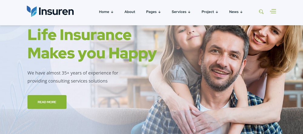
Having a well-designed website is a must for any insurance agency. In this post, we’ll look at why you should invest in it and some tips to help you create a site that converts visitors into leads and sales.
The importance of having a well-designed insurance agency website cannot be overstated. The website is the first point of contact between your company and potential customers, so it’s important to use this opportunity to your advantage.
The importance of having a well-designed website for an insurance agency
If you’re in the insurance business, then you know how important it is to have a well-designed website. It doesn’t matter if your website looks like it was designed by someone using only their left hand and their feet (it does not actually matter if this happens). You need to have a good user experience that makes sense for your users and converts them into customers.
The role of the website in attracting and converting leads
If you’re a long-time Digital Marketing veteran, you may be surprised to learn that your website is actually the first point of contact with most potential customers.
The average person does very little research before buying insurance; most simply call their agent and ask for a quote. If they do any research at all, it’s usually just enough to get an idea of what kind of coverage they need and how much it’ll cost them.
Tip 1: Use a clean, modern design
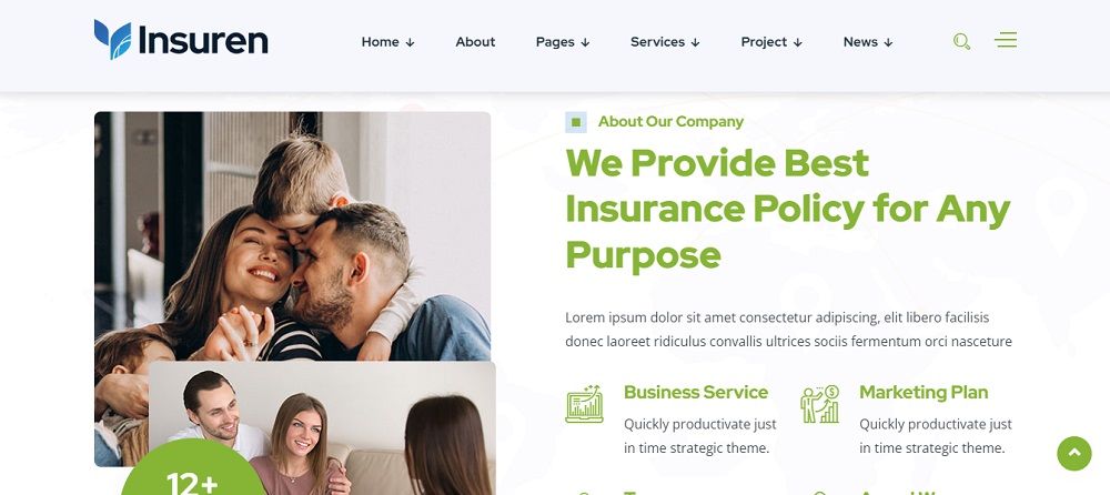
It’s important to have a clean, modern design that is consistent across the website. This will help customers find what they are looking for easily and make them feel like they can trust your agency.
Use white space to let the content breathe. A lot of times you can use images or video in place of text to create density on the page without sacrificing readability.
Use grids, columns and images as background elements when possible. This helps organize information into digestible chunks that are easy to scan through quickly on mobile devices or desktops alike!
The benefits of a clean, uncluttered design
A clean, uncluttered design is easier to read and navigate. Visitors can focus on the content without being distracted by clutter.
A clean web design is also easier to maintain, which is important for SEO rankings and conversion rates.
Finally, a clean design that isn’t cluttered with unnecessary elements or ads makes it more likely that your site will be mobile-friendly (which Google loves).
How to create a visual hierarchy and balance on the website
Create a grid system. When designing your page layout, ensure that every section is aligned with another section on either side of it, as well as the overall website itself. This will help establish visual balance and hierarchy throughout your site.
Use colour to create a visual hierarchy. Colours are powerful tools for creating a visual hierarchy on a website because they’re universally understood as having different meanings in various contexts (e.g., red means danger or success).
You can use colour alone or with other design elements like images and videos to create a sense of flow throughout your site’s content, which encourages visitors to stay on longer or come back later when they know there will be something important waiting for them at each stage along their journey through your pages before reaching their destination at checkout or contact form submission buttons!
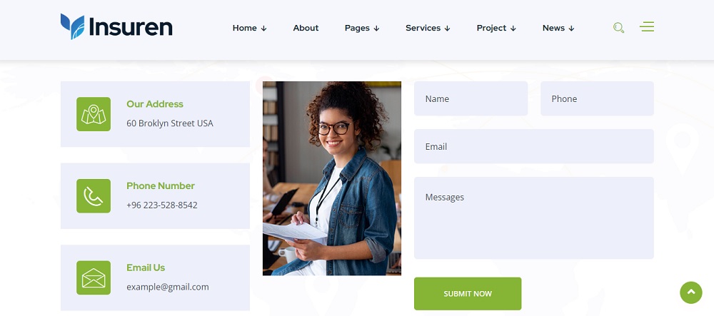
Tip 2: Make it easy for visitors to find what they need
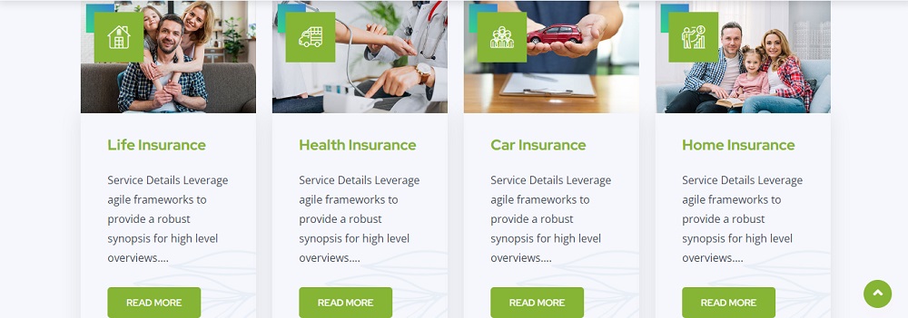
To keep visitors on your site longer, you’ll want to make sure they don’t have to sift through a lot of information. Use search and filtering options to help people find what they need quickly.
Your website must also be easy to navigate. If you have more than one page of content, use a navigation bar at the top or bottom of the page so that visitors can quickly find what they want without scrolling around too much on your site.
It is also important to include clear calls-to-action (CTAs) on each page of your site so that people know where they can click next when they are ready to take action.
The importance of clear navigation and clear calls to action
Clear call to action (CTAs) are important because they direct the user’s attention towards the next step in a conversion funnel.
Clear website navigation is important because it helps visitors navigate through your website and find what they want quickly and easily.
How do you create clear CTAs? Use clear language, like “Learn More” or “Get a Quote” instead of “Submit” or “Contact Us.”
How do you create clear navigation? Use words that are easy for people to understand, like “Homepage,” “About Us,” “Quotes & Forms,” etc., rather than something technical like “/about-us/contact-us.”
How to use search and filtering options to help visitors find what they’re looking for
The search and filtering options on your insurance agency website are key to helping visitors find what they want. It’s important that they be easy to use, intuitive, fast and accurate. They also need to provide relevant results—and be helpful.
First things first: Make sure your site has a good search function! The best way for visitors to find what they’re looking for is through the use of clear, specific keywords in their search terms (think “homeowner policies” instead of “insurance coverage”). By making it easier for users to locate relevant content on your site, a powerful search tool will improve conversion rates by reducing the amount of time spent browsing around before finding what they need or give up altogether because there isn’t enough guidance available through navigation menus alone.
Suggested Read: Ecommerce Website Development in Toronto
Tip 3: Optimize for the mobile devices
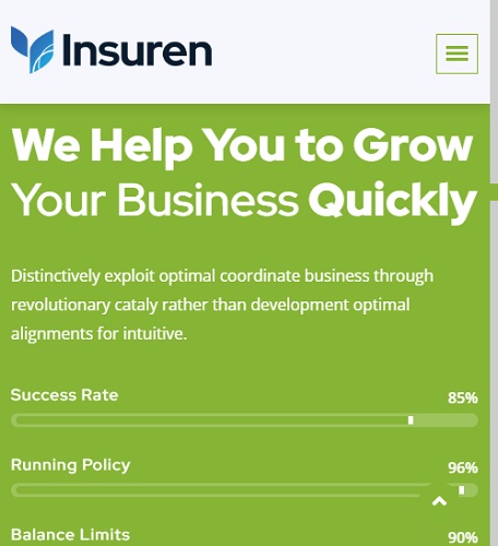
Mobile responsiveness is one of the most important things in an insurance agency’s website. You want visitors to be able to find what they need easily and quickly, regardless of which device they’re using. To ensure this, you’ll need to make sure that the site is responsive on both desktop and mobile devices.
With the rise in popularity of mobile browsing, it’s important that your website looks good on all devices so that customers can easily navigate through their options without any hassle or frustration. This means having high-quality images and text as well as creating a user experience that is easy for users to navigate around on different devices (iPad vs iPhone).
The increasing importance of mobile responsiveness in website design
It’s become increasingly important to make sure that your website is mobile-responsive. Mobile responsiveness is a design concept that ensures your website looks good and functions well across all devices, from desktops to tablets to smartphones.
How does one go about testing for mobile responsiveness? There are a number of easy ways you can do this. Some websites offer free tools for checking a site’s mobile-friendliness by entering its URL; here are some examples:
- Google Webmaster Tools
- Yahoo! Site Explorer (for entering the URL)
- Bing Webmaster Tools (for checking the site on multiple browsers)
How to ensure that the website looks good and functions well on all devices
You want your customers to be able to easily navigate your insurance agency website no matter what device they’re using. Make sure that the site is responsive, meaning it doesn’t look or work differently depending on whether a person is using a desktop computer, tablet, or smartphone.
To ensure that your pages are responsive:
Double-check the responsiveness of each page on all devices before you launch them. If you have any non-responsive elements (like an embedded Google map), then use this tool from Google to check if they’re responsive as well.
Suggested Read: Mobile App Development Company in Toronto
Tip 4: Incorporate social proof and customer testimonials
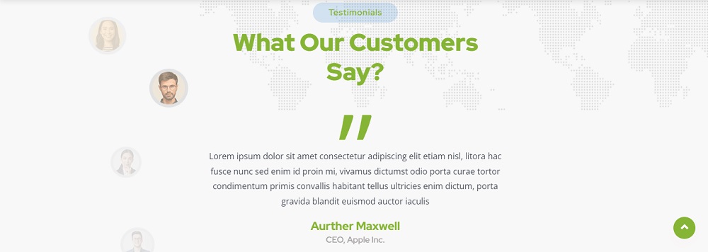
Social proof is a powerful persuasion tool that can be used to build trust and credibility. Social proof is often cited as a strategy for increasing conversions on your website. You might be familiar with some of the ways social proof can be used, such as customer testimonials or reviews. But did you know that social proof can also be used to create a sense of urgency? And did you know that there’s more than one way to use this technique?
The power of social proof in persuading visitors to take action
Social proof is a powerful tool to help convince visitors to take action. It can come in the form of testimonials, reviews or even social media shares. When you showcase social proof on your website, it tells people that others have already done what they are thinking about doing and were happy with the results.
When visitors see a social proof on your site, it reassures them that purchasing from you will be a good decision. The more positive reviews and testimonials you have showing how many people are satisfied with their purchase from your company, the more likely it is for them to convert into customers.
How to use customer testimonials and reviews to build trust and credibility
- Testimonials and reviews can go a long way to build trust and credibility. They’re also an effective way to showcase your services as a business.
- Use customer testimonials and reviews on the website to create trust, increase conversion rates and show prospective clients that you’re an industry leader in your field.
Suggested Read: 5 Tips for Designing an Effective Website for Your Law Firm
Tip 5: Test and optimize the website for conversions
You have a website, and it’s time to test it. It’s not enough to just have a functional site that looks good and tells the story of your agency. You need to optimize your site for conversions the number of leads (or sales) you get as a result of people visiting your website. This is where A/B testing comes into play.
The importance of A/B testing and conversion rate optimization
A/B testing is a method of measuring the effectiveness of a website or landing page by comparing two separate versions of it. The first version (the control) remains unchanged while the second version (the test) is modified in some way. Conversion rate optimization then uses these results to determine which modifications perform better, allowing you to make informed decisions about how best to improve your website’s user experience.
Techniques for improving the conversion rate of the website
Once you’ve got a solid website design, it’s time to start optimizing. Conversion rate optimization (CRO) is the process of improving your site’s conversion rates through A/B testing, usability testing and other methods. Here are some CRO strategies that can help improve your website’s conversion rate:
- Testing different landing pages
- Testing different forms
- Testing different offers
- Testing different calls to action (CTA)
- Testing different headlines
- Testing different images
Conclusion
There are several benefits to following best practices for designing an insurance agency website that converts visitors into leads or customers. Some of these benefits include:
It can increase conversions, provide a better user experience, increase credibility, have greater reach, and be a cost-effective marketing tool. By following best practices for website design, insurance agencies can effectively showcase their products and services and encourage visitors to take the next step and contact them for more information.
For website design for insurance agency in Toronto Canada contact Tectera for web design in Toronto.

