fbpx
sales@tectera.com
+1 (437) 830-4940)

Tectera

BLOG

Bring your
web ideas to life

Website redesign is the complete process of giving the website a makeover. Every element including content, layout and navigation has to be improved and updated. The ultimate goal of this process is to increase the performance of the website.

Here’s a complete guide for you to understand when and why you need a makeover and how it can be done.

Why Redesign a Website?

There are a lot of reasons why people or companies tend to redesign their websites. Some of the main reasons as below:

Outdated Design

The design and the layout plays a major role in a website. It is the main reason to attract visitors and keep them engaged. If the website design is outdated, the bouncing rate of the customers will be higher. And the other competitors will get the benefit out of it.

Look for the color scheme on the website that is off trend, the old and poor layout designs and fonts that have been used for years. These might be the major reasons for the website to be noted as outdated.

An eye catching website with newest trends is what any customer would look for. A pleasant design catches anyone’s attention and this would lead your website to become their favorite.

Poor User Experience

User experience is also an important factor when it comes to a successful website. If the information and the purpose of the page is not highlighted or well organized, difficult to make a purchase or to get any other information easily, the website needs a massive upgrade.

An easy to navigate, organized website guarantees a smooth run and attraction from the users.

Mobile Responsiveness

Using mobile phones to explore and to shop through the internet has now become the new trend. So a website should be very responsive to any smart device.

If the website doesn’t fit to the screen size or the navigation system is complex, users struggle on going through the website. And in some cases, it takes a lot of time to download a page on a mobile device. And this will not keep the users waiting.

The text is also another major issue. If the font is not easy to read or the text is not legible on all screen sizes, people don’t waste their time sitting and trying to understand things.

Changing Business Goals

A website of a company has to reflect the business goals as it is the first point that the customers get contact. The business goals should be well aligned with the direction of the company.

Generating sales, building brand awareness, establishing competitiveness and providing customer support are some of the main parts in business goals that should be focused on while redesigning.

Signs It’s Time to Redesign

Understanding the weaknesses and the pin points that are needed to be changed in a website is much important in redesigning.

There are signs that will confirm it’s time to design the website again.

There are some main indicators that will tell a website is declining its performance.

Slow loading of pages will let the users to be away from a website. This will also impact on the search engine rankings where it will start to massively drop.

A higher bouncing rate, which means that the users leave the website in a short time will be high and this indicates that they don’t find anything important there anymore.

An outdated website makes it look unprofessional and not trustworthy. If users are not able to find relevant information easily, it makes them frustrated and to stay away from the website. Outdated websites usually don’t have clear navigation and well organized content. These outdated functionalities will lead to a poor experience.

Incompatibility of a website with a mobile device can impact significantly on a business as majority of the web traffic are from mobile devices. If the text of a website is quite small, it is a challenge to read it. 

And modern websites don’t require java or flash. So if your website is still running on these, it may not work correctly on devices. 

Optimizing screen sizes according to the device is also another important feature. If users have to zoom, pinch or swipe to see contents clearly, then the website needs a redesign.

Benefits of Website Redesign

Website redesign can help evolve any business as it relies on the identity and the vision. If these two factors are shifted by time but the online presence is not yet developed, it needs to be redesigned.

There are many benefits of redesigning a website.

The improved experience that the user gets from any website is important and it helps the business to grow. The user-friendly navigation is the most important part that will bring more traffic to the site. It will enhance the users that actually come to the website and actively engage in things.

A fast website with mobile compatibility makes the site more accessible and it will optimize the search of the particular website.

An enhanced brand image will create a positive impression for anyone who is viewing the website. A visually pleasing site will benefit a business in so many ways.

It makes the brand trustworthy and customers find it legitimate and well established. It also emphasizes that the company knows what are new trends and stays up to date with them. 

After the redesign there are some factors that can actually help to increase the conversion rates. A well designed website and a user experience can make it visually pleasing and easy to navigate. This will lead to more positive conversations between the business and the customers.

The updated content can also draw new customers and keep them engaged. Make sure they are upto date and relevant. Include eye catching CTAs (call to action) that will encourage the visitors to be active on the website.

A redesign can also improve the optimization by making the website get better search rankings. This can make the page more visible to users and drive more traffic towards it.

Creating a unique brand identity brings competitive advantage to a business. A custom website can be tailored according to the business in order to match the brand. This makes sure that the website is recognized and stands out among the competitors.

Planning a Website Redesign

The first impression about any business is important. A business needs to have proper goals and objectives. So the first step in planning a website redesign is identifying the primary goals of redesigning. This will guide and ensure that the redesigning process will meet the goals of the needs of your business.

Reviewing the current website in terms of user experience helps to get the insights on what sort of improvements are required. This will help to focus on the strengths and the weaknesses of the current website and begin the redesign process accordingly.

Improving the website navigation is also crucial in redesigning. Simple and clear navigation labels are essential for users to understand the contents of the website. A search function where users can quickly access things also should be included. A good navigation helps in positive user experience, and engagement.

In order to enhance the visual appeal, choosing colors that will align and emphasize the brand is important. And selecting images that’s relevant to the purpose of the website can give a clear idea about the business. By using the white space effectively, users will have the attention to the key elements and draw them into the website. Consider fonts, size and color as it complements other elements of the website.

Since more than a half of the web traffic is generated from mobile devices, optimizing the website for mobile is an important step. Make sure that your website downloads quickly on any device. Measure the speeds to improve accordingly. Check whether the media files such as pictures and videos are downloading faster.

Consider using larger input fields and vertical scrolling to improve the user experience.

Updating Content and SEO is also another important part that should be focused on when redesigning a website. As the first step, it’s better to review all the existing content of the website and note down what to remove and improve. Do a thorough keyword research for all the pages of the website. Use tools that are helpful in this.

Update meta descriptions that include keywords to improve the visibility of the website. Use hyperlinking within the pages that will guide to relevant content. This will let your users experience the website efficiently. The algorithms are focused on providing the best content for the users. Therefore, make sure that the content is well aligned with the intention of the users.

You can utilize social media in order to bring the traffic to your website. And the website can also help in providing the space for social media promotions. So integrating social media is also important in web redesigning. Place social media icons on the website in a much visible spot to make it easy to find the pages. You can also utilize the widgets in order to display the social media pages on the website. By implementing these tips, social media can be effectively used to connect with the users.

In order to make sure that the new functions of the website provide the best possible user experience, testing and launch is important. In order to identify bugs, test the website completely and thoroughly. Perform usability testing in order to make sure that users can navigate and use the site easily. Test the website on various platforms like mobile devices to make sure that it works well on all screens.

Ensure that your website meets all the standards. Once the website is tested and launched, make sure that you have a backup of the previous website and DNS settings. Monitor the website and quick fix if there are any bugs discovered. 

Overall, redesigning a website takes a lot of effort on thorough research, planning, understanding the users and the objectives of the business and proper launching strategies. If the steps are followed carefully and cautiously, a website can be created where it meets all the business goals while enhancing the user experience. 

Contact Tectera who provide web design in Toronto for website redesign.

See Also:

Looking for payment gateways? A payment gateway is essential for every online store or shopping website. It is the best way to accept payments while doing business online.

Most payment gateways work in the same way. When a consumer makes a payment on a merchant’s website, the payment gateway takes the payment information and securely transmits it to the payment processor or acquiring bank.

After that, the payment processor authorizes the transaction and sends funds from the customer’s bank account to the merchant’s account.

 In addition, the payment gateway provides a user interface via which merchants can monitor and track their payments, analyze transaction statistics and analytics, and issue refunds and charge backs.

Payment gateways enable internet transactions while safeguarding private cardholder information. Customers can thus safely purchase goods from any online store without having to worry about identity theft.

In this article, some of the famous and best getaways will be elaborated and discussed.

PayPal

paypal

Paypal is an ecommerce platform designed for online payments. It doesn’t require any financial information. This top rated payment gateway allows doing payments worldwide.

With the help of PayPal, businesses and individuals can send and receive payments online safely and easily.

Since its founding in 1998, it has grown to rank among the most commonly used online payment platforms worldwide, doing more than 10 million transactions every day.

The top features of this gateway includes,

  • Providing top-notch security features to protect the money and sensitive data. This is done by using encryption and SSL protocol. Buyers on the other hand, also have protection programs in case if the items are damaged or not received.
  • Users are able to make payments from any part of the world. They can even do money transfers or donations through the online website or mobile application.
  • Paypal comes with a mobile app that allows users to do everything similarly to their website. 
  • Supports multiple payment options where users can choose whatever fits for them.
  • Has a dispute resolution process that enables reaching resolutions for both buyers and sellers in case anything happens. 
  • Refund policy to request refund in case the buyer is not happy with the purchase.
  • Allows payments over 200 countries and regions. Also supports different currencies.

On any retailer’s website or app, it is incredibly simple to purchase or sell using PayPal on a mobile device. PayPal is active in 203 nations and accepts popular credit cards globally.

Stripe

stripe

It is a cloud payment gateway platform that is useful in controlling all the transactions from anywhere.

There are a lot of great features provided by stripe which makes the work more easy.

The movements of funds will run smoothly with stripe. The interface of the application is highly secured making sure that there will be no frauds.

The application also integrates with the business ecosystem by providing an API.

  • Has a user friendly API that is easy to integrate with e-commerce platforms.
  • Offers pre-built payment forms that can be integrated into websites. This makes accepting payments quickly .
  • Supports a wide range of payment methods including Google pay and Apple pay. 
  • Can do payments by using currencies from over 135 different countries. 
  • Provides ability to customize the checkout pages according to the brand.
  • Ability to set up recurring payments for customers who are on subscription basis.
  • Has advanced fraud protection that uses machine learning to detect fraud transactions.
  • Offers a payout feature that allows businesses to do payouts.
  • Has a simple and a straightforward refund managing system that makes doing refunds easy.
  • Team of 24/7 customer support to help with any payment related issues or to make inquiries.

It is one of the best ways to get and do all the payments. It also increases global sales as it supports more than different currencies. This getaway is a subscribed one but it offers you the best for the price.

Square

Square

Square was founded in 2009 and initially, it was not a payment gateway. It was more like an end-to-end processor for payments.

Businesses can effortlessly and securely take payments thanks to Square.

When it was established, Square transformed the payments sector by giving small companies a convenient and affordable option to take credit card payments.

Its best features include,

  • Square enables accepting multiple payment methods.
  • Customizable checkout pages and 3D authentication to reduce fraud risks.
  • Allows businesses to send customized invoices to customers.
  • Direct link to do the payment through the invoice.
  • Setup of recurring and subscription payments.
  • Virtual terminal that allows businesses to accept over the phone or mail payments.
  • Provides detailed transaction information where sellers can also track customer information and behavior.
  • Integrates with a number of e-commerce platforms where the workflows can be automated and operations can be streamlined.
  • It is a PCI compliant payment gateway and uses advanced encryption and fraud prevention techniques. This will protect the sensitive data.

Due to its simplicity of use, low cost, and wide range of services, Square is a well-liked option for small and medium-sized enterprises.

It keeps coming up with new ideas and broadening its selection of services to make sure that companies can securely accept payments and handle their money well.

If you have a low transaction volume or it keeps fluctuating every month, Square is the best option for you as it only deducts a processing fee only if you earn.

Authorize.net

Authorize

This payment gateway is primarily designed for e-commerce businesses. It was founded in 1996 and is currently owned by Visa.

Authorized.net offers a wide range of features to its customers such as,

  • Allowing businesses to accept payments through credit cards, debit cards, e-checks etc.
  • It uses advanced security measures like SSL encryption, fraud detection and tokenization to protect sensitive data from cyber attacks. 
  • It provides real-time reporting and analytics to businesses in order to analyze sales data and track transactions. 
  • It integrates with several e-commerce platforms, POS systems and shopping carts.
  • It offers recurring billing solutions that will automate payments for subscriptions and services.
  • 24/7 customer service through calls and e-mails to resolve any issues that may encounter.

For companies of all sizes, Authorize.net provides a dependable and secure payment option.

It gives companies the resources they need to swiftly and effectively take payments while ensuring that all transactions are safe and secure against fraud.

2Checkout

2Checkout

2checkout was founded in 1999 and its initial name was Avagante. It enables businesses to accept payments globally.

This gateway offers around 45 payment options and it is available in more than 200 different countries.

Its platform is designed to be flexible and customizable including features like,

  • Allows customers to do payments using a wide range of payment methods including credit and debit cards.
  • Provides data security and fraud prevention to make sure the transactions are secure.
  • Allows sellers to sell products all over the world by accepting multiple currencies.
  • Ability to customize business checkout pages to match the branding.
  • Fraud protection tools to help businesses detect fraud transactions.
  • Manage customer subscriptions, view payment history and manage the refunds.
  • Provide business with the insights of sales and revenue.
  • Takes care of global tax and compliance.

Overall, 2checkout platform provides businesses with all the necessary payment processing solutions which will make the online payments simple and helps in increasing the revenue by expanding all the possible payment options.

Braintree

Braintree

Braintree is a payment gateway that was founded in 2007 and then owned by Paypal from 2013. This is known for its solutions which are developer friendly and giving businesses ultimate flexibility in integrating payment processing in the webpages.

There are number of many other features for merchants to make it easy to accept payments online,

  • Supports different payment methods and gives the customers a wide range of options to choose from.
  • Follows highest standards to ensure secure transactions and offers advanced fraud protection features.
  • Straightforward methods of creating accounts and making the businesses start accepting immediate payments.
  • Customizable checkout tools to match the brand and the needs.
  • Easy set up of recurring and subscriptions to avoid manual billing hassel.
  • Transparent pricing with no hidden fees makes it easy to calculate costs and budget.
  • Supports transactions in over 130 currencies and operates in over 44 countries where the businesses can expand globally.

Braintree is an excellent payment gateway for businesses which are looking to accept payments via online and mobile apps. The secure and streamlined payment process allows accepting payments globally.

In summary, a payment gateway is a crucial tool for companies who want to take payments online. Customers can use a variety of payment options to complete transactions in a secure and effective manner.

Additionally, payment gateways offer a range of services and functionalities, including fraud prevention, recurring invoicing, and reporting, that aid companies in efficiently managing their online transactions.

It is crucial to take into account a payment gateway’s costs, security, customer service, and compatibility with your website or platform before making your decision.

In the end, an effective payment gateway may aid in boosting revenues, enhancing client pleasure, and streamlining your online payment procedures.

Contact Tectera who provide web design in Toronto to implement Payment gateways.

Looking for real estate website design ideas? A website aids in brand awareness and showcasing your brand to prospective customers. It helps to establish your image by letting the audience know who you are and what you stand for.

A website provides consumers with trustworthy information, which helps to distinguish your company from the competition. Websites in the Real Estate industry can assist consumers gain more ideas and comprehend what they would like.

When you build a website using real estate website templates, you have a significant advantage and far more chances of closing large deals.

Selling real estate is a cutthroat business. Only those who execute it strategically see the success they desire. With a proper website, you can quickly put yourself ahead of your competitors. A great way to generate leads and promote your services is by building a real estate website.

Real Estate Website Design Idea 1

Website Design Ideas For Real Estate Businesses

The website has a color combination of white and blue. The website offers clients to choose the property type, offer type, and price ranges they are looking for. The website has contact information, social platforms, and location. The purple pop-up button states that clients are offered a free demo and the green button states the purchase to the clients.

Suggested Read: The Best 7 CMS Platforms

Real Estate Website Design Idea 2

Website Design Ideas For Real Estate Businesses

The website has a color background of black and a tab in white. It has a darker picture and bold text such as ‘Find Your Dream Home.’ Customers can find the availability and property for sale and rent through the site. The top bar includes the blogs, pages, and listings. The website offers the option to sell the properties. The website has a darker background.

Real Estate Website Design Idea 3

Website Design Ideas For Real Estate Businesses

The website combines blue and white. With different shades of the two colors, it creates a calming yet pleasing impression. The website offers clients three options for all listings, sales, and rent. Clients can create a listing via the website and contact through the hotline noted at the very top of the page.

Real Estate Website Design Idea 4

Website Design Ideas For Real Estate Businesses

The website has a picture of a luxury house which matches the tagline added ‘Find your Perfect Home.’ This site has three dropdowns sold, rent, and buy. On the top bar, the website includes the contact information such as the phone number and location.

The website lists down the opening hours and clients can change the language in viewing the website. The image creates a welcoming appearance.

Real Estate Website Design Idea 5

Website Design Ideas For Real Estate Businesses

The website focuses on the Property as a dream of the client. It offers a bright color for the background but cuts it out with the white text. The page is very simple and has fewer options but has all the mandatory information such as the features and pages. The website has the option to find as well see properties.

Real Estate Website Design Idea 6

Website Design Ideas For Real Estate Businesses

The website creates the first impression of New Future to the property. Despite having a dull and pale color the website drags clients by the tagline. The contact information as the phone number and email address is listed at the two top corners. Moreover, it has the option for contact information, blogs, and pages.

Real Estate Website Design Idea 7

Website Design Ideas For Real Estate Businesses

The website has an image of a couch as the background. The site focuses more on finding properties. The contact information is noted in the top bar. The Social platforms are added on the top. The site lets clients add properties and search according to categories. The site has a pleasing and cozy color combination.

Real Estate Website Design Idea 8

Website Design Ideas For Real Estate Businesses

This site creates a good first impression on the customers. Even though it does not have a background image of a building, it has categories the clients can choose from. There are options with relevant images which makes clients easy to choose what category they are in need of.

The yellow clicks bring a contrast to the page. The black bar on top includes the home page,  listing, and blogs. The website has the option to add to the cart and make purchases contactless.

Real Estate Website Design Idea 9

Website Design Ideas For Real Estate Businesses

The website mixes white and blue. It conveys a calming yet attractive impression by using various shades of the two colors. For all listings, sales, and rent, the website gives users three choices. Customers can create listings on the website and get in touch with the company using the hotline listed at the very top of the page.  It emphasizes providing customers with their ideal home.

Real Estate Website Design Idea 10

Website Design Ideas For Real Estate Businesses

The website drags the attention of the customers with the tagline One Click Away. It has a texture of black and gray with white font. It places a focus on giving customers the home of their dreams.  In order to build more trust and uphold the reputation, the company is described on the website.

Customers can easily choose the category they need because there are options with appropriate images. The contrast on the page is provided by the yellow clicks. The contact information is listed at the top. 

Conclusion

Some websites allow you to bookmark items that inspire you, which adds a personal touch. These can be used to inspire any client, business, or portfolio website, as well as your own agency website. It is critical to understand the purpose of your website and thoroughly research your competitors.

Having a few solid starting points, on the other hand, can help you meet your client’s demands while motivating you to investigate novel design solutions, keep up with design trends, and exercise your creativity.

Finally, web design is an important aspect of the real estate industry. A well-designed website can attract potential clients, establish credibility, provide a seamless user experience, and generate more leads.

Contact Tectera who do web design in Toronto to get more website design ideas for real estate businesses in Toronto Canada.

See Also:

Looking for website design ideas for restaurants? A website allows you to show who you are to new and existing customers without spending money on additional marketing. Your customers will have a clear understanding of the experience the restaurant provides and the atmosphere guests can expect.

A website gives you the ability to regulate your restaurant’s image. It allows a restaurant to tell its own story in its own words (unlike third-party sites). Customers will get a good sense of who you are as well as the overall atmosphere of the restaurant.

A well-designed website can help you make an excellent first impression on your potential customers. It can also help you cultivate your leads and increase conversions. But, more importantly, it provides a good user experience and allows your website visitors to get to and around your online presence easily.

Website Design Idea For Restaurants 1

Website Design Ideas For Restaurants

This website’s appealing tagline ‘Delicious Foods’ demonstrates the company’s confidence and aids in fostering trust among site visitors. It has the email and phone number mentioned on the top along with the address.

The website follows a white background which highlights the image on the main page. It also has the menu song with the contact information. Most importantly it has the option to book a table from the website itself.

Website Design Idea For Restaurants 2

Website Design Ideas For Restaurants

This website is both aesthetically pleasing and functional, thanks to its simple navigation menu. The white and black color scheme is soothing to the eyes. The large, bold text on the homepage makes a statement and directly emphasizes what cuisine the restaurant offers customers.

Customers can find contact information at the very top of the page. The website lists the menus and opening hours, making it easy for customers to choose.

Website Design Idea For Restaurants 3

Website Design Ideas For Restaurants

The website has a darker texture with the product displayed. The website has focused on dragging the customers by adding the offer on the cover page.

It also gives the option to check on the menu and order online. The website has a hotline on the top where viewers can directly call and check on requirements.

Website Design Idea For Restaurants 4

Website Design Ideas For Restaurants

The website is covered with the image and the caption drags the attention of customers. The website contains the option to order and purchase via the site.

The top bar includes the contact info, address, and social media pages. The site follows a color combination of green and light grey which enables highlighting the image in the center.

Website Design Idea For Restaurants 5

Website Design Ideas For Restaurants

The website gives a black and brown texture. The capital letters point to what type of industry it is. The site gives an option to shop and add to the cart. On the very top, next to the search bar it has the option to check on the items added to the bag. The website has blogs, pages, and other elements for the customers to view from.

This site does not have contact info listed in the vey first page.

Website Design Idea For Restaurants 6

Website Design Ideas For Restaurants

The website cover gives a tempting image. It states the motto of the restaurant in capital letters to highlight it more. The image adds color while the combination is black and white in the top bars.

The main bar includes details such as the Home page, gallery, and social media platforms. Along with the address, it states the deals and states of free delivery for clients. Customers have the option for reservations via the site.

Website Design Idea For Restaurants 7

Website Design Ideas For Restaurants

This website is a simple yet elegant one. It has pale colors but gives a rich look. The website has limited options but mandatory options. The website includes news and pages on the top.

Customers can reserve a table and view the menu through the website. The website uses a texture of white and beige. It has a very simple picture of a wine glass and is very calming.

Website Design Idea For Restaurants 8

Website Design Ideas For Restaurants

This website is very dark in color and highlights the name and cuisine they offer mostly. The blurry image in the background creates a very elegant and rich look. The website offers customers to book a table through the site.

They can reserve via the hotline added at the top of the website. Along with all these, the site contains common fields such as pages, blogs, and home pages. It also lists the menu.

Website Design Idea For Restaurants 9

Website Design Ideas For Restaurants

The website gives a very welcoming ambiance as the first impression. It states ‘Welcome feel at home.’ There is an option to book via the site. Along with these, the site includes common fields such as pages, blogs, and home pages. It also lists the elements and the events. Customers can order food through the site.

Website Design Idea For Restaurants 10

Website Design Ideas For Restaurants

The website has a very dark color background with a combination of dark blue and light brown on the top. The top bar includes the location, hotline, and social media platforms. Customers can view the menu and shop from the website. They also have a separate option for reservation. The cover image contains the history of the restaurant. Customers can call and make bookings. 

Conclusion

Some websites allow you to save the things that inspire you, which adds a personal touch. However, having a few solid starting points can help you meet your client’s demands while motivating you to investigate novel design solutions, stay current with design trends, and exercise your creativity.

These can be used as inspiration for any client, business, or portfolio website, as well as your own agency website. Understanding the purpose of your website and thoroughly researching your competitors are critical. A website is ideal for a restaurant because it attracts customers.

Contact Tectera who do web design in Toronto to get more website design ideas for restaurants in Toronto Canada.

See Also:

Looking for website design ideas for IT company? An outstanding web design is one of the factors that might help you stand out in this highly competitive field, especially with the rising standards that tech giants like Apple are establishing in terms of digital presence.

A well-designed website should engage the visitor while also carrying out the purpose for which it was created. Good website design is influenced by a variety of elements, including consistency, colors, font, images, simplicity, and usefulness. The way a website is perceived depends on a number of important design factors.

A well-designed website can encourage users to take action by building trust. Making sure that your website design is optimized for usability and how simple it is to use is a crucial part of creating a fantastic user experience. The most effective websites usually present what they offer directly on the homepage.

Some of the best tech websites support the focus of their services with strong landing pages geared toward customers that help shape the company’s identity without compromising accurate descriptions of its more abstract services.

Given below are 10 IT company websites based on design, functionality, originality, and user experience. These websites represent online excellence in the tech and IT industries, from visually appealing layouts to smooth navigation.

Website Design Idea For IT Company 1

Website Design Idea For IT Company

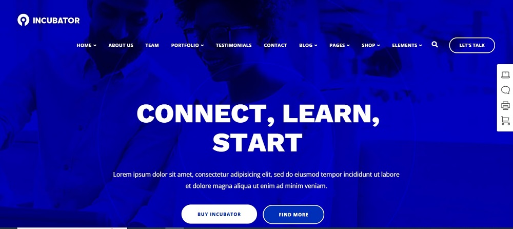
Too frequently, when you visit a website, you must first determine the brand’s mission but when you visit the above it company website, you know exactly what to expect. This website’s appealing tagline, “Best IT service provider,” demonstrates the company’s confidence and aids in fostering trust among site visitors.

It has a very aesthetically pleasing blue-and-white color scheme. The interactive homepage displays the most important information, like the company’s phone number, email address, and handles for all four social networking platforms, making it easier for clients to get in touch with them.

Website Design Idea For IT Company 2

Website Design Idea For IT Company

With a straightforward website navigation menu, this website is both aesthetically pleasing and functional. The white and light blue color scheme is calming to the eyes. The large, bold text on the homepage makes a statement and emphasizes what the company offers to customers directly.

Customers can find solutions and answers to questions via the site. The website has also listed vacancies on the very top of the page.

Website Design Idea For IT Company 3

Website Design Idea For IT Company

The company’s phone number is listed at the top of the homepage, and there are other pages on the menu with further details about the business, what they offer, and how to get in touch with them.

The website follows a very bright background with a touch of blue and white. It has a search bar on top along with the news and About drop-down lists.

Website Design Idea For IT Company 4

Website Design Idea For IT Company

The following is much more than a digital directory. It is an innovative technological platform that links users to power solutions all over the world. This website offers predictable and reasonable fixed elements, clients have the option to directly purchase services via the site, and it has an innovative and technologically enabled model that supports a business to thrive across all stages of growth.

The site follows up with a blue and white texture for the background. It also has social media page links on top of the page. A very serene background and soft colors give off a positive first impression.

Website Design Idea For IT Company 5

Website Design Idea For IT Company

This website features a red, white, and faintly black font color scheme. It gives the clients important details such as their phone number and email. Customers can dial a direct number with just one click, and a separate contact icon is available on the website. It lists the services and elements.

A white and blue-textured image can be found on the website. The website is imaginative and makes a good first impression on the visitor.

 Website Design Idea For IT Company 6

Website Design Idea For IT Company

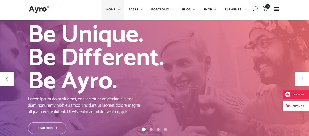
This website provides all essential information, including contact, about, and services. The website has a black and purple context that follows a background texture of purple and white texture. The top of the website offers customers the option to request services at any time.

The website has a separate tab for the common information, including the blog, elements, and pages, in light of all these facts. The company logo, which perfectly complements the website’s background, is displayed at the very top of the homepage.

 Website Design Idea For IT Company 7

Website Design Idea For IT Company

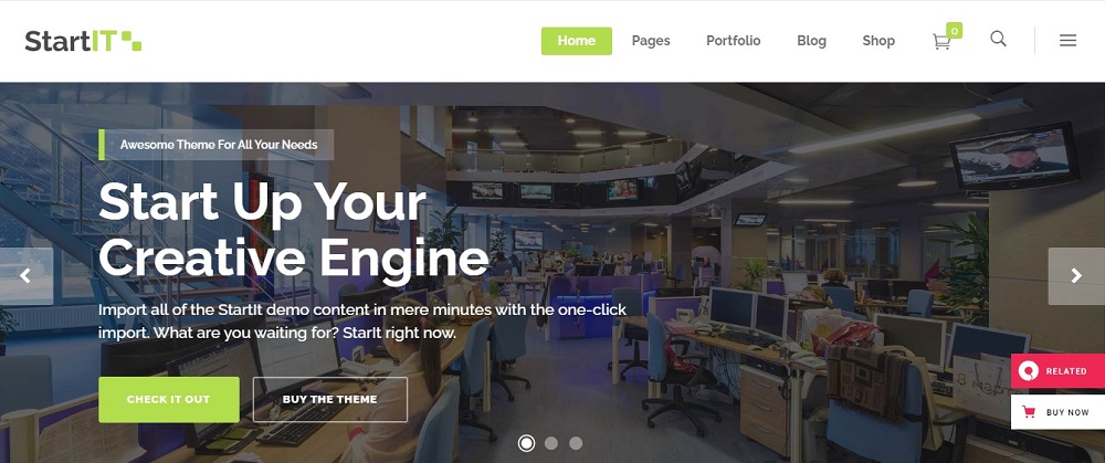
Customers can view blogs and portfolios on the website. It frequently has tabs for viewing services and elements. The phone number and email address are on the page. The texture of the website is purple and white.

Additionally, tabs for home-pages and pages are located at the top. The website has options for customers to view their primary services and a background with the artwork. Customers can select the language they want to view in as well. 

Website Design Idea For IT Company 8

Website Design Idea For IT Company

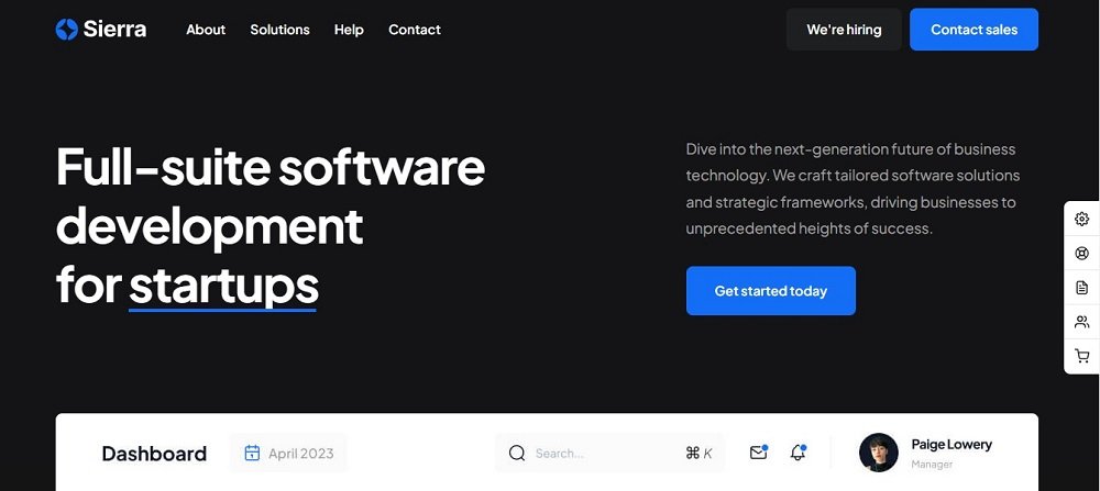
This website is very straightforward but consistent. It has a primary menu bar with information on everything from services to contacts. The website’s black background draws attention to the white letters on the page.

It has an orange and purple textured gradient background. Services and contact information are available on the website. Both a search bar and a list of the locations are present. Customers can click once to watch a video and learn more! 

Website Design Idea For IT Company 9

Website Design Idea For IT Company

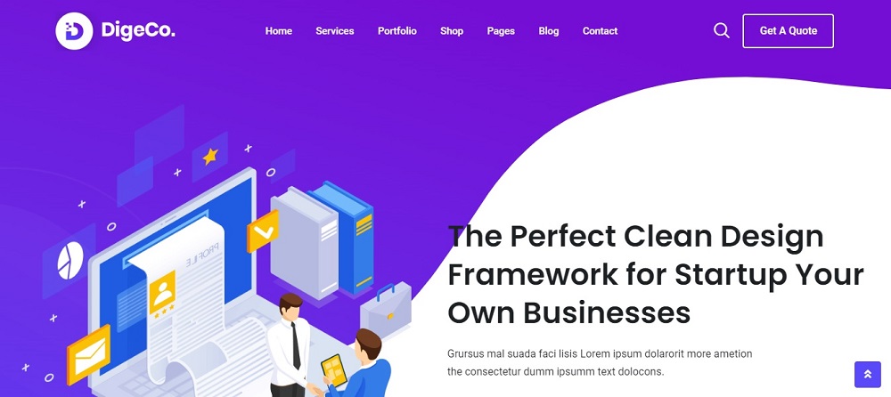
In addition to having company information on the blog pages, the website also has it at the very top. The website uses a purple and blue color scheme that leans more toward a gradient background.

Customers can browse products and purchase them online. The website has a shop bar at the top where customers can browse and buy products. Through the website, customers can view additional and pertinent information.

Website Design Idea For IT Company 10

Website Design Idea For IT Company

The colors on this website are dark blue and white. It contains contact information like a phone number and email. Clients can learn how the organization operates on the website’s unique features. The website offers information about the features and search bar in addition to the blogs. 

Some websites allow you to save the things that inspire you, which adds a personal touch. However, having a few solid starting points can assist you in meeting the demands of your clients while motivating you to investigate novel design solutions, stay current with design trends, and exercise your creativity.

These can serve as inspiration for any client, business, or portfolio website in addition to your own agency website. A crucial element is comprehending the goal of your website and thoroughly investigating the rivals.

Contact Tectera who do web design in Toronto to get website design ideas for IT company.

See Also:

Looking for lawyer website design inspirations? Law firm website templates make short work of designing and launching a site. They are fully responsive Creating the latest and greatest lawyer website templates for all your legal practices and consulting services is a key factor.

Building a small business website is important to inform your audience, explain your value proposition, boost brand recognition, and drive sales  This helps to push your professionalism.

If your website development is done well, and your site is clear and professional, the first impression of your company is that you are trustworthy. Your clients will want to know your firm is authentic and credible. It would be a good idea to show your testimonials on the front page.

Compassion is the main point this law firm website design wants to convey. A good website loads super fast, from anywhere in the world. Everything works towards that goal.

A good web design is easy to use, aesthetically pleasing and suits the user group and brand of the website. Many web pages are designed with a focus on simplicity so that no extraneous information and functionality that might distract or confuse users appears.

Below are 10 lawyer web design ideas to inspire you.

Lawyer Website Design Inspiration 1

Lawyer Website Design Inspirations

This is much more than a digital directory. It is a leading-edge technology platform that connects members to the right lawyer and firms, around the world.

This website has an innovative and technology-enabled model that helps a business to thrive across all stages of growth, It offers a Predictable and reasonable fixed price general counsel legal packages, Sophisticated legal representation from seasoned attorneys, and a client-centric focus that is collaborative, transparent, and efficient. Clients have the option to directly book appointments via the site.

The site follows up with a blue texture for the background.

Suggested Read: 10 Website Design Ideas For IT Company

Lawyer Web Design Inspiration 2

Lawyer Website Design Inspirations

The attorneys at the O’Connor Law Firm website provide a personalized, compassionate, and ardent representation to their clients, putting the rights and needs of their clients at the heart of O’Connor Law Firm’s mission and practice. The website follows a gray and dull texture for the background.

The Website provides more information on the firm and contact details. The website provides details on attorneys, practice areas, and verdicts and settlements. The website has an extra option that allows finding out about class action lawsuits.

Lawyer Website Design Inspiration 3

Lawyer Website Design Inspirations

This website includes a brown color theme. It gives the clients important details such as the opening hours, opening days, and location. The clients can call directly with just one click and the website includes all four social media platforms.

It lists the services and elements. The website includes a picture with a brown texture and white and nude text on top of it. The website is creative and creates a good impression for the client as soon as it is viewed.

Lawyer Website Design Inspiration 4

Lawyer Website Design Inspirations

This website follows a blue-and-white color coordination. It includes the contact details such s the contact number and email. The website has a special feature where clients can schedule a consultation. Along with the location, the site provides information such as the practice areas, pages, news, etc…

Lawyer Website Design Inspiration 5

Lawyer Website Design Inspirations

The website lists the contact information such as the phone number and fax. It also includes the social media pages and opening hours. The clients can get a free evaluation via the site. They can also get a free consultation by calling the website. The site follows a green color code along with a black-and-white image. Furthermore, clients have the option to purchase products with the buy-now icon.

Lawyer Website Design Inspiration 6

Lawyer Website Design Inspirations

The site follows a green and red combination. It includes the email and phone number on top for easy access for the clients. Along with the contact details the site includes case studies and attorneys etc… The site along with a picture describes the current service that they are focused on and promotes it on the cover page. This is a good marketing trick in which customers will be taken on for the service in the heading as they enter the site first.

Lawyer Website Design Inspiration 7

Lawyer Website Design Inspirations

The site includes contact information on the very top and the social media pages as well. The website follows a color combination of blue and gold. The clients can check with products and buy them through the site. It has a search bar on the top of the website for the clients to search for products and purchase. The clients can get a free consultation through the site.

Lawyer Website Design Inspiration 8

Lawyer Website Design Inspirations

This website is a very simple, yet uniform one. It has the main menu bar which includes details from the services to contact info. The background of the website is black, which highlights the letters in white. The website contains attorneys, services, and contact details. The website follows a black and dull texture and the white text is highlighted through it.

Lawyer Website Design Inspiration 9

Lawyer Website Design Inspirations

The website offers clients to get a quote for services. Commonly it includes tabs to view services and elements. The page includes the contact number and email address. The site is of a blue and red texture. Furthermore, the tabs such as elements and pages are also at the top. The website contains a background with artwork and has options for contact info and services etc…

Lawyer Website Design Inspiration 10

Lawyer Website Design Inspirations

This Website offers all common factors such as the about, contact, and services. Following a gray and white texture for the background, the site has a white and gold context. Clients have the option to request a free consultation at the top of the site. With all these facts, the website has a separate tab for Q & A. Clients have the chance to view all questions and answers in relation to the organization and its services.

Some websites add the personal element that comes from allowing you to save the things that inspire you. But having a few reliable starting places can help you meet clients’ needs while encouraging you to explore new design solutions, keep up with design trends, and push your creativity.

These can be inspiring not only for your own agency website, but also for any client, business, or portfolio site. Understanding the purpose of your website and doing thorough research on the competitors is a key factor.

So looking for lawyer website design services? To develop attorney website development in Toronto Canada contact Tectera who offer web design in Toronto for Toronto law firms.

Looking for medical website design ideas? Look no further.

A good website lets the world know that your business exists. It helps people know how to reach you and where. Creating a website could be complicated if you work with amateurs.

Hire a professional designer who has worked in the healthcare niche and make your medical business stand out from competition with a customized medical website, designed to suit your needs.

We have listed out 10 of our favourite picks from the wide web for you to get inspirations from.

Get inspired and start sketching out the blueprint to your perfect medical website today.

Medical Website Design Idea 1

Medical Website Design Ideas

This is a Website Design that allows you to choose from a long list of medical services, including paediatrics, respiratory, dental, osteology, reproduction, oncology, and so on.

This website is ideal for a multi- faceted hospital that has several departments, and offers an extensive service offering to the patients. If you own an hospital with an in- house client, you can purchase your medical essentials through this website.

The timetable feature is particularly useful for medical businesses that run with an extensive team of

Doctors and specialists. Patients are able to view the times and availability of the consultants and doctors, they wish to visit.

Medical Website Design Idea 2

Medical Website Design Ideas

Do you own a Weight Loss Center? If you do, it is important to have a beautiful website that will nail the brief. This website design is ideal for slimming centers, as it is responsive, and comes with easy – to – customize layouts.

This fully customizable website lets you have an attractive landing page that will hook your customers at first glance. Your patients will be able to easily book appointments, know how to reach your clinic, and access doctor information through your website.

With this website design, you can showcase your services in a easy to view manner and make it easy for customers to choose your clinic over your competition.

Medical Website Design Idea 3

Medical Website Design Ideas

Do you run a clinic and would like to sell your products online? Then this website design is perfect for the job. This layout is attractive, and easy to navigate. The user is able to view the catalogue in PDF format, and study the thousands of products that are available for sale, in one glance.

Your customers can also visit your shop and make their purchases there. You can partner with a payment gateway company who will help with your financial transactions.

This website design is ideal for pharmaceutical companies, medical suppliers, surgical equipment suppliers, and Mobility assistive equipment suppliers who wish to have a strong presence online, with a fully – comprehensive shop page that will let their customers make online purchases without visiting their premises.

Medical Website Design Idea 4

Medical Website Design Ideas

This type of medical website design is conducive for healthcare businesses that offer e-channeling services to patients. This service eliminates the hassle of obtaining an appointment to meet a Specialist or Consultant Doctor, and connects you to a global network of specialist doctors using secure and innovative technology.

With this website, one can choose a doctor, select the time of appointment, and connect via any devices, including phone, tab, and computer.

Medical Website Design Idea 5

Medical Website Design Ideas

If you own or operate a beauty salon or spa salon then you know how important it is to have a website that reflects the level of quality and professionalism. This web design is perfect for dermatologists, aesthetic clinics, spas, and skin clinics. You need a website that is result – oriented and delivers the brief.

Your patients should feel comfortable with your brand, and your website should help build trust between you and your patients. This is why it is important to have your website created by an industry experienced agency or web developer.

A good Skin Care Solutions website will also have a shop page, that allows customers to purchase skin care products that will be prescribed by the dermatologists in question.

Medical Website Design Idea 6

medical website design inspiration

A good dental website design should be breathtaking, attractive, and help build your online trust and integrity. You can choose from premium, or free dentist wordpress themes, which is easy to build, than building a website from ground zero.

If you have the means of hiring a professional web designer, then you can create unique, creative, innovative, and customized design that will hook your customers.

This website design is ideal as it has clear navigation, attractive landing page design, easy to read typography, and sophisticated style. Blue and white are the usual primary colours associated with dentistry, and this website can also let you showcase a nice animation video that will talk about your dental services.

Medical Website Design Idea 7

medical website design inspiration

This sleek, responsive web design layout is suitable for clinics, hospices, retirement homes, and surgical centers, that offer medical procedures, therapy sessions, online consultations, and other medication therapies to patients.

This website is well – spaced out, easy to navigate, and responsive. The user journey of this website is seamless, and is built for high conversions.

Medical Website Design Idea 8

medical website design inspiration

Do you own a medical practice that has an OPD service, and emergency medical department with several health departments? Then look no further, as this web template is ideal for such a business model. It allows patients to choose from a myriad of sections and departments, and even choose between doctors of their choose.

The CTA information is clearly mentioned on the header of the website, and the landing page is clean, and easy to scroll through.

Medical Website Design Idea 9

medical website design inspiration

If you have plans of starting your own cardio center to offer Preventive Health Services (long term and short term), then an appropriate website is vital. In such a case, it is imperative to build trust and credibility.

The website design you choose, will play a strong role in this, and will impact the conversion rate of your patients. This web design is informative, and focuses on showcasing

Medical Website Design Idea 10

medical website design inspiration

As a healthcare provider that offers surgery services, it is crucial to have a website that instills the feeling of security and trust in the minds of the patient. They are trusting you with their life, and so it is important to convince them that their life is in the right hands.

This website delivers the brief and offers the user a stress – free experience, while offering well – detailed information about each surgery procedure.

To get more medical website design ideas or to design medical website in Toronto Canada contact Tectera for web design in Toronto.

See Also:

Looking for graphic design agency in Toronto? Toronto is a hub for creative talent and home to numerous graphic design agencies. Choosing the right one for your business can be a daunting task. This guide will help you evaluate your needs, assess the portfolio and experience of potential agencies, and make an informed decision to ensure a successful partnership.

However, with the right approach and consideration, you can find an agency that aligns with your vision and helps bring your brand to life.

In this guide, we will outline key factors to consider when selecting a graphic design agency in Toronto, including their expertise, portfolio, communication and collaboration style, and pricing.

Whether you’re looking to revamp your brand identity, create promotional materials, or build a website, choosing the right graphic design agency can have a significant impact on your success. Get ready to find your perfect design partner and take your brand to the next level.

Portfolio and case studies

When evaluating a graphic design agency, it’s important to look at their portfolio to get a sense of their style, experience, and expertise. The portfolio should showcase a variety of projects they have completed for different clients and industries. Look for an agency with a portfolio that aligns with your vision and the type of work you need done.

Case studies provide additional insight into the design process and the results the agency was able to achieve for their clients. Reading case studies can help you understand the agency’s approach to problem-solving and their ability to deliver quality results.

Additionally, it’s important to pay attention to the diversity of their portfolio and the types of projects they have tackled. A well-rounded portfolio is a good indicator of an agency’s versatility and ability to handle a variety of design challenges.

You may also want to consider if the agency has experience in your industry, as this can be a valuable asset when it comes to understanding your business and creating designs that resonate with your target audience. By taking the time to review the portfolio and case studies of potential agencies, you’ll be better equipped to make an informed decision and choose the right graphic design partner for your business.

References and testimonials

Referrals and testimonials from previous clients can provide valuable insights into the agency’s performance, reliability, and ability to meet clients’ expectations. When evaluating a graphic design agency, reach out to their past clients and ask for their feedback on the agency’s work, communication, and overall experience. This will give you a better understanding of the agency’s strengths and weaknesses and how they handle client relationships.

You can also look for online reviews and testimonials from previous clients. These reviews should provide a balanced view of the agency’s capabilities and the results they were able to deliver. Look for reviews that highlight the agency’s strengths and weaknesses, and pay close attention to any recurring themes or issues that multiple clients have mentioned.

By taking the time to gather this information, you’ll be able to make a more informed decision and choose the right graphic design agency for your business.

Design Process and Communication:

The design process and communication style of a graphic design agency can have a significant impact on the success of your project. When evaluating a potential agency, ask about their design process and how they collaborate with clients. A clear and transparent design process that includes regular check-ins and opportunities for feedback will help ensure the final product meets your expectations.

Effective communication is also essential for a successful partnership. Look for an agency that is responsive and open to feedback, and has a clear process for addressing any issues that may arise during the project. Consider the agency’s availability, response time, and communication channels, and make sure they align with your needs and preferences.

Expertise and Experience:

The expertise and experience of a graphic design agency is a critical factor to consider when choosing the right partner for your project. Look for an agency with a deep understanding of design principles, a track record of delivering quality results, and a portfolio that showcases their skills and experience.

Consider the agency’s years of experience, any relevant certifications or awards, and their specialized areas of expertise, such as branding, print design, or web design.

It’s also important to look at the agency’s experience in your industry, as this can be a valuable asset when it comes to understanding your business and creating designs that resonate with your target audience. Look for an agency with a proven track record of success and a reputation for delivering quality results.

By choosing an agency with the right expertise and experience, you’ll be better equipped to achieve your design goals and bring your brand to life.

Cost and Budget:

Cost is an important consideration when choosing a graphic design agency. It’s important to have a clear understanding of the agency’s pricing structure, as well as any additional fees or costs that may be involved.

When setting your budget, consider the scope of the project and the types of services you need. Look for an agency that offers competitive pricing, but also don’t compromise on quality for the sake of cost.

Availability and Timeline:

Finally, it’s important to consider the availability and timeline of a potential graphic design agency. Make sure the agency has the capacity to take on your project and deliver the results you need within your desired timeline.

Consider the agency’s work schedule, their ability to prioritize your project, and their capacity to handle any unexpected delays. A clear understanding of the agency’s availability and timeline will help ensure a smooth and successful project.

Conclusion

In conclusion, choosing the right graphic design agency in Toronto requires careful consideration of several important factors. By evaluating the agency’s portfolio and case studies, seeking out references and testimonials, and considering factors such as design process and communication, expertise and experience, cost and budget, and availability and timeline, you’ll be able to make an informed decision and find the right partner to help bring your design vision to life.

Remember to keep your goals and budget in mind and choose an agency that aligns with your values and has a proven track record of delivering quality results. With the right graphic design agency by your side, you’ll be well on your way to creating a successful and impactful design project.

Contact Tectera Canada if you are searching for graphic design agency in Toronto.

Scroll to Top

We'd love to hear all about

Who you are and what your needs are!