


Looking for website design for university?
A well-structured university website feels like a central ecosystem to interconnect students, faculty, researchers, and the global community. It shapes perceptions, drives engagement, and serves as the hub where academic life and administrative processes converge.
Although there are many things involved, an effective website design comes first to support the core pillars of higher education. It must operate seamlessly in a digital-first environment. Explore the key design strategies to enhance learning, research, and administration.
University Website Audiences
A university website has to serve multiple audiences simultaneously, each with distinct needs. Designing role-based content access ensures clarity, trust, and engagement across the diverse ecosystem.
- Undergraduate and Postgraduate Students: Program details, admissions requirements, scholarships, campus life, and career outcomes.
- Parents and Guardians: Tuition fees, financial aid, safety policies, housing, and student support services.
- Faculty and Researchers: Access to research databases, grant opportunities, departmental resources, and teaching tools.
- Alumni and Donors: Networking opportunities, giving portals, event updates, and success stories.
- Administrative Staff: Internal communication, HR policies, IT support, and workflow systems.
Information Architecture and Navigation Design
A website succeeds when vast amounts of academic content feel simple, predictable, and fast. Clear information architecture (IA), a disciplined hierarchy, and intuitive search turn complexity into confident action.
Logical Structuring of Many Academic Content
- Core IA Principles: Organize content so users can find information and complete tasks with minimal effort. Good IA improves usability, supports institutional goals, and scales as programs and resources grow.
- Tiered Hierarchy: Group content by audience and intent (Study → Programs → Undergrad/Postgrad; Research → Institutes → Publications; Campus → Services → Housing/Health). It clarifies “what’s here” and “where to begin,” reinforcing trust at first click.
- Sitemaps and Card Sorting: Use card sorting to discover natural groupings, then formalize them into a sitemap that maps primary sections, subpages, and cross-links. It should reduce duplication while revealing gaps before design and build.
- Label Clarity (Clearly): Use plain-language labels (“Programs”, “Admissions”, “Fees”) instead of internal jargon. Offer paths (Prospective student, Parent, Faculty, Alumni, Staff) to route users to relevant content while preserving a consistent global navigation.
Mega Menus, Sub-Menus, and Site Hierarchy
- Mega Menus: For deep information architectures, a mega menu surfaces many options at once in a large, structured dropdown. It must reflect the site’s taxonomy and remain clear, scalable, and user-friendly, guiding rather than overwhelming.
- Designing the Panel: Use visual grouping (columns), short section headings, and 5–9 items per group. Include top tasks (Apply, Programs, Costs, Contact) and avoid multi-level hover cascades that cause “menu fatigue”.
- Sub-Menu Discipline: On section landing pages, use sub-menus and breadcrumbs to clarify depth and support backtracking. Navigation should tell users where they are, what else is here, and how to proceed—without instructions.
Search Functionality for Programs, Departments, and Resources
- Task-Oriented Search: Students and researchers often arrive with specific queries. Search should offer autosuggest, spelling tolerance, and filters to align with the user intent.
- Scoped Search: Provide a dedicated search for Programs, People (faculty directory), and Resources (policies, forms, libraries) to avoid noisy results and accelerate discovery.
- Contextual Results: Enrich results with key metadata (award level, duration, deadlines, prerequisites) and direct CTAs (Apply, Contact, Download prospectus) to cut extra clicks.
Reducing User Friction through Intuitive Navigation
- Navigation that Teaches: Well-designed navigation tells users what exists on the site, where they are, and which options come next, instilling confidence to continue and return.
- Consistency across Templates: Keep global nav, breadcrumbs, filters, and CTAs consistent across program pages, department pages, and services. Inconsistent placement creates cognitive load and increases abandonment.
- Mobile-First Patterns: Use collapsible sections, sticky bottom bars for key actions (Apply, Contact, Share), and tap-friendly hit areas. Many international audiences access university sites on mobile; navigation must remain fast and legible.
Accessibility and Compliance in University Web Design
Inclusive web design is fundamental to a university’s mission. When information, services, and learning resources are accessible, more people can study, teach, research, and participate.
- Academic Equity: Ensuring all users can access admissions, program pages, course materials, and campus services enables fair participation and reduces barriers in critical academic journeys.
- Operational Continuity: Accessible websites reduce abandonment on key tasks (apply, enroll, pay, access LMS) and minimize the need for one-off accommodations, improving efficiency for staff and students alike.
- Global Visibility: International audiences expect modern, inclusive digital experiences; accessibility demonstrates institutional maturity and serves as a core signal for recruitment and partnerships.
Web Accessibility Standards (WCAG) for Universities
- Guideline Foundations: The Web Content Accessibility Guidelines (WCAG) provide testable success criteria across levels A, AA, and AAA. Universities should target WCAG 2.1/2.2 AA for a practical, widely recognized baseline.
- Design Considerations: WCAG-aligned practices include sufficient color contrast, avoiding color-only distinctions, clear and consistent navigation, properly labeled form controls, meaningful feedback on actions, and well-structured headings to group content.
- Implementation Impact: Designing for screen readers and keyboard navigation, conducting accessibility audits, and enforcing contrast thresholds are key steps that both expand reach and align with legal standards in many regions.
Legal and Ethical Responsibilities of Accessible University Websites
- Legal Alignment: Many jurisdictions mandate accessible digital services for public institutions. Meeting WCAG AA supports compliance while providing a defensible framework for audits and remediation planning.
- Ethical Obligation: Universities have a duty of care to prospective, current, faculty, and staff. Accessible design promotes inclusion, reduces the risk of discrimination, and demonstrates accountability.
- Governance Practice: Establish accessibility policies, assign ownership, and maintain continuous improvement. Integrate accessibility checks into CMS workflows and design systems to prevent regressions.
Visual Design and University Branding
- Consistency: A university website must reflect the institution’s mission, values, and culture. Consistent branding across digital platforms reinforces recognition and credibility.
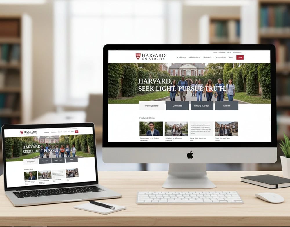
- Colors: Official palettes (often tied to university emblems) should dominate the design. For example, Harvard’s crimson or Oxford’s dark blue instantly signal institutional heritage.
- Logos: The logo must be consistently placed (usually top-left) and linked to the homepage. Variations should be avoided to maintain brand integrity.
- Typography: Universities often adopt custom or licensed fonts to distinguish their identity. Serif fonts convey tradition, while sans-serif fonts suggest modernity.
- Imagery: Use authentic photography—students, faculty, campus life, research labs—rather than stock images. Real visuals build trust and emotional connection.
- Professionalism: Clean layouts, structured navigation, and academic tone reinforce credibility.
- Tradition: Incorporate heritage elements (crests, mottos, historical imagery) without overwhelming modern usability.
- Modernity: Responsive design, interactive features, and multimedia storytelling appeal to digital-native students.
Academic Program and Course Page Design
- Header and Overview: Start with a concise program summary.
- Admission Requirements: List key qualifications and deadlines.
- Course Details: Include course content, prerequisites, and possible career outcomes.
- Fees and Financial Aid: Outline tuition and financial support options.
- Contact Information: Ensure easy access to relevant contact details.
- Navigation: Simple and intuitive for ease of access.
Summarize the program in 3–4 sentences that cover the discipline focus, outcomes, and study mode. Provide a structured semester-by-semester or year-by-year outline, separating core courses, electives, and capstone/thesis. Include short course descriptions and precise prerequisites.
List measurable outcomes (skills, competencies, certifications, career paths) to align expectations and aid accreditation transparency. Link to faculty profiles, research labs, accreditation details, and industry partnerships to demonstrate depth beyond marketing copy.
Admissions and Enrollment System Integration
- Innovative Forms and Validation: Break long forms into steps with progress indicators. Validate in-line (format, file type, size) and provide examples/tooltips for transcripts, test scores, and SOPs to reduce errors and support first-time applicants.
- Document Workflows: Support multiple document formats, secure storage, and versioning. Allow conditional uploads based on applicant type (domestic/international, transfer, postgraduate) to make portals feel more personalized rather than generic.
- Real-Time Status Tracking: Provide applicants with a dashboard that clearly displays milestones (submitted, under review, decision pending, decision released, offer accepted) and expected timelines. Visible status reduces anxiety and inbound queries.
- Two-Way Communication: Offer secure messaging within the portal so applicants can ask questions and admissions staff can respond with context (attached files, notes). Preserve these threads in the record for auditability.
- Seamless Data Flow: Sync applicant profiles, documents, decisions, offers, and matriculation data directly into the SIS to eliminate manual re-entry and errors. Map fields carefully (name variants, IDs, program codes, term codes) to preserve data integrity.
- Compliance and Security: Enforce role-based access, encryption at rest/in transit, and audit trails. Use APIs with granular permissions; log system-to-system calls to meet internal governance and external regulatory requirements.
Faculty, Research, and Department Pages
- Structured Profiles: Each faculty member should have a dedicated page featuring qualifications, teaching areas, research interests, publications, and contact details.
- Academic Credibility: Highlight peer-reviewed publications, conference presentations, and grants. According to Elsevier, over 70% of students and researchers check faculty publications before applying to programs, making this a critical trust signal.
- Audience Segmentation: Organize content for prospective students (programs, admissions), current students (resources, advising), and external audiences (research collaborations, industry partnerships).
- Visibility of Innovation: Highlight active research centers, labs, and projects with descriptions, objectives, and outcomes. Use videos, infographics, and interactive timelines to showcase breakthroughs.
- Rankings and Recognition: Display global rankings, accreditations, and awards prominently to reinforce credibility. Showcase grants, fellowships, keynote lectures, and patents.
- Student Involvement: Highlight student-led research projects, competitions, and innovation challenges to demonstrate a vibrant academic culture. Pair academic excellence with impact stories.
A university website acts like the living heartbeat of its identity and mission. Making the university more visible, credible, and engaging is mandatory to serve the diverse interests of its audiences worldwide. Structuring logically, embedding trust signals, and integrating digital services are a must. They let a university create an online ecosystem to empower students, faculty, alumni, and partners alike.
Contact Tectera a web design company in Sri Lanka for website design for university.
Frequently Asked Questions
The homepage must feature straightforward navigation, academic programs, admissions information, research highlights, campus life, and CTAs such as Apply Now or Request Information.
Consistent use of colors, logos, typography, and imagery reinforces institutional identity and builds credibility across global audiences.
Programs should have structured layouts with curricula, admission requirements, fees, deadlines, and career outcomes to support informed decision-making.
Portals should provide secure login, grades, schedules, LMS access, library integration, and financial services in one centralized dashboard.
Testimonials and alumni success stories provide social proof, strengthening trust and motivating prospective students to apply.
