If you’re a salon owner and looking for some salon website design ideas for your website then you’ve reached at the right destination. This blog will prove to be a perfect guide and will help you decide how to perfectly design your salon website to make it appear attractive and functional.
Before starting to design, it is important to be aware of the website design trends specifically of those who shares the same focus as you. This helps you to stay updated of the recent trends and make the step of creating sitemap easier. A sitemap is actually a rough draft of how you want to make your website look like and what features and pages it should have.
Once you have your sitemap approved you can then choose a template and design it accordingly. Let’s have a look at different design ideas to help you get inspiration;
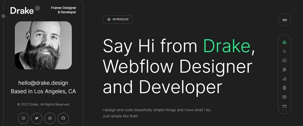
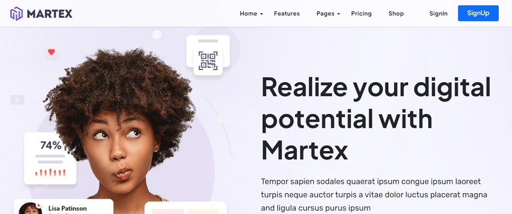
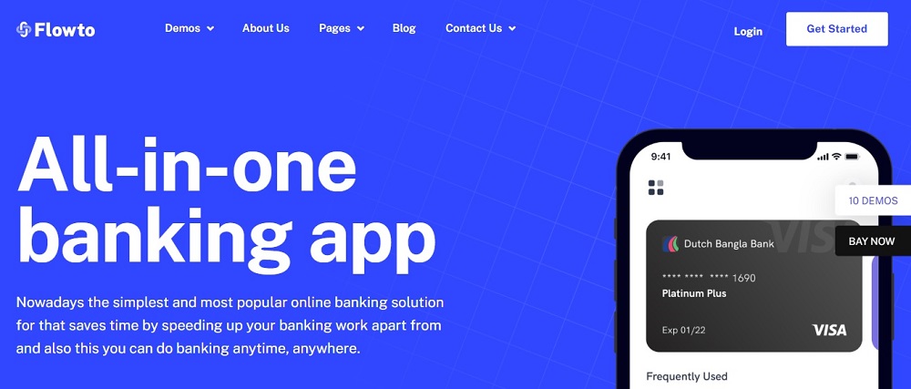
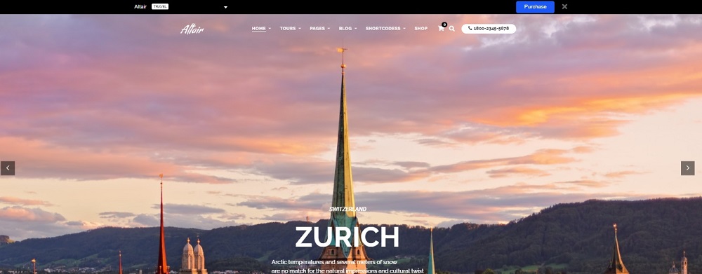
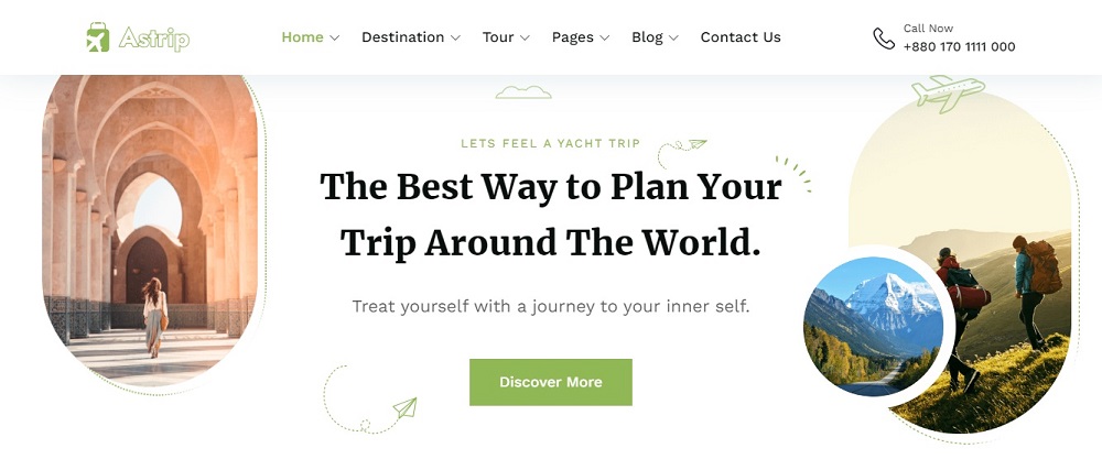
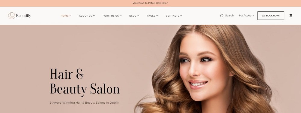
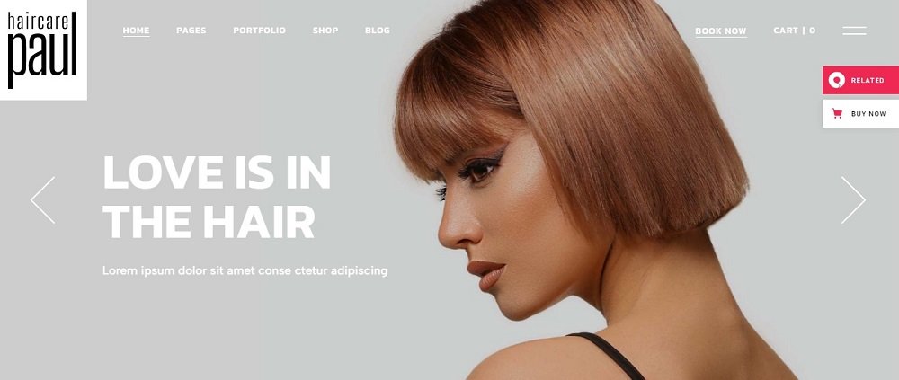
Salon Website design Idea 1
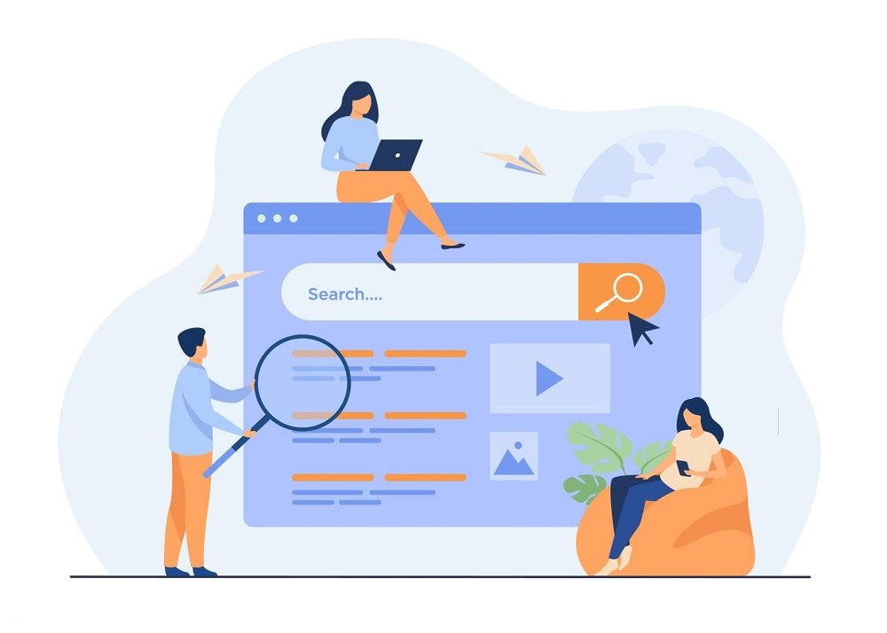
This website design is clear accessible and functional, the designer chooses to mention the name, location of the salon and how long they’ve been providing their services clearly. The right use of color pallet and graphics makes this website look attractive. Keeping in mind the 4P’s of marketing, the designer has added portfolio to showcase their work and services and also has added the option to shop or book appointment. Plus, in order to help the customer navigate through the page the designer has provided the option to search so that the potential customer can directly look into the services and products they’re more interested in.
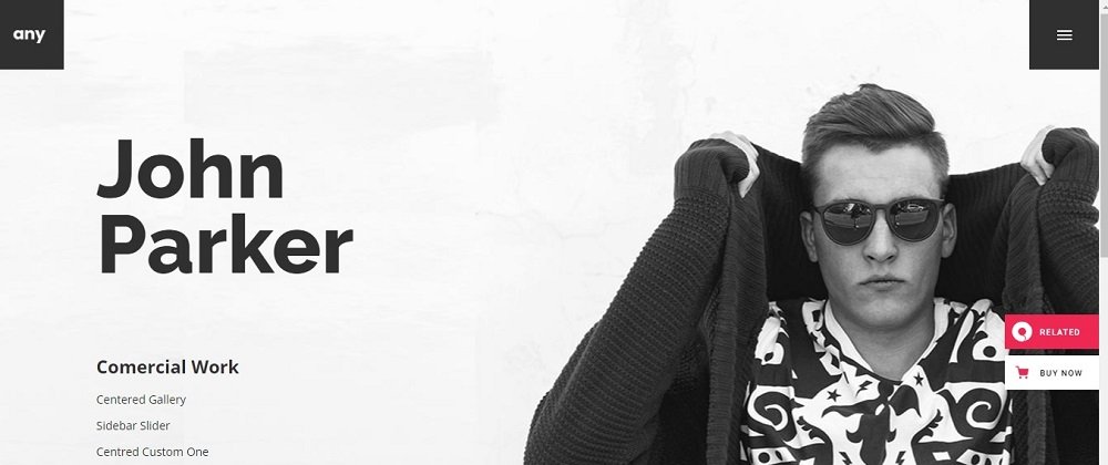
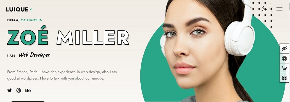
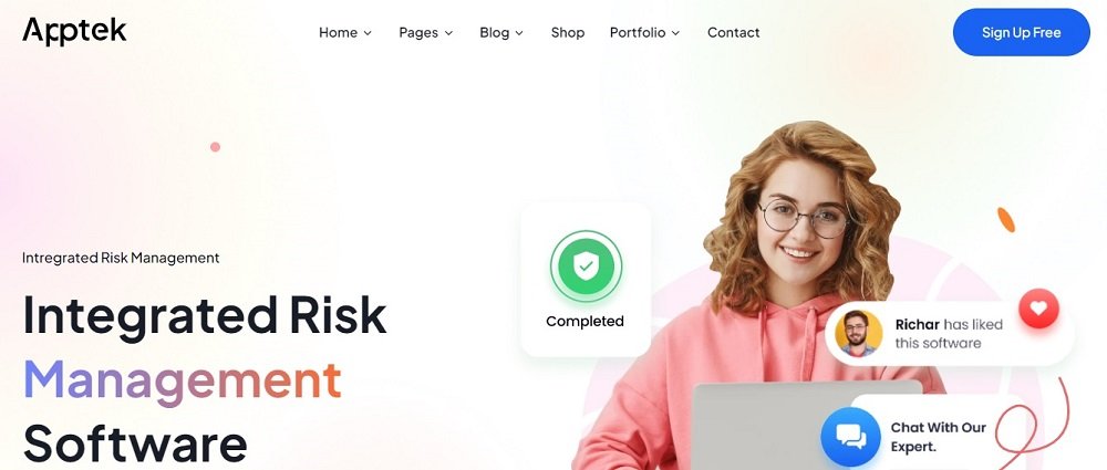
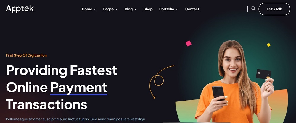
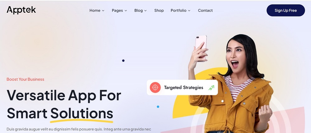
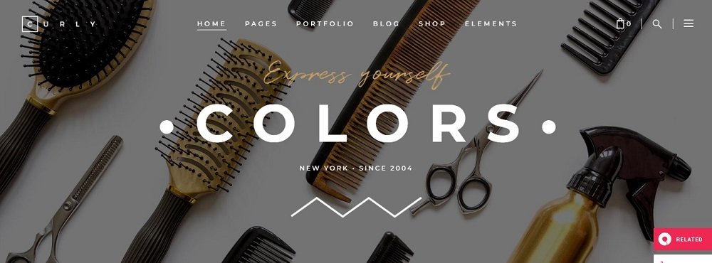
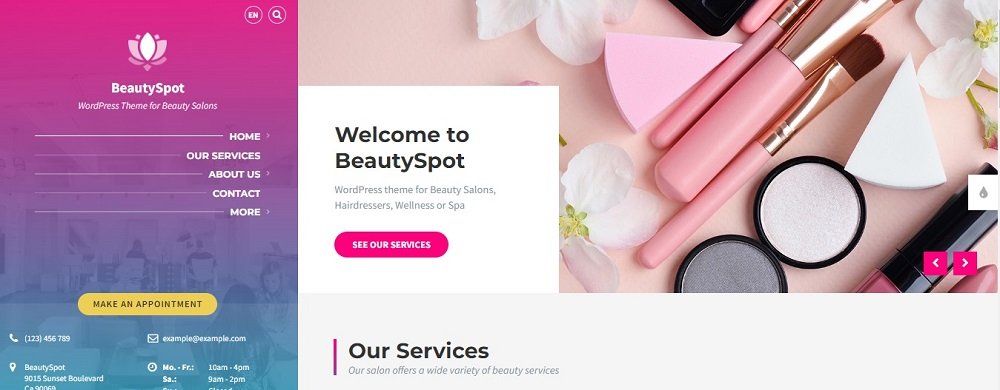
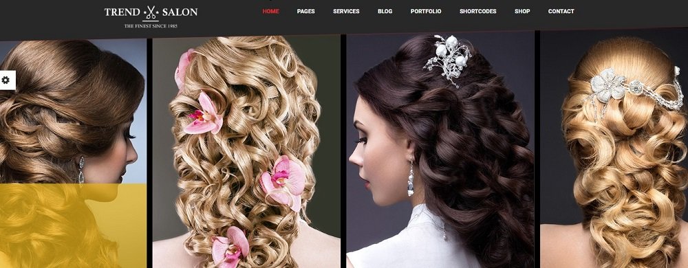
Salon Website design Idea 2
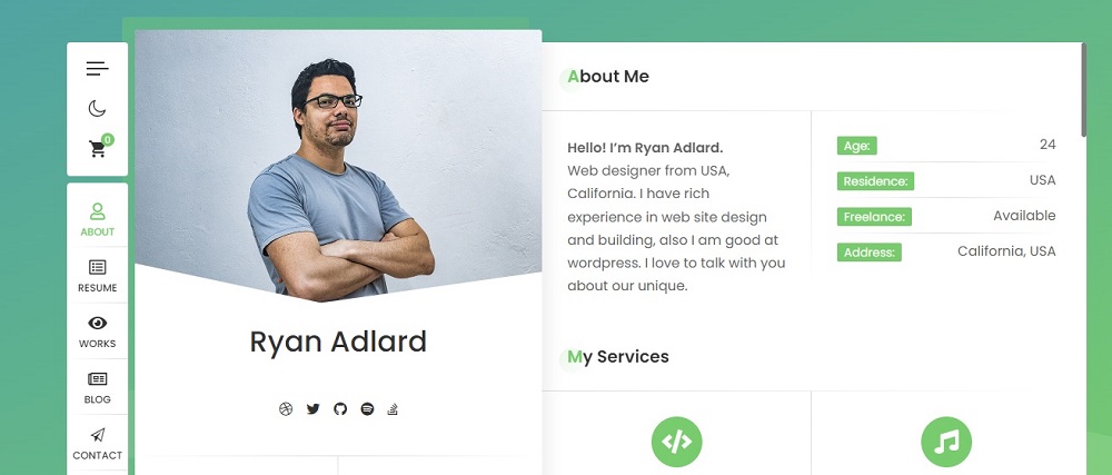
This website design looks amazing at very first glance, the use of subtle and nude colors makes the website outlook well designed and functional. The designer has smartly mentioned the name of salon and the services they offer, not only that but has rightly utilized the opportunity of mentioning the achievement of the salon to gather public’s attention. Apart from this, the portfolio and introduction about the salon is added for further clarity and customer trust.
The other distinct feature about this website is, it enables the user to create their account to avail the services and has provided the option to book to get the customers on board. Additionally, they’ve provided their contacts to answer queries from customers.
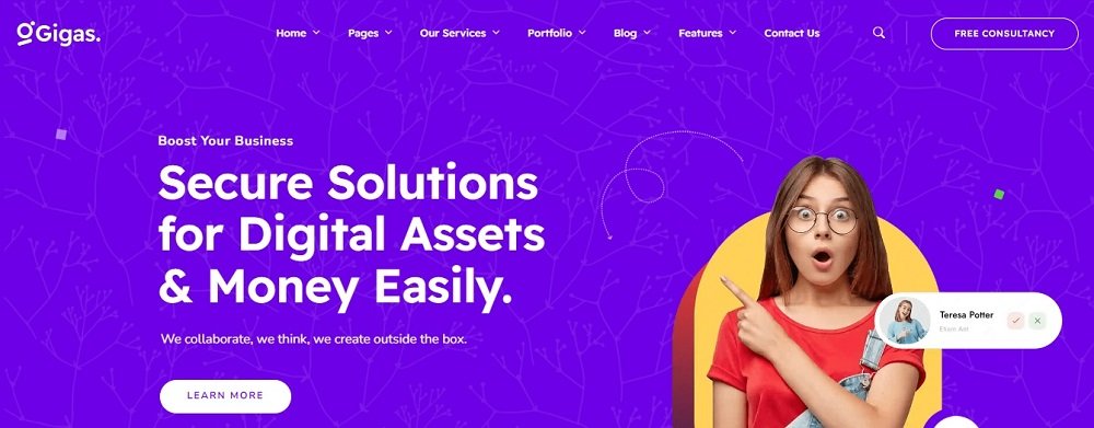
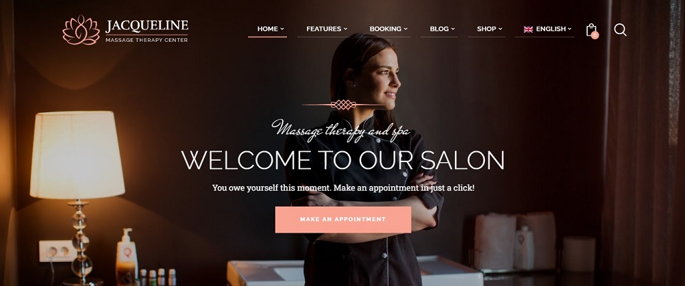
Salon Website design Idea 3
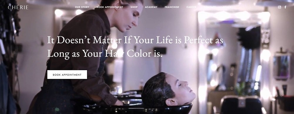
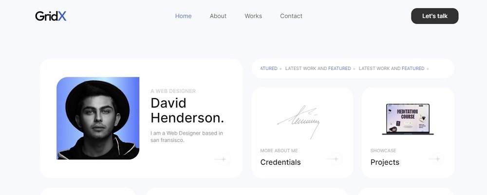
The designer opted an exceptional style by adding a catchy caption at the homepage of the website. This website also contains the story of the salon talking about how they started and how far they have come in this industry. It also includes the option to book appointment, shop and also has the option for career for people who want to get on board with them. Apart from this, they have mentioned the location of their franchise and has provided social media handles to make an impact in the market and grow popularity among the customers.
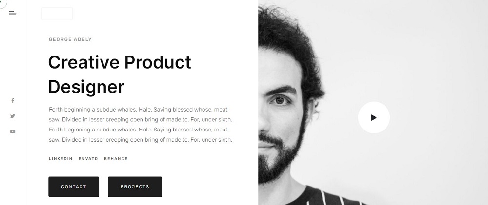
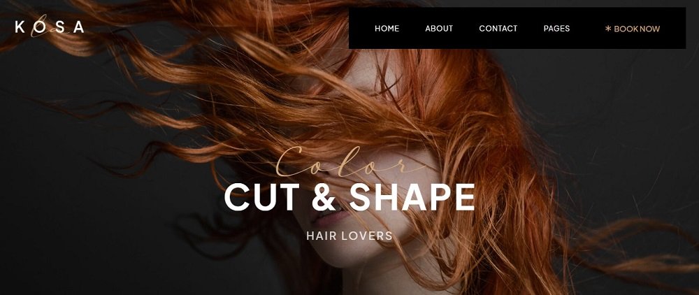
Salon Website design Idea 4
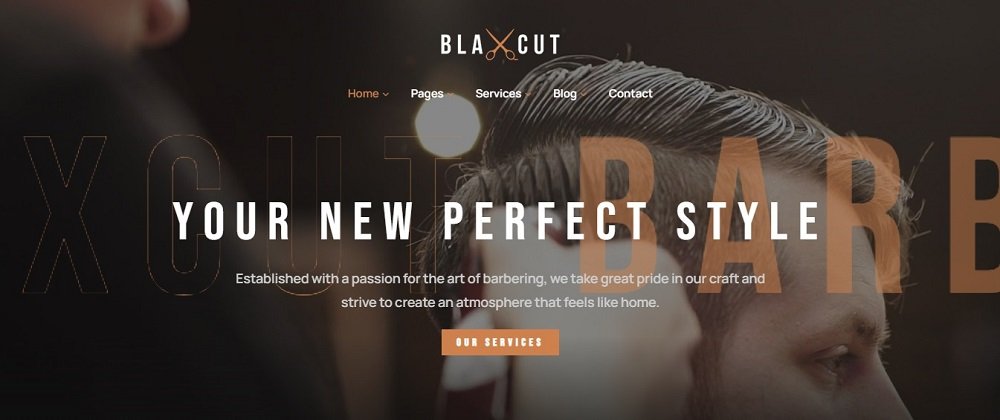
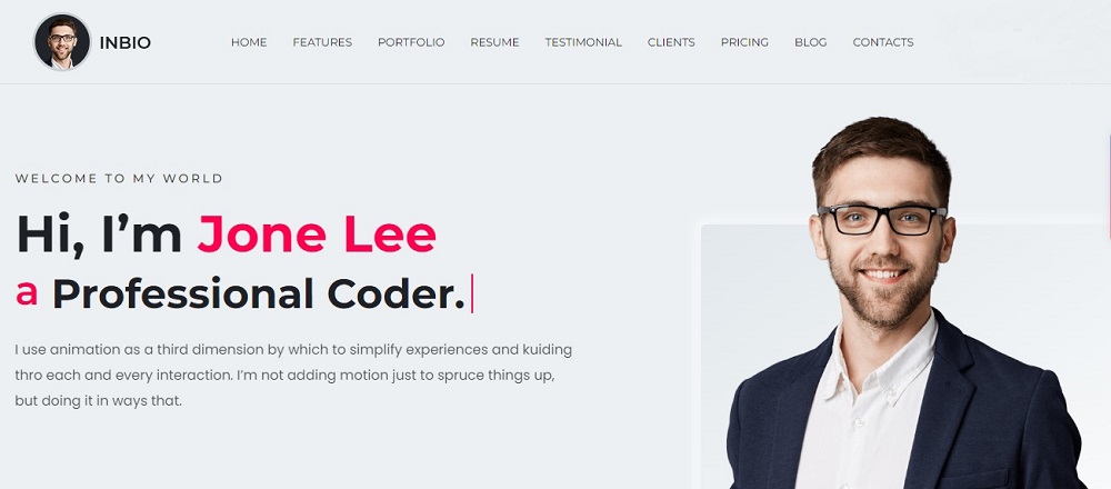
The very first thing to catch your eye after having a look at this website design is the caption which perfectly defines the salon’s specialty. The designer has mentioned a brief introduction about the salon and has mentioned the services they offer. For customer satisfaction they’ve provided the option to contact in order to engage with the customers and answer their queries.
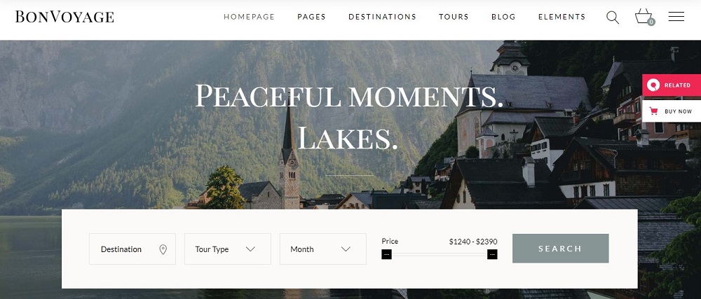
Salon Website design Idea 5
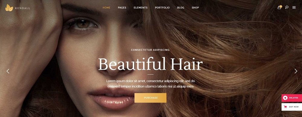
The highlight of this website design is the captivating tagline and a brief introduction about the salon along with the option to purchase. The website includes portfolio, blog and the option to shop. For further clarity the designer has provided the search option to help the customer find what they’re looking for. They have also smartly added a buy now icon on the front of the web page to engage customers in making a purchase.
Salon Website design Idea 6
This website design also incorporates an appealing tagline and a brief history of the salon. The overall look of the website is kept simple and user friendly and is based on light color theme to make a statement. The homepage is provided with the option of portfolio to show their services and the option to shop. In order to make the appoint process easier for the customer, book now option has been provided at the top right side.
Salon Website design Idea 7
This website includes different color transition to make it appear attractive and welcoming.
Instead of choosing the contemporary template, the designer opted a template with more text and information. The website includes a little introduction about the business along with their services. It also includes the contact number, email address and the location of the salon with operational timings to make it easier and hassle free for their customers. Apart from all this, the graphics of the website is classy and different with the right use of colors and designing approach.
Salon Website design Idea 8
This website design looks professional and exclusive, the designer has made sure to make the tagline captivating and the right use of graphics and template adds more value to the overall outlook of the website. The option to make an appointment looks pretty accessible. Also, the website has a separate page for the features of this salon that make them stand apart from others. Additionally, they’ve provided the option to change the text language for making it user friendly accompanied by the option of booking and shop.
Salon Web site design Idea 9
The designer has used the approach of simplicity by keeping the graphics and template simple and subtle, precisely describing the salon’s service and making sure not to over crowd the home page of the website. This seems like a smart idea, with less but meaningful text. The designer has tried to design this website keeping in mind accessibility and user approachable.
Salon Web site design Idea 10
This looks like an innovative website design idea, the designer instead of writing a tagline or description about the salon has showcased the work as a sample to gather customers attention. The portfolio as presented on the homepage is doing enough justice with the website already. Apart from this, the page also includes the services they offer, portfolio and contact details to get in touch with clients.
To get more salon website design ideas contact Tectera who provides web design in Scarborough.
See Also: