Looking for website design ideas for School? Check below best 10 ideas.
In the digital age, school websites are like having a lively stage that shows what they stand for, its successes and how it teaches. Making a school website is not just about its look and feel, it’s about how you can create a good website that incorporates good website design functionalities ans still keep the community involved.
Table of Contents
ToggleThis guide shares ten cool ideas for school website designs. It explains how to use good web design tricks without losing quality and clear communication.
Let’s see what makes a good website and look at some great examples that use these ideas in their designs!
Responsive Design
Responsive design means making a website work and look good on all kinds of screens and devices. This includes not just pictures and words, but also things like animations, videos, and interactive stuff.
Here are some great website examples that incorporate responsive design into their websites.
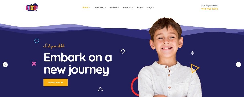
The school website is a great example of a design that works well on different devices. It uses moving elements that follow your mouse when you move it. This makes the website fun to use and keeps you interested in what’s on it. It doesn’t matter if you’re on a big computer or a small phone, the website looks good and works the same.
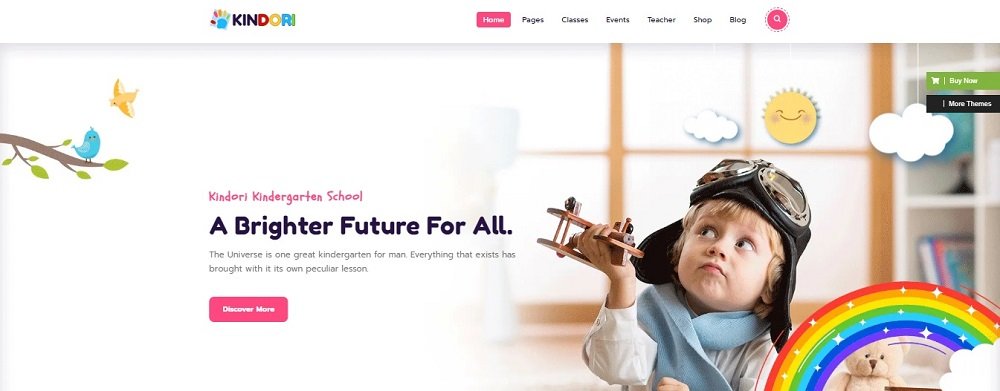
Another good example of a website that is responsive is above. It’s designed to keep you interested while you use it. Also, the website loads really fast, so you don’t have to wait. This is important because it makes sure you don’t get bored waiting for things to show up. Above school website shows how a website can be both fun and work well, no matter if you’re on a computer or a phone.
Clear Use Of White Space
Using negative space in a smart way makes it easier to read and focus. A good website leaves enough empty space around their pictures and short descriptions to be noticed well. This helps those things catch the eye and get the attention of people who are interested in the school.
Now, let’s check out some examples.
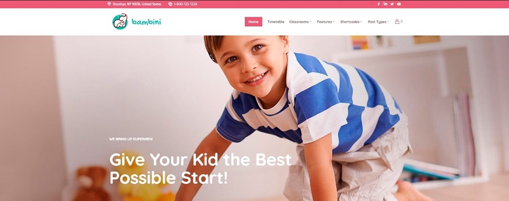
This website shows how to use empty space in a smart way. It lets the different parts of the page have their own space, so you can see and understand everything easily. The website looks clean, and it makes sure you notice the important stuff.
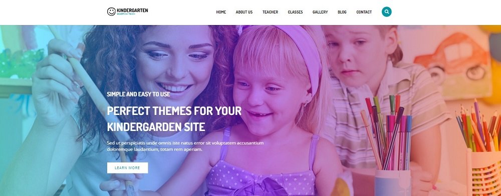
This website is another good example of using empty space well. It doesn’t crowd the page with too many things. Instead, it gives each thing its own space to breathe. This makes the website look neat and organised, even if there’s a lot of information.
Visual Appeal
How things look is really important in catching people’s eye and showing what a brand is like. When you’re making a website, you have to be careful about this because if it doesn’t look nice, people might leave quickly. The goal is to want to keep the visitors on your website long enough to tell them what you want to say!
Here are some examples visually appealing websites:
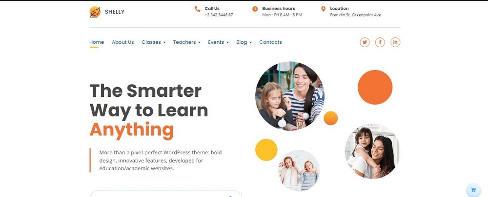
When you go to a website, how it looks is the first thing you notice. If it looks good, you’ll want to see more and check out what’s there. This website does a great job of making a good first impression. But, a good design also makes sure it’s easy to use and looks nice at the same time. This website gets that balance right.
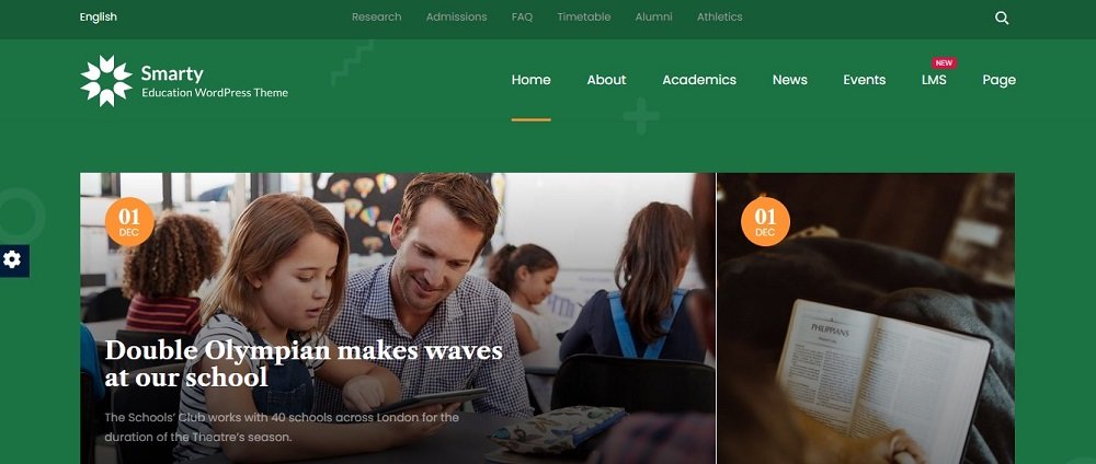
Having all the important stuff visible at once can increase the value of the website. People like being able to quickly see what they need without feeling confused. This is about making things easy to find and understand. The way a website looks also helps you recognize a brand. This website is a good example that maintains the brand identity as well.
User-Centred Design
When it comes to school websites, we want to make sure they are easy and helpful for students, parents, and teachers. That’s why we have to focus on designing them with the user in mind!
Let’s take a look at some examples of school websites that are designed with the user in mind:
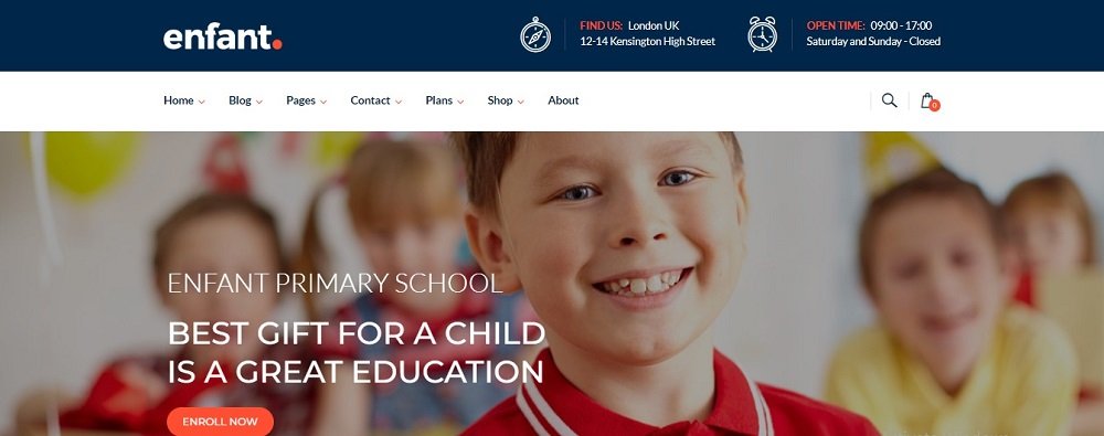
This website is a great example of thinking about what users want. Everything on the website, like how it’s set up and how you can interact with it, is made with users in mind. When you use this website, it feels like it knows what you want and helps you find it. The important stuff is easy to find.
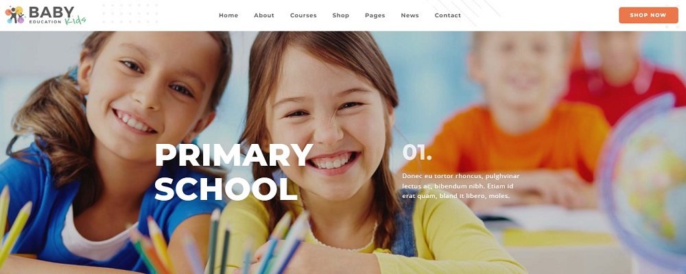
This website is an excellent example. It’s designed to assist parents and students providing information about prices and the staff. This showcases how a website can be helpful when it’s created with users in focus. It’s about ensuring that everyone can easily find what they’re looking for and enjoy their experience.
Clear Navigation
Well-structured website navigation is akin to a road map guiding visitors through the website’s offerings.
Let’s take a look at some examples:
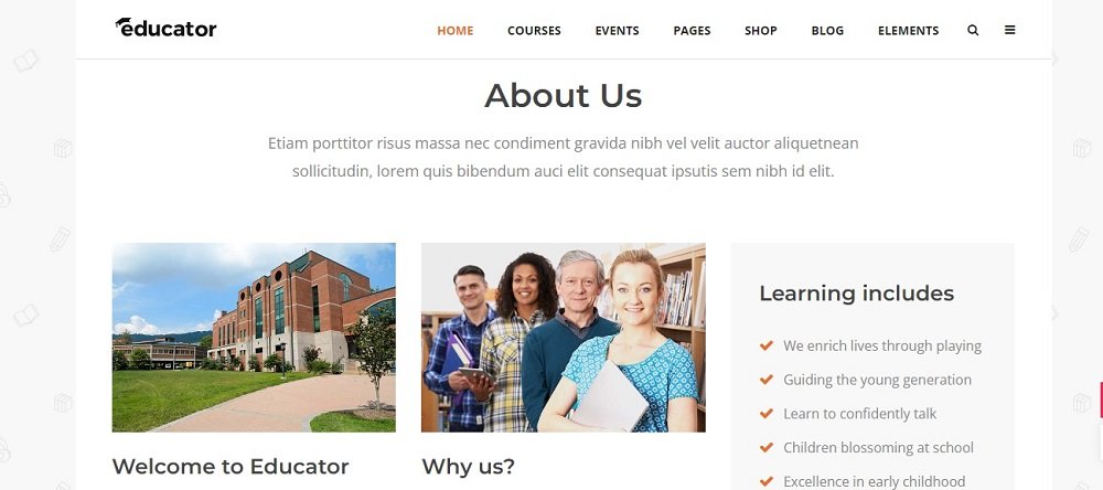
This website is a great example of easy navigation. They’ve organised everything in a smart way so that you can find things easily. It’s like putting similar things together, such as having a section for “courses,” another for “events,” and even a “blogs” section. They also have a search bar that lets you find anything quickly. It’s like having a shortcut to what you’re looking for.
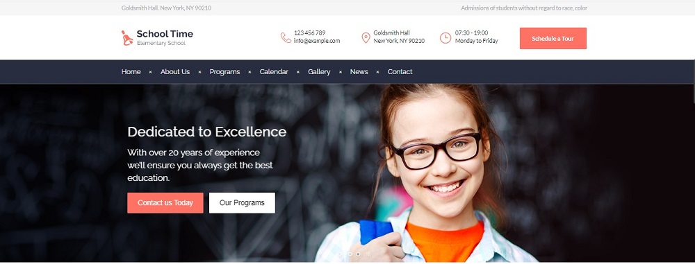
This website is a perfect example of how to make moving around really clear. It’s designed so that you don’t get lost. They have a menu with different sections like “About Us,” “Programs,” “Calendar,” and “News.” It’s like having signs that show you the way. This makes using the website much better for everyone.
Conclusion
In this guide, we explored 10 website design ideas for School and learned how to make a great school website while keeping quality communication.
Now, you can use these ideas for your own school website.
Contact Tectera who provides web design in Toronto to develop school website.
See Also:


