Looking for website design ideas for IT company? An outstanding web design is one of the factors that might help you stand out in this highly competitive field, especially with the rising standards that tech giants like Apple are establishing in terms of digital presence.
A well-designed website should engage the visitor while also carrying out the purpose for which it was created. Good website design is influenced by a variety of elements, including consistency, colors, font, images, simplicity, and usefulness. The way a website is perceived depends on a number of important design factors.
Table of Contents
Toggle- Website Design Idea For IT Company 1
- Website Design Idea For IT Company 2
- Website Design Idea For IT Company 3
- Website Design Idea For IT Company 4
- Website Design Idea For IT Company 5
- Website Design Idea For IT Company 6
- Website Design Idea For IT Company 7
- Website Design Idea For IT Company 8
- Website Design Idea For IT Company 9
- Website Design Idea For IT Company 10
A well-designed website can encourage users to take action by building trust. Making sure that your website design is optimized for usability and how simple it is to use is a crucial part of creating a fantastic user experience. The most effective websites usually present what they offer directly on the homepage.
Some of the best tech websites support the focus of their services with strong landing pages geared toward customers that help shape the company’s identity without compromising accurate descriptions of its more abstract services.
Given below are 10 IT company websites based on design, functionality, originality, and user experience. These websites represent online excellence in the tech and IT industries, from visually appealing layouts to smooth navigation.
Website Design Idea For IT Company 1

Too frequently, when you visit a website, you must first determine the brand’s mission but when you visit the above it company website, you know exactly what to expect. This website’s appealing tagline, “Best IT service provider,” demonstrates the company’s confidence and aids in fostering trust among site visitors.
It has a very aesthetically pleasing blue-and-white color scheme. The interactive homepage displays the most important information, like the company’s phone number, email address, and handles for all four social networking platforms, making it easier for clients to get in touch with them.
Website Design Idea For IT Company 2
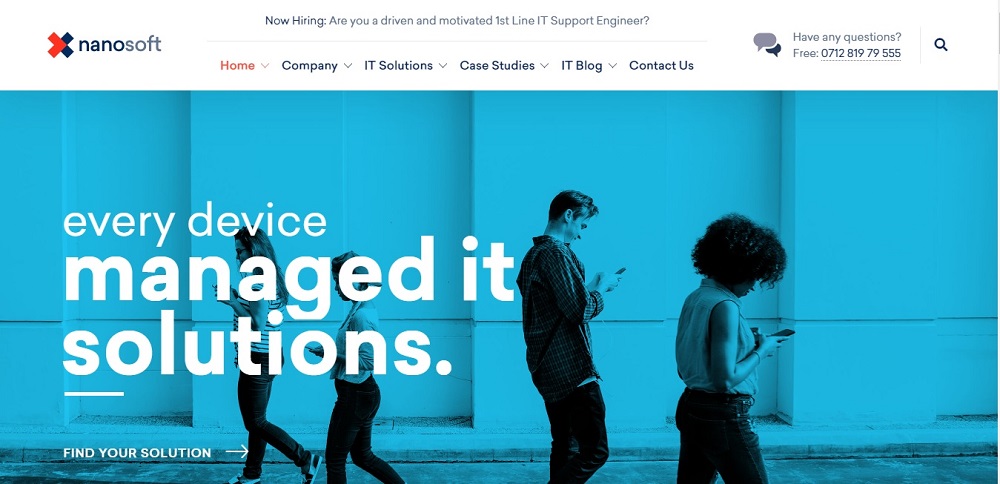
With a straightforward website navigation menu, this website is both aesthetically pleasing and functional. The white and light blue color scheme is calming to the eyes. The large, bold text on the homepage makes a statement and emphasizes what the company offers to customers directly.
Customers can find solutions and answers to questions via the site. The website has also listed vacancies on the very top of the page.
Website Design Idea For IT Company 3
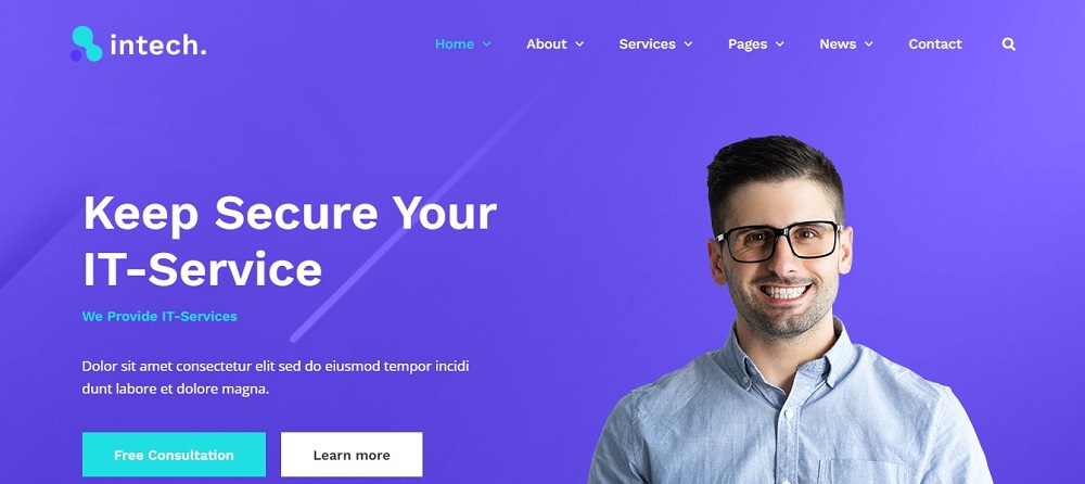
The company’s phone number is listed at the top of the homepage, and there are other pages on the menu with further details about the business, what they offer, and how to get in touch with them.
The website follows a very bright background with a touch of blue and white. It has a search bar on top along with the news and About drop-down lists.
Website Design Idea For IT Company 4
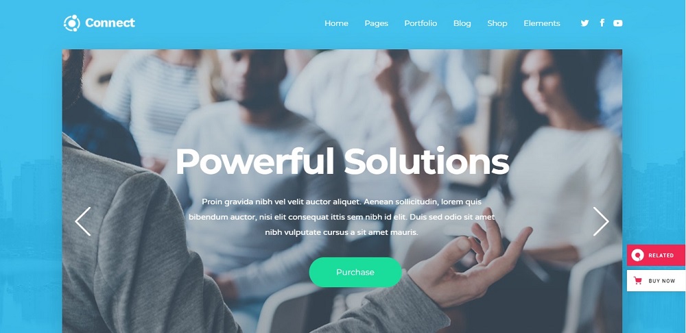
The following is much more than a digital directory. It is an innovative technological platform that links users to power solutions all over the world. This website offers predictable and reasonable fixed elements, clients have the option to directly purchase services via the site, and it has an innovative and technologically enabled model that supports a business to thrive across all stages of growth.
The site follows up with a blue and white texture for the background. It also has social media page links on top of the page. A very serene background and soft colors give off a positive first impression.
Website Design Idea For IT Company 5
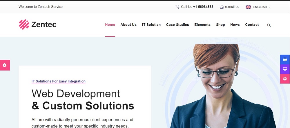
This website features a red, white, and faintly black font color scheme. It gives the clients important details such as their phone number and email. Customers can dial a direct number with just one click, and a separate contact icon is available on the website. It lists the services and elements.
A white and blue-textured image can be found on the website. The website is imaginative and makes a good first impression on the visitor.
Website Design Idea For IT Company 6
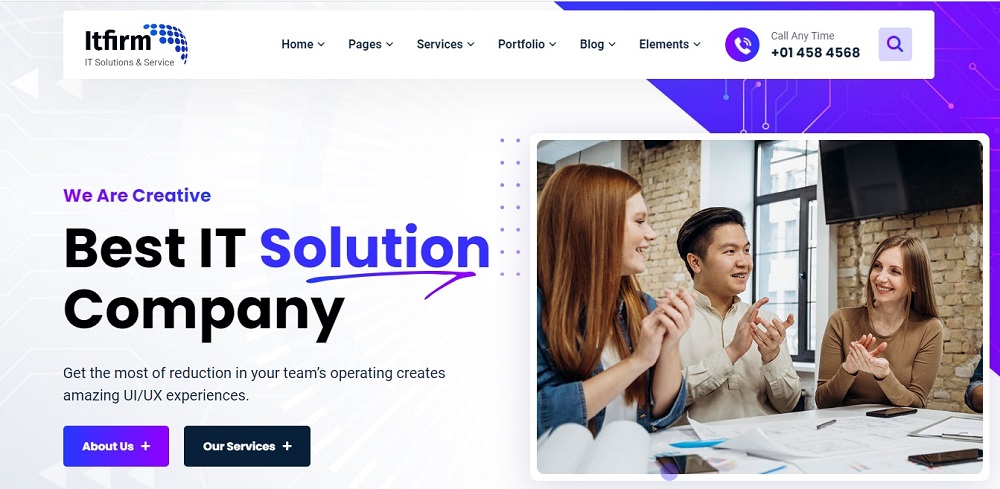
This website provides all essential information, including contact, about, and services. The website has a black and purple context that follows a background texture of purple and white texture. The top of the website offers customers the option to request services at any time.
The website has a separate tab for the common information, including the blog, elements, and pages, in light of all these facts. The company logo, which perfectly complements the website’s background, is displayed at the very top of the homepage.
Website Design Idea For IT Company 7
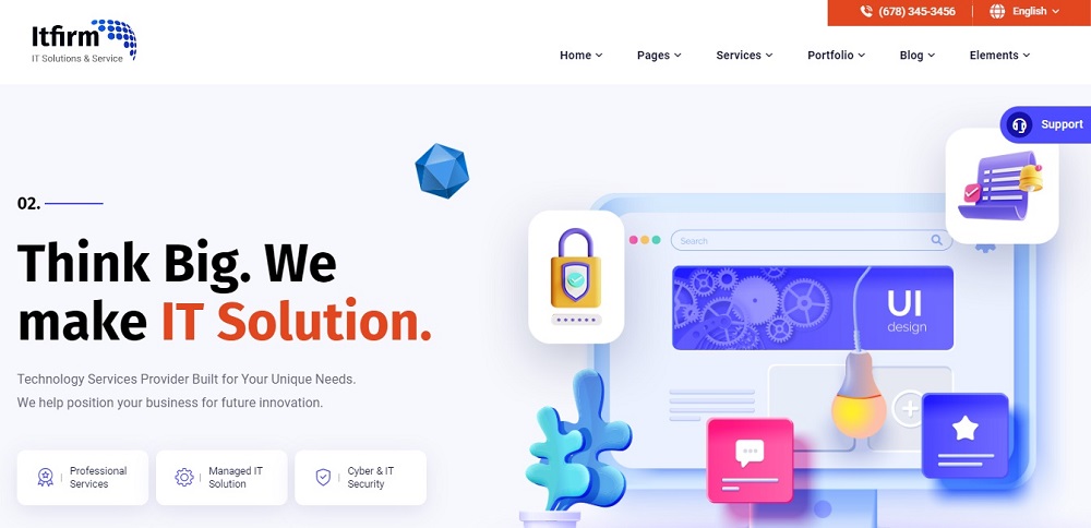
Customers can view blogs and portfolios on the website. It frequently has tabs for viewing services and elements. The phone number and email address are on the page. The texture of the website is purple and white.
Additionally, tabs for home-pages and pages are located at the top. The website has options for customers to view their primary services and a background with the artwork. Customers can select the language they want to view in as well.
Website Design Idea For IT Company 8
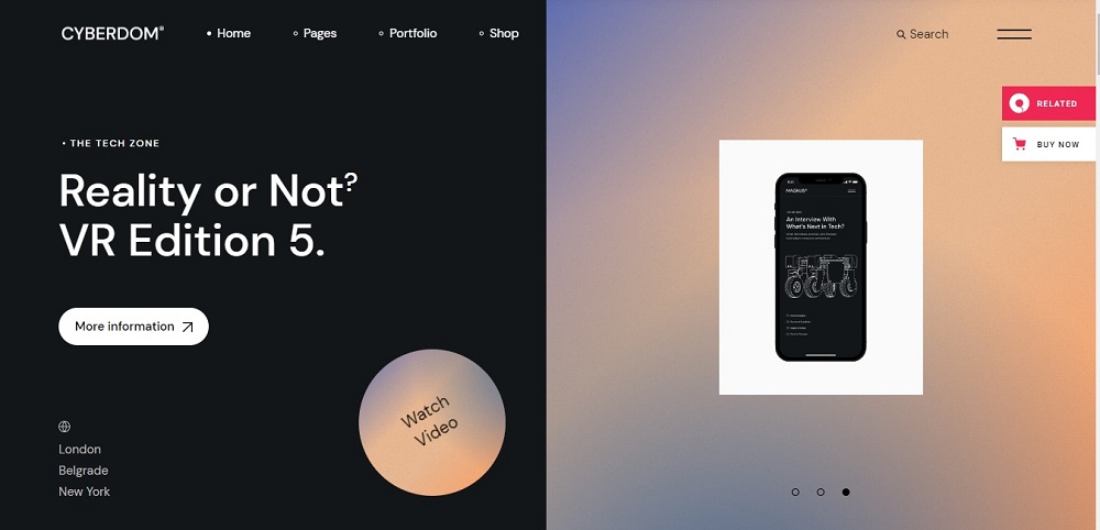
This website is very straightforward but consistent. It has a primary menu bar with information on everything from services to contacts. The website’s black background draws attention to the white letters on the page.
It has an orange and purple textured gradient background. Services and contact information are available on the website. Both a search bar and a list of the locations are present. Customers can click once to watch a video and learn more!
Website Design Idea For IT Company 9
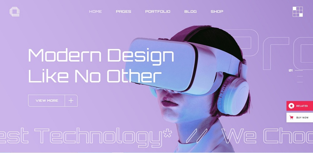
In addition to having company information on the blog pages, the website also has it at the very top. The website uses a purple and blue color scheme that leans more toward a gradient background.
Customers can browse products and purchase them online. The website has a shop bar at the top where customers can browse and buy products. Through the website, customers can view additional and pertinent information.
Website Design Idea For IT Company 10
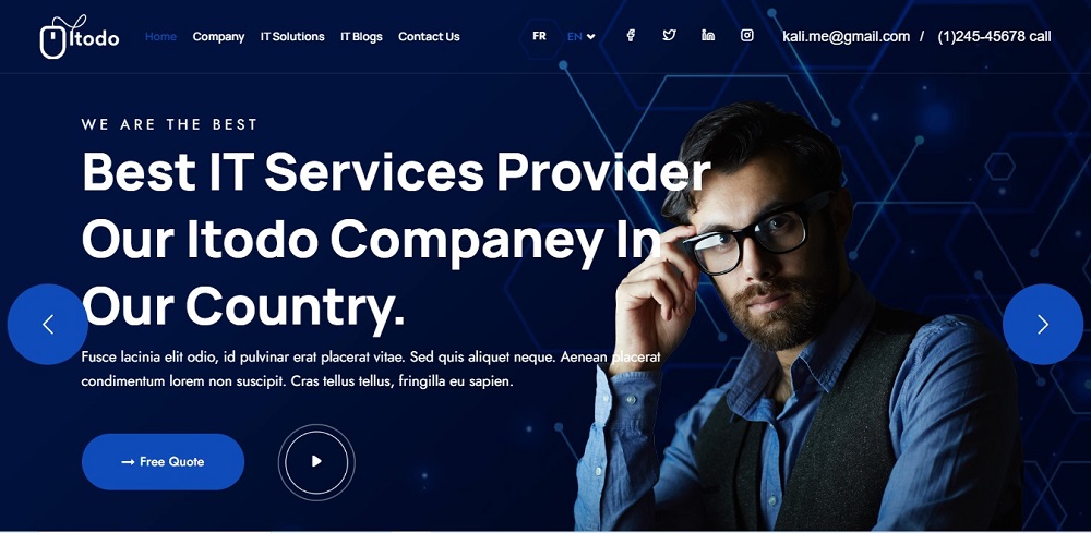
The colors on this website are dark blue and white. It contains contact information like a phone number and email. Clients can learn how the organization operates on the website’s unique features. The website offers information about the features and search bar in addition to the blogs.
Some websites allow you to save the things that inspire you, which adds a personal touch. However, having a few solid starting points can assist you in meeting the demands of your clients while motivating you to investigate novel design solutions, stay current with design trends, and exercise your creativity.
These can serve as inspiration for any client, business, or portfolio website in addition to your own agency website. A crucial element is comprehending the goal of your website and thoroughly investigating the rivals.
Contact Tectera who do web design in Toronto to get website design ideas for IT company.
See Also:


