


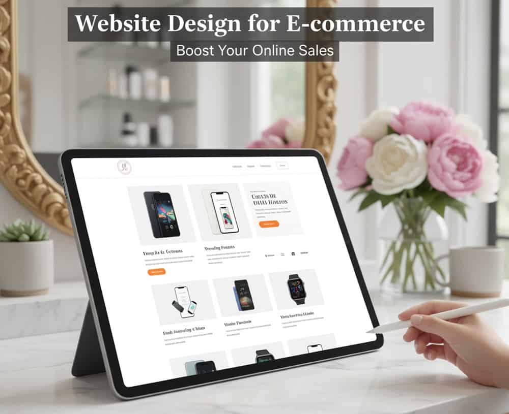
Looking for website design for E-commerce?
Your e-commerce website acts like the digital storefront. It’s the first thing customers see, judge, and interact with. Visitors decide whether to browse, buy, or bounce within seconds.
Table of Contents
ToggleStill, many e-commerce businesses pour resources into ads, SEO, and listings while overlooking website design. A cluttered layout, confusing navigation, or slow load time can erode trust and sabotage sales.
This article dives deep into the principles, features, and strategies that make ecommerce sites not just appealing but strategically effective, which drives engagement, trust, and transactions.
Why Website Design Matters in E-commerce?
Your website design is your silent salesperson. It influences how users feel, behave, and decide — often within milliseconds. For instance,
- 94% of first impressions are design-related.
- 75% of users judge a brand’s credibility based on its website design.
- A well-designed UI can boost conversion rates by up to 200%.
Clean, professional design signals legitimacy and security. Poor design breeds skepticism. Confusing layouts, slow pages, or hidden fees lead to drop-offs. Clear CTAs and fast checkout reduce friction.
Key Elements of a High-Converting E-commerce Website Design
Clean and Intuitive Layout
Simplicity sells. A cluttered interface overwhelms users and dilutes your message. Instead, prioritize clarity and hierarchy –
- Visual hierarchy ensures users know where to look first — typically product images, pricing, and CTAs.
- Whitespace (or negative space) creates breathing room, making products and buttons stand out.
- Short menus and organized categories reduce cognitive load and improve navigation.
Mobile-Friendly and Responsive Design
With over 60% of ecommerce traffic now coming from mobile devices, responsive design is non-negotiable. Key mobile design principles –
- Fast-loading pages: Mobile users are impatient, as delays lead to drop-offs.
- Large, tappable buttons: Avoid tiny links or crowded interfaces.
- Streamlined checkout: Autofill, guest checkout, and mobile wallets.
Fast Loading Speed
Speed is a silent killer of conversions. Every second of delay can reduce conversions by up to 20%. Speed optimization tactics include –
- Compress images without sacrificing quality.
- Use browser caching to store assets locally.
- Leverage CDNs to deliver content faster across geographies.
- Minify code and optimize hosting for performance.
Strong Branding and Visual Consistency
Your brand is your promise — and design is how you deliver it visually. Consistent color palettes and typography build recognition. A memorable logo and brand story create an emotional connection.
Product images and banners should reflect your brand’s tone — whether minimalist, luxurious, playful, or eco-conscious. Consistent branding across platforms can increase revenue by up to 23%.
Clear and Visible CTAs (Calls to Action)
CTAs are your conversion catalysts. They should be –
- Action-oriented: Use verbs like “Buy Now”, “Get 20% Off”, or “Add to Cart”.
- Visually distinct: Use contrasting colors and strategic placement.
- Surrounded by minimal distractions: Avoid clutter or competing elements near CTAs.
Homepage Design
Your homepage must captivate, inform, and guide users within seconds. Bounce rates are high, and attention spans are short. And homepage design directly influences trust, engagement, and sales.
- Top-selling or seasonal products: Highlight what’s trending or timely (holiday bundles, new arrivals).
- Clear value proposition: Communicate what makes your brand unique — fast shipping, ethical sourcing, exclusive deals.
- Strong CTA: Use action-driven buttons like “Shop Now”, “Get 20% Off”, or “Explore New Arrivals.”
- High-quality visuals: Crisp, professional images build credibility and showcase product quality.
- Trust indicators: Add badges like “Free Shipping”, “Secure Checkout”, or “30-Day Guarantee”.
Featured Categories and Product Highlights
Once users are intrigued, they need direction. Featured categories and product highlights simplify navigation and accelerate discovery. Best practices include –
- Trending collections: Use data to spotlight what’s popular — “Best Sellers”, “Editor’s Picks”, or “Back in Stock”.
- Visual tiles or cards: Make categories scannable with icons or thumbnails.
- Quick links: Offer shortcuts to top categories like “Men’s Shoes”, “Skincare”, or “Tech Deals”.
Social Proof and Trust Signals
Trust is the backbone of e-commerce. Social proof reassures users that others have bought, loved, and recommended your products.
- Customer reviews and ratings: Display average ratings, review snippets, and verified buyer badges.
- Testimonials and media mentions: Highlight endorsements from influencers, press, or industry awards.
- Security and service icons: Include “SSL Secure”, “Free Returns”, “PayPal Verified”, or “24/7 Support”.
Product Page Design
Your product page is the final pitch before a purchase. It’s the digital equivalent of a sales associate answering questions, showcasing features, and nudging the buyer toward checkout.
High-Quality Product Images
- Multiple angles: Show front, back, side, and close-ups.
- Zoom-in and 360° views: Let users inspect details like texture, stitching, or finish.
- Real-life usage: Include lifestyle shots, models, or contextual environments.
Clear and Engaging Product Descriptions
- Benefit-driven copy: Focus on how the product improves life — comfort, durability, style, etc.
- Bullet points: Improve scannability and highlight key features.
- Size guides, specs, and FAQs: Reduce uncertainty and preempt objections.
Transparent Pricing and Discounts
- Clear pricing: Include taxes, shipping, and any fees upfront.
- Highlight discounts: Use strikethroughs, countdown timers, or “limited-time offer” badges.
- Bundle deals: Promote value with “Buy 2, Get 1 Free” or “Starter Kits”.
Prominent “Add to Cart” and “Buy Now” Buttons
- Contrasting colors: Make buttons pop against the background.
- Sticky placement: Keep CTAs visible as users scroll.
- Intent-aligned copy: Use “Buy Now,” “Add to Bag,” or “Get Yours Today” based on context.
Product Recommendations
- Cross-sell: “You may also like” — related or complementary products.
- Upsell: “Frequently bought together” — bundles or premium versions.
- Personalized suggestions: Based on browsing or purchase history.
Navigation and User Experience (UX) Optimization
In e-commerce, navigation is about guiding through a seamless journey from discovery to purchase. A well-optimized UX reduces friction, boosts engagement, and directly impacts conversion rates.
Simple, Predictable Navigation
- Logical menu structure: Follow intuitive paths like `Home → Shop → Categories → Product → Cart → Checkout`.
- Sticky navigation bars: Keep menus accessible as users scroll.
- Search bar with autocomplete: Helps users find products faster and reduces bounce.
- Filters: Allow users to refine by price, size, color, brand, etc.
Breadcrumbs and Filters
Breadcrumbs show hierarchy like `Home > Men > Shoes > Running Shoes > Nike Air Zoom`. Filters refine results without reloading pages — especially vital for large catalogs.
A combination of UX (Breadcrumbs + filters) initiates clarity for users and authoritative control. 67% of mobile e-commerce sites have poor navigation UX due to missing breadcrumbs.
Intuitive Site Architecture
Site architecture is the skeleton of your e-commerce experience. It determines how easily users can find what they need — and how search engines index your content.
- Three-click rule: Ensure users can reach any core page within three clicks.
- Link related content: Suggest similar products, blog posts, or FAQs to keep users engaged.
- SEO-friendly structure: Use clean URLs, internal linking, and structured data.
Streamlined Checkout Process
The checkout process is the final and most critical step in the e-commerce journey. A streamlined checkout reduces abandonment, builds trust, and increases revenue.
Fewer Steps = More Sales
- One-page checkout: Consolidate billing, shipping, and payment into a single, scrollable page.
- Guest checkout: Avoid forcing account creation — let users buy first, register later.
- Auto-fill and address lookup: Speed up form completion with smart input fields.
Multiple Payment Options
- Credit/debit cards
- Digital wallets: PayPal, Apple Pay, Google Pay, Amazon Pay
- Buy Now, Pay Later (BNPL): Klarna, Afterpay, Affirm
- Local options: M-Pesa (Kenya), iDEAL (Netherlands), Alipay (China)
Secure payment badges with “SSL Secure”, “Verified by Visa”, “PCI Compliant”. The same goes for visible padlock icons and HTTPS in the browser.
Transparent Costs
- Upfront pricing: Show total cost — including taxes, shipping, and discounts — before the final step.
- Free shipping thresholds: Encourage higher AOV with offers like “Free shipping on orders over $50”.
- Real-time shipping calculators: Let users estimate costs based on location and delivery speed.
Progress Indicators
Step-by-step indicators like `Cart → Shipping → Payment → Review → Confirmation`. Highlight the current step and allow users to go back without losing data.
Progress indicators reduce abandonment by up to 10% – 15%, especially on mobile. Amazon uses a clear, linear checkout flow with progress markers and editable sections.
Post-Purchase Experience
- Order confirmation page: Include order summary, estimated delivery, and contact info.
- Follow-up email: Send confirmation with tracking and support links.
- Product suggestions: “You might also like…” or “Complete your look”.
- Loyalty sign-up: Invite users to join your rewards program or newsletter.
Integrating Trust and Social Proof
Social proof is the psychological phenomenon where people mirror the actions of others. It plays a pivotal role in building trust by transforming hesitation into confident purchases.
Customer Reviews and Ratings
- Prominent placement: Display reviews and star ratings directly on product pages, near CTAs, and during checkout.
- Verified reviews: Use “Verified Buyer” tags to distinguish authentic feedback.
- Review prompts: Encourage post-purchase reviews via email or incentives (discounts, loyalty points).
- Filter and sort options: Let users view reviews by rating, relevance, or recency.
User-Generated Content (UGC)
- Customer photos/videos: Feature real-life usage on product pages, galleries, or Instagram feeds.
- Hashtag campaigns: Encourage customers to tag your brand for a chance to be featured.
- Shoppable UGC: Let users click on customer photos to shop the featured products.
- Video testimonials: Showcase unboxing, tutorials, or reviews from real users.
Common Mistakes in E-commerce Website Design
Overcomplicated Navigation or Design Clutter
Confusing menus and visual overload can overwhelm users and derail their shopping journey. Common issues include –
- Overloaded mega menus with too many categories.
- Inconsistent layout or font styles.
- Pop-ups, banners, and sliders competing for attention.
Poor Mobile Optimization
With mobile commerce dominating global traffic, a non-responsive or clunky mobile site is a deal-breaker. Common issues include –
- Tiny buttons and unreadable fonts.
- Horizontal scrolling or broken layouts.
- Slow mobile load times.
Missing or Hidden CTAs
If users can’t find the “Add to Cart” or “Buy Now” button, they won’t convert — no matter how good the product is. Common issues include –
- CTAs buried below the fold.
- Low-contrast buttons that blend into the background.
- Vague or passive CTA copy.
Ignoring Analytics and Testing
Without data, you’re designing in the dark. Many e-commerce sites fail to iterate based on real user behavior. Common issues include –
- No heatmaps or session recordings.
- Ignoring bounce rates, exit pages, or funnel drop-offs.
- No A/B testing of layouts or CTAs.
Trends in E-commerce Website Design
AI-Driven Personalization: Interfaces That Learn and Adapt
Dynamic layouts that adapt based on user preferences, device, and browsing history. Predictive product suggestions using machine learning and purchase intent modeling. Personalized content modules: banners, CTAs, and offers tailored to individual users.
AR/VR Product Visualization: Try Before You Buy
Augmented and virtual reality are transforming product exploration into interactive, immersive experiences. Use cases include –
- AR fitting rooms: Try on clothes, glasses, or makeup virtually.
- VR showrooms: Explore furniture, cars, or luxury goods in 3D environments.
- Interactive product demos: Rotate, zoom, and interact with products before purchase.
Voice Commerce Optimization: Shopping by Command
Voice search optimization: Natural language queries and long-tail keywords.
Voice-enabled checkout: Seamless purchasing via Alexa, Google Assistant, or Siri.
Conversational UX: Chatbots and voice bots guiding users through product discovery.
Sustainability-Focused Design: Ethical and Eco-Conscious UX
Consumers are increasingly choosing brands that align with their values — and ecommerce design must reflect this shift.
- Eco-badges and filters: Highlight sustainable, cruelty-free, or carbon-neutral products.
- Minimalist design: Reduce digital clutter and energy consumption.
- Transparency modules: Show lifecycle impact, sourcing details, and ethical certifications.
Headless Commerce: Speed, Flexibility, and API-Driven Architecture
Headless commerce decouples the frontend from the backend, allowing for faster, modular, and omnichannel experiences.
- Lightning-fast performance: Optimized for Core Web Vitals and mobile speed.
- Omnichannel delivery: Push content across web, mobile, apps, and IoT devices.
- Custom UX: Design freedom without backend constraints.
A great e-commerce website can become your strategic engine to push trust, engagement, and growth. Sleek visuals, intuitive navigation, mobile responsiveness, fast performance, and frictionless checkout can convert visitors into customers.
Contact Tectera a web design company in Toronto to get website design for E-commerce.
FAQs
A homepage should be long enough to showcase key categories, promotions, and trust signals. Aim for 3–5 scrolls on desktop and 2–3 on mobile, with clear CTAs above the fold.
Go for sticky bar, especially on mobile. A sticky nav bar keeps search, cart, and menu options visible at all times. It reduces friction and improves conversion rates by up to 10%.
Use geolocation to auto-detect language and currency. Offer multi-language support, localized content, and region-specific shipping/payment options to boost global conversions.
Use a grid layout with filters on the left (desktop) or collapsible top filters (mobile). Include product thumbnails, quick views, and price/sale tags. Avoid infinite scroll unless paired with sticky filters.
Improve page speed, above-the-fold content, and first-click clarity. Use engaging hero banners, clear CTAs, and personalized product suggestions to keep users exploring.

