Looking for lawyer website design inspirations? Law firm website templates make short work of designing and launching a site. They are fully responsive Creating the latest and greatest lawyer website templates for all your legal practices and consulting services is a key factor.
Building a small business website is important to inform your audience, explain your value proposition, boost brand recognition, and drive sales This helps to push your professionalism.
Table of Contents
Toggle- Lawyer Website Design Inspiration 1
- Lawyer Web Design Inspiration 2
- Lawyer Website Design Inspiration 3
- Lawyer Website Design Inspiration 4
- Lawyer Website Design Inspiration 5
- Lawyer Website Design Inspiration 6
- Lawyer Website Design Inspiration 7
- Lawyer Website Design Inspiration 8
- Lawyer Website Design Inspiration 9
- Lawyer Website Design Inspiration 10
If your website development is done well, and your site is clear and professional, the first impression of your company is that you are trustworthy. Your clients will want to know your firm is authentic and credible. It would be a good idea to show your testimonials on the front page.
Compassion is the main point this law firm website design wants to convey. A good website loads super fast, from anywhere in the world. Everything works towards that goal.
A good web design is easy to use, aesthetically pleasing and suits the user group and brand of the website. Many web pages are designed with a focus on simplicity so that no extraneous information and functionality that might distract or confuse users appears.
Below are 10 lawyer web design ideas to inspire you.
Lawyer Website Design Inspiration 1
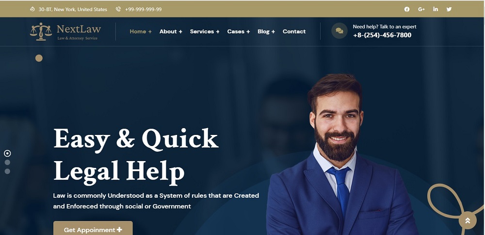
This is much more than a digital directory. It is a leading-edge technology platform that connects members to the right lawyer and firms, around the world.
This website has an innovative and technology-enabled model that helps a business to thrive across all stages of growth, It offers a Predictable and reasonable fixed price general counsel legal packages, Sophisticated legal representation from seasoned attorneys, and a client-centric focus that is collaborative, transparent, and efficient. Clients have the option to directly book appointments via the site.
The site follows up with a blue texture for the background.
Suggested Read: 10 Website Design Ideas For IT Company
Lawyer Web Design Inspiration 2
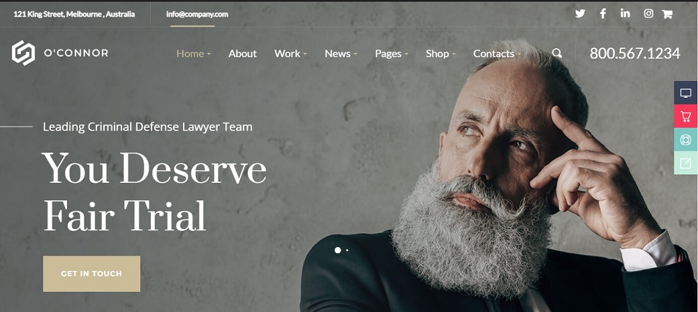
The attorneys at the O’Connor Law Firm website provide a personalized, compassionate, and ardent representation to their clients, putting the rights and needs of their clients at the heart of O’Connor Law Firm’s mission and practice. The website follows a gray and dull texture for the background.
The Website provides more information on the firm and contact details. The website provides details on attorneys, practice areas, and verdicts and settlements. The website has an extra option that allows finding out about class action lawsuits.
Lawyer Website Design Inspiration 3
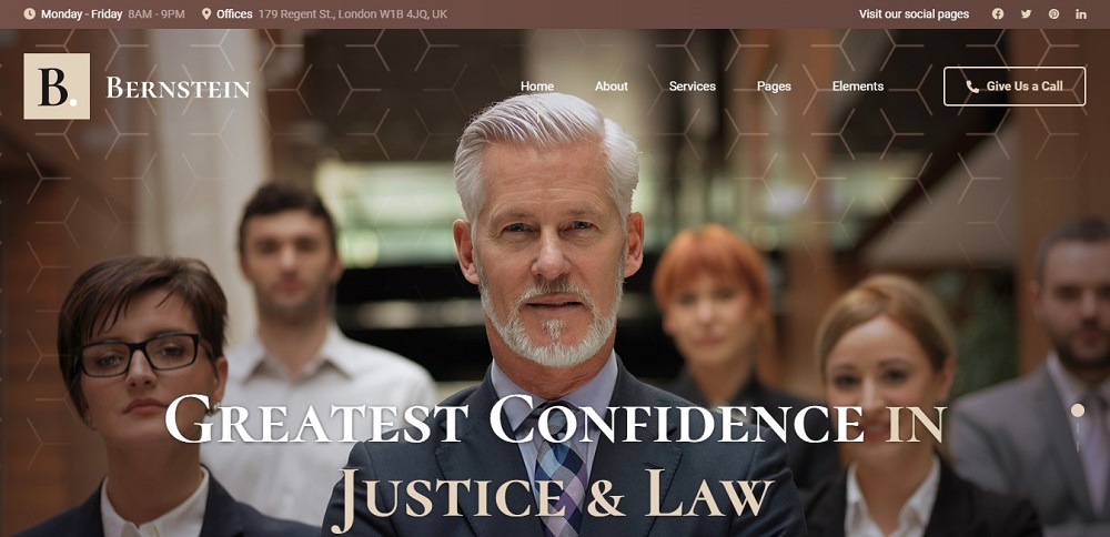
This website includes a brown color theme. It gives the clients important details such as the opening hours, opening days, and location. The clients can call directly with just one click and the website includes all four social media platforms.
It lists the services and elements. The website includes a picture with a brown texture and white and nude text on top of it. The website is creative and creates a good impression for the client as soon as it is viewed.
Lawyer Website Design Inspiration 4
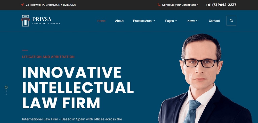
This website follows a blue-and-white color coordination. It includes the contact details such s the contact number and email. The website has a special feature where clients can schedule a consultation. Along with the location, the site provides information such as the practice areas, pages, news, etc…
Lawyer Website Design Inspiration 5
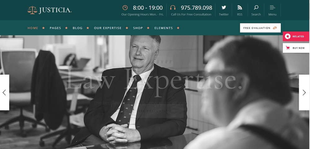
The website lists the contact information such as the phone number and fax. It also includes the social media pages and opening hours. The clients can get a free evaluation via the site. They can also get a free consultation by calling the website. The site follows a green color code along with a black-and-white image. Furthermore, clients have the option to purchase products with the buy-now icon.
Lawyer Website Design Inspiration 6
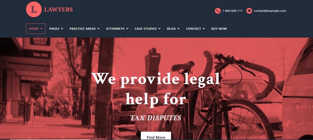
The site follows a green and red combination. It includes the email and phone number on top for easy access for the clients. Along with the contact details the site includes case studies and attorneys etc… The site along with a picture describes the current service that they are focused on and promotes it on the cover page. This is a good marketing trick in which customers will be taken on for the service in the heading as they enter the site first.
Lawyer Website Design Inspiration 7
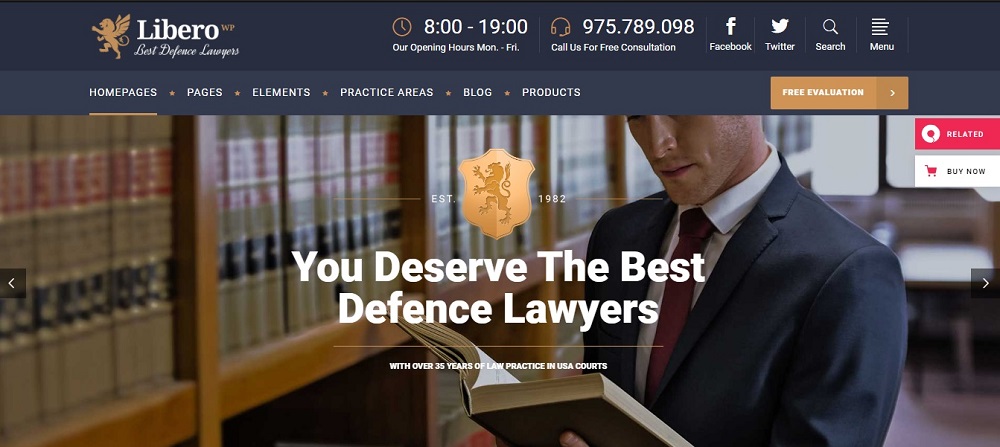
The site includes contact information on the very top and the social media pages as well. The website follows a color combination of blue and gold. The clients can check with products and buy them through the site. It has a search bar on the top of the website for the clients to search for products and purchase. The clients can get a free consultation through the site.
Lawyer Website Design Inspiration 8
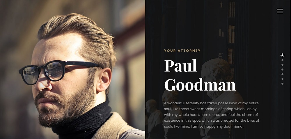
This website is a very simple, yet uniform one. It has the main menu bar which includes details from the services to contact info. The background of the website is black, which highlights the letters in white. The website contains attorneys, services, and contact details. The website follows a black and dull texture and the white text is highlighted through it.
Lawyer Website Design Inspiration 9

The website offers clients to get a quote for services. Commonly it includes tabs to view services and elements. The page includes the contact number and email address. The site is of a blue and red texture. Furthermore, the tabs such as elements and pages are also at the top. The website contains a background with artwork and has options for contact info and services etc…
Lawyer Website Design Inspiration 10
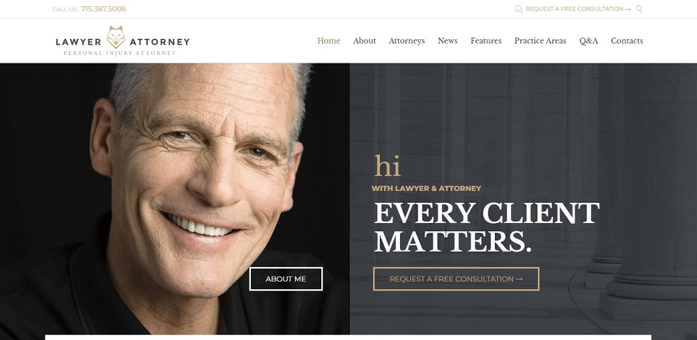
This Website offers all common factors such as the about, contact, and services. Following a gray and white texture for the background, the site has a white and gold context. Clients have the option to request a free consultation at the top of the site. With all these facts, the website has a separate tab for Q & A. Clients have the chance to view all questions and answers in relation to the organization and its services.
Some websites add the personal element that comes from allowing you to save the things that inspire you. But having a few reliable starting places can help you meet clients’ needs while encouraging you to explore new design solutions, keep up with design trends, and push your creativity.
These can be inspiring not only for your own agency website, but also for any client, business, or portfolio site. Understanding the purpose of your website and doing thorough research on the competitors is a key factor.
So looking for lawyer website design services? To develop attorney website development in Toronto Canada contact Tectera who offer web design in Toronto for Toronto law firms.


